
Red
Red posters: sheets that carry the colour across the whole surface. Start with a wall that needs warmth, not a picture. Start there.
Showing all 25 resultsSorted by latest


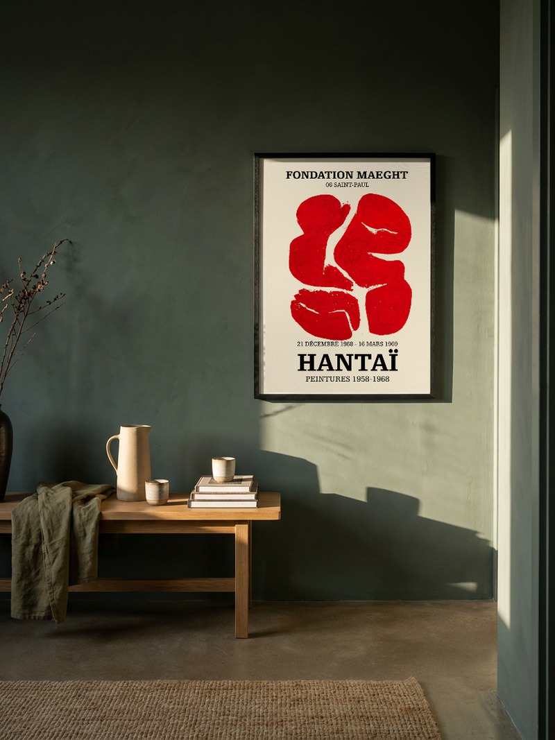


Red posters and the heat they add
The shades in this collection run from brick and rust to a bright, almost artificial crimson, and each one behaves differently. Darker tones sit heavily beside wood; lighter ones lift a pale surface.
Choose the tone by the hour you use the room most. A deep red is an evening colour; a bright one is a morning colour.
One red, one wall
Red is the single strong note in a quiet space, so give it room. A metre of white wall on either side will do more for it than any frame. Nothing beside it should compete — no second bright print, no patterned textile at the same height.
If the room already has plenty of colour, use red small: at 30×40 or 40×50 it reads as punctuation rather than a statement.
Which red posters work best
Travel and film posters from the middle of the last century were printed with red as a structural colour, not a decoration — see the travel and film collections, where the red is doing real work.
For something quieter with the same warmth, look at brown and yellow. For the opposite effect, blue.
Red can also be an accent rather than a field. The af Klint sheet, a pale ground with a slender column down the middle and small forms floating at either side, uses red the way a drawing uses a signature: a few marks, and the rest of the page left to breathe. It belongs on the wall that is already warm, where a full crimson would tip the room over, and it is the sheet a strong red can be hung beside without either of them losing its nerve.
Sizes, paper and delivery
Pigment print on 210 gsm Hahnemühle paper, 30×40 to 70×100 cm plus A3 and A2. Frame not included. Dispatched within 24 hours, 3–5 working days in the EU, tracked.
If you want the historical red of the Bauhaus, start there.