Details
The image
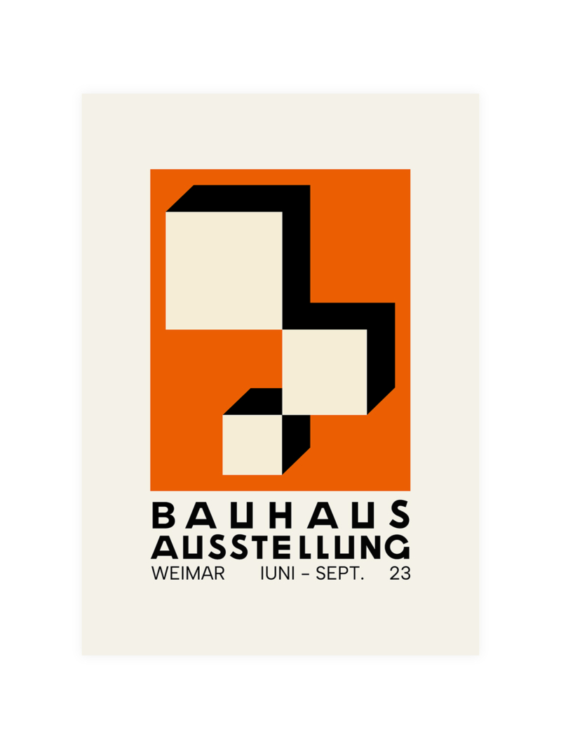
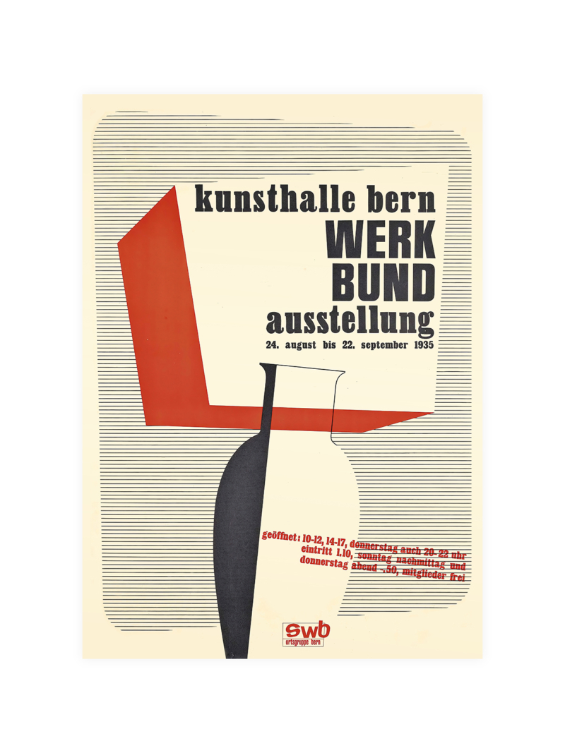
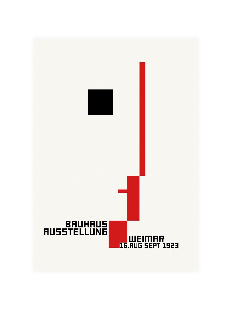
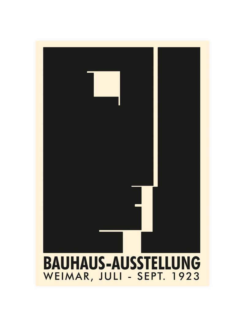
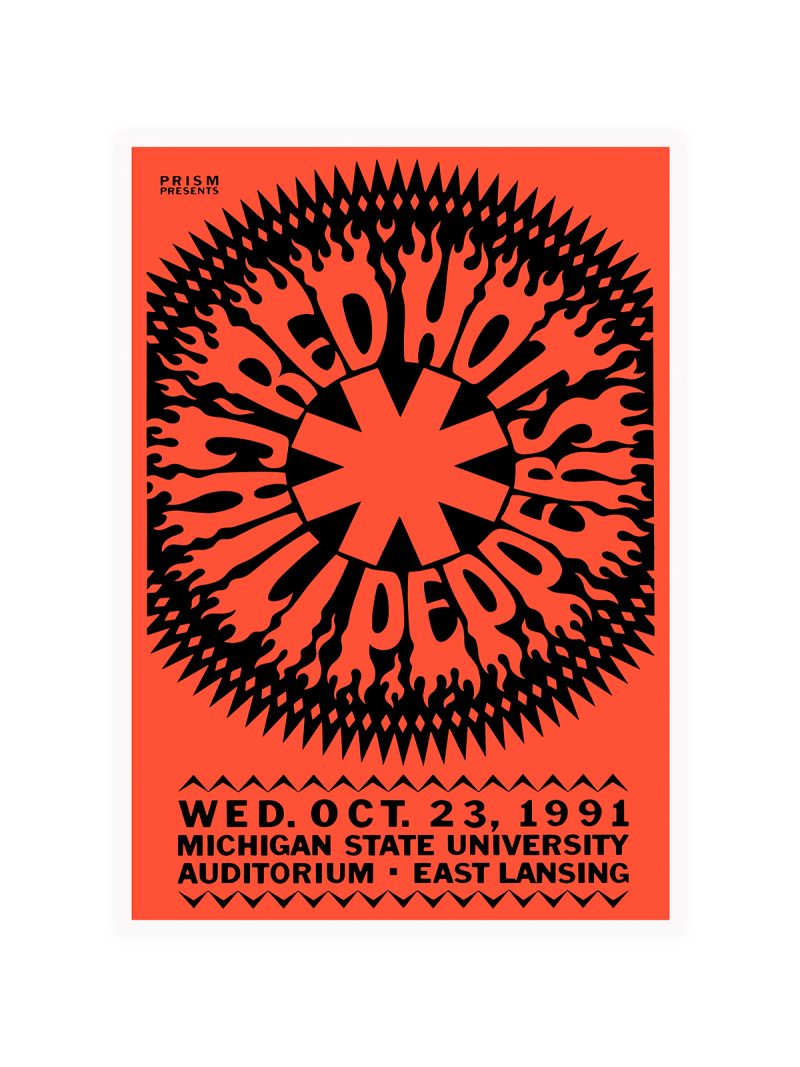
Clean geometry and confident lettering, arranged so the information reads like a diagram. There is no illustration of a building and no crowd, the poster argues with typography and with a few decisive shapes. The palette is restrained, the contrast high and every element sits on a grid.
Where it comes from
The Stockholm Exhibition of 1930 introduced functionalism to a wide Swedish audience, with buildings, furniture and lighting designed as one argument about how people should live. The graphics that accompanied it belong to the same movement: information treated as architecture, decoration stripped away, nothing added that does not carry meaning.
On the wall
It suits a study, a stairwell or a hallway with a long sightline, where the grid can be read as a whole. Because the composition is quiet, it holds up in rooms that are already busy without adding noise. In a Scandinavian interior it looks less like decoration and more like a period document.
In company
Pairs well with Bauhaus graphics and with mid-century furniture and it can anchor a group of three. Because the lettering is part of the image, avoid hanging it beside other text-heavy posters, two typographic pieces next to each other cancel out. Give it a metre of plain wall. The Bauhaus collection is where the same argument is made again and again.