Details
The image
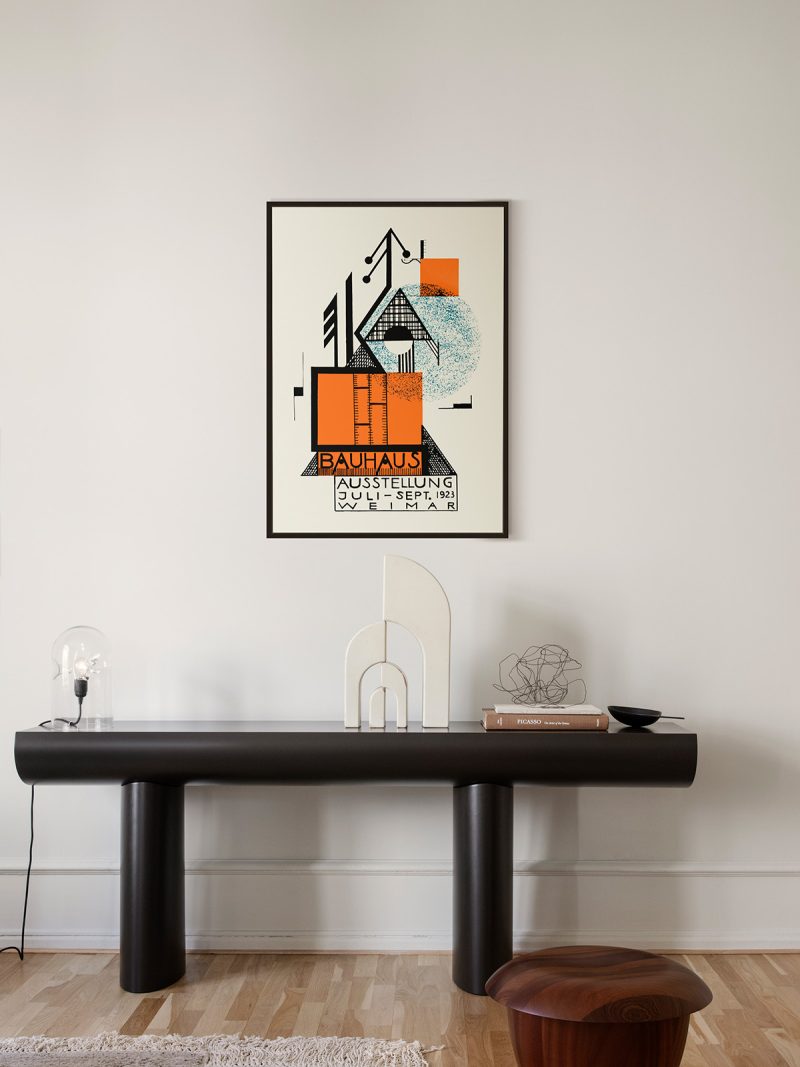
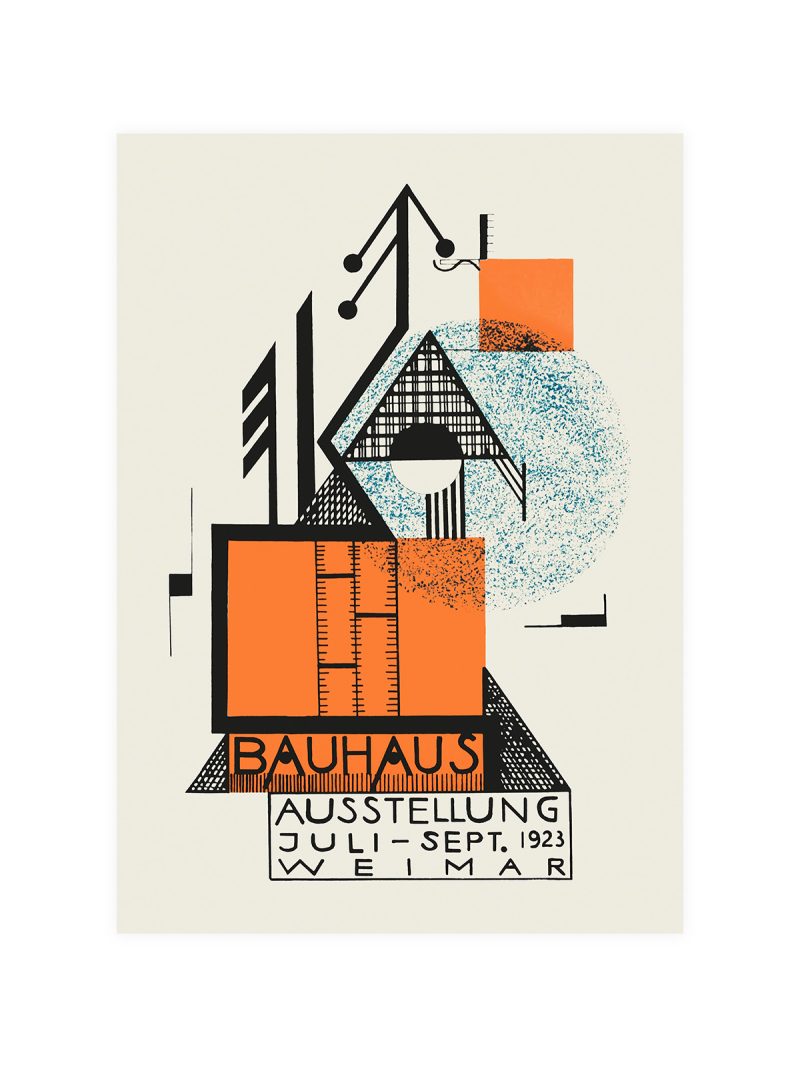
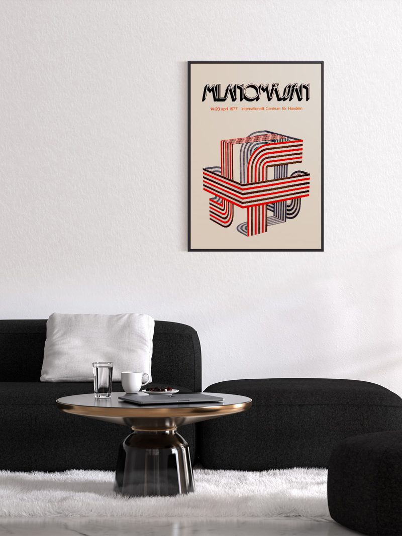
A composition on a strict grid with a strong vertical axis, geometric forms overlapping a central column and the lettering drawn as one of the shapes. Colour is limited to a few flat notes and the whole sheet is arranged so that it can be read in a single glance from a street.
Where it comes from
The school’s first public exhibition, held in Weimar in the summer of 1923, was designed as an argument in itself: the buildings, the products and the printed matter were all supposed to obey the same rules. The poster carried those rules onto paper, geometry, interval, no ornament and it became one of the most reproduced documents of modern design, quoted in every history of the subject and reprinted continuously since.
On the wall
It suits a study, a stairwell or a hallway where a grid can be read as a whole. Because the composition is ordered and the palette restrained, it holds its own beside bookshelves and dark furniture. In a modern interior it works as the piece that gives a wall structure rather than colour.
In company
Hung beside another piece from the Bauhaus collection, it reads as part of a series rather than a single picture.In a group it should set the grid, hang it first and place softer work around it.