Details
The image
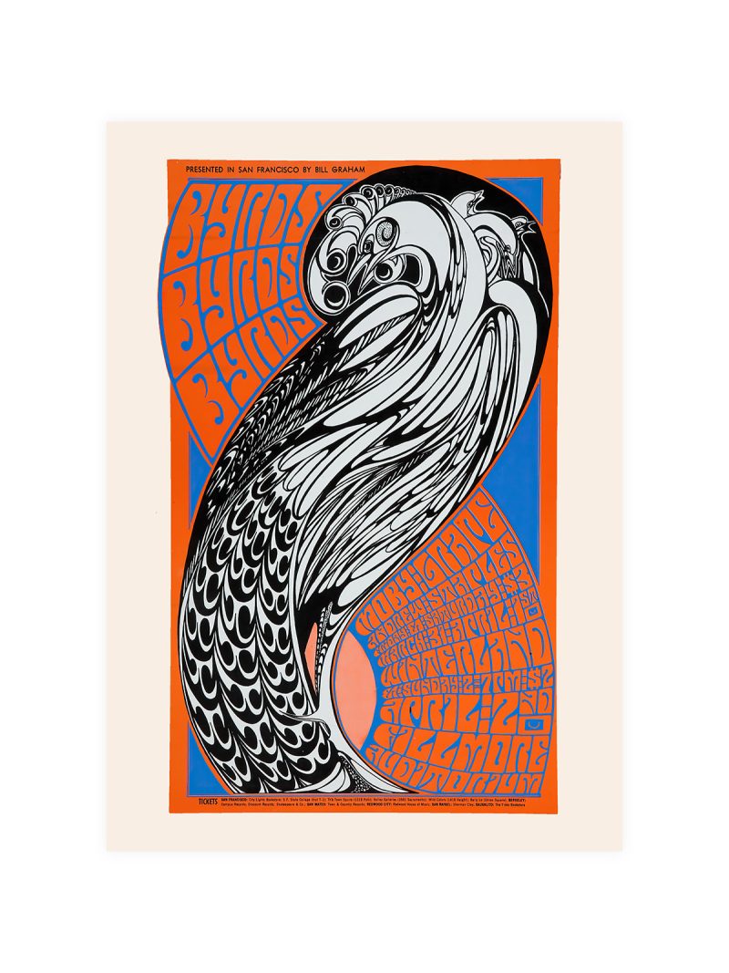
Three colours doing all the work, with heavy black lines weaving between them so that no shape is allowed to sit quietly. The space is flat and the composition is rhythmic: intervals of colour take the place of distance, and the eye is kept moving rather than led in.
Where it comes from
The reduction to a handful of tones and an insistent line is a strategy that came out of American painting between the wars, when the structure of a picture was borrowed from commercial design and the cadence from jazz. Colour was used to mark out zones rather than to describe light, and the line was used to keep those zones in tension. The result looks abstract but behaves like a map, which is why it reproduces so well on paper.
On the wall
It brings colour and structure into a room without a subject, so it suits a living room, a study or a hallway with strong furniture. Because the composition is dense and the palette limited, it needs a plain wall around it. In a group it should be the piece that sets the tempo.
In company
The Geometric collection gathers prints made for the same kind of wall.Avoid hanging it beside soft, tonal work, where the black line would look aggressive.