Details
The image
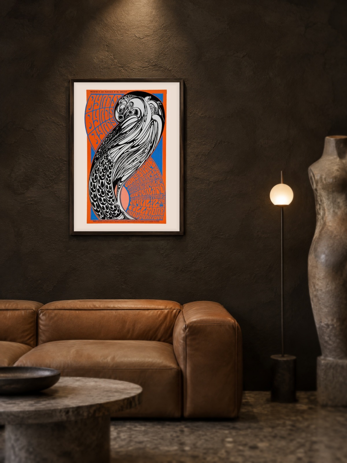
A band poster built from flat colour and hand-set lettering, the name set large and slightly irregular, the image simplified to a few shapes. The palette is warm and the composition busy, with text wrapping around the picture instead of sitting above it.
Where it comes from
The mid-1960s concert poster was printed cheaply for a single event: a dance, a club night, a tour date. Designers worked fast and experimented, because the sheet would be pasted on a wall and gone in a fortnight. The Byrds stood at the folk-rock edge of that scene, and their posters belong to the moment when pop graphics became collectable.
On the wall
It brings energy into a room, so it suits a studio, a hallway or a teenager’s room better than a formal living room. Because the composition is dense and warm, it needs a plain wall around it. In a group it works as the loudest piece, with quieter prints around it.
In company
Pairs well with black-and-white photography and with record sleeves, and it looks right at eye level. Two concert posters of the same period hung together read as an archive; three become a crowd. A simple frame without a mount keeps the period feel. A second sheet from the Vintage collection will balance it rather than compete.