Details
The image
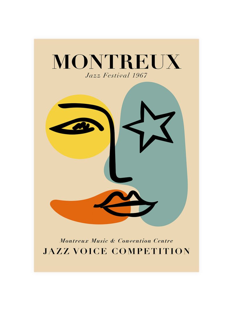
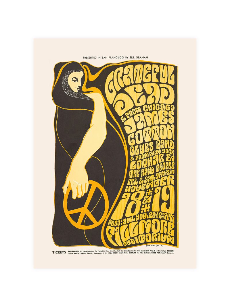
A graphic that argues with geometry: overlapping forms in strong colour, lettering set on two axes and a composition that refuses symmetry. The image looks constructed rather than drawn, as though a diagram had been pushed until it became a picture.
Where it comes from
In 1978 a major exhibition in Paris examined the cultural relationship between Paris and Berlin in the early twentieth century and its graphics borrowed from the period it was describing: constructivist angles, hard colour, type treated as structure. Exhibition design of that decade often used the visual language of its subject as the poster’s own language.
On the wall
It suits a study, a hallway or a studio where a strong graphic can hold a wall. Because the composition is dense and angular, it needs plain surroundings. In a large room it works as the piece that sets the rhythm; in a small one it may be the only picture.
In company
Pairs well with other exhibition posters and with modern furniture and it can anchor a group. Avoid hanging it beside softer work, the angles need contrast rather than company. A thin black frame keeps the geometry sharp and the picture needs a metre of plain wall so the two axes can be read without furniture interrupting them. If you want company for it, the Exhibition collection is where to look.