Details
The image
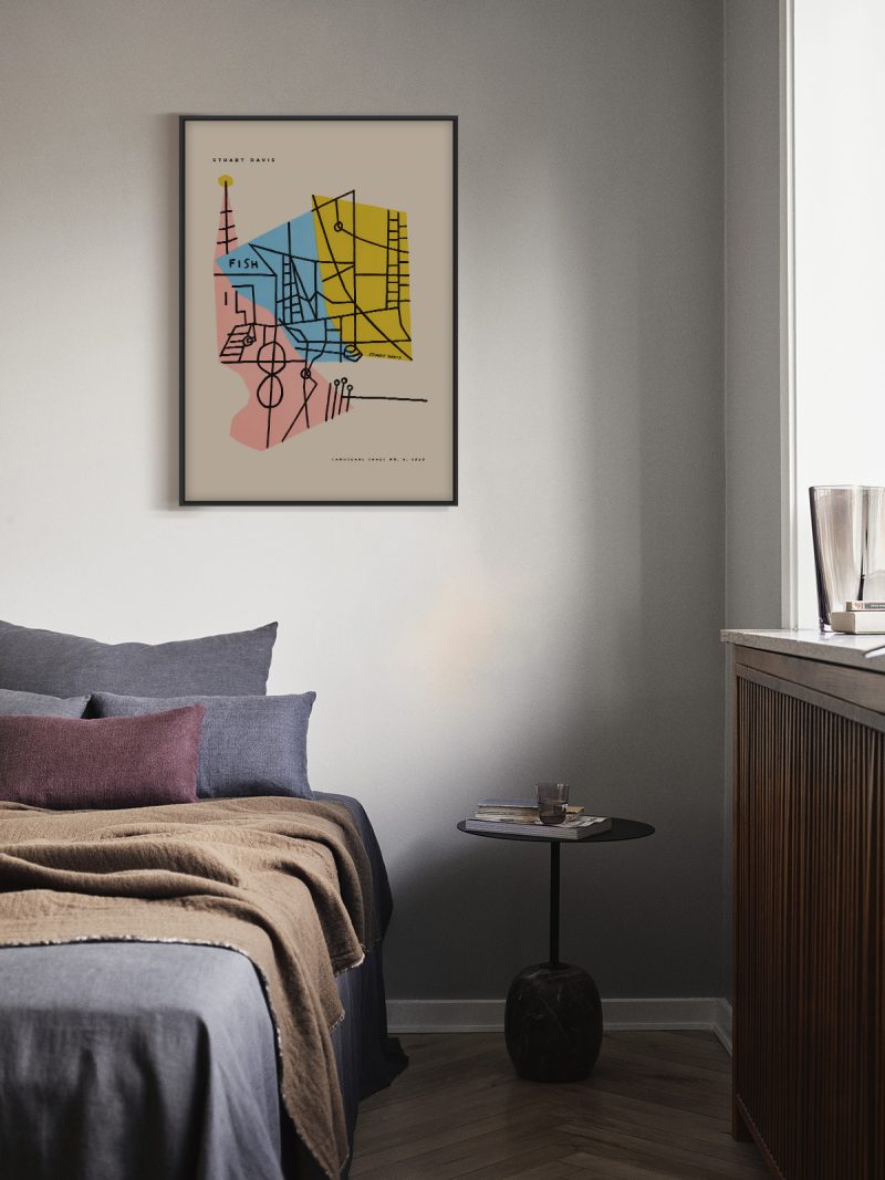
A building drawn as flat geometry: towers, roofs and windows arranged in a strong vertical composition with lettering set into the structure rather than above it. The palette is limited and the drawing simplified, so the architecture reads as a shape from a distance.
Where it comes from
Polish poster design after the war turned cityscape and infrastructure into graphic subjects: churches, ports, stations and bridges were drawn as compositions rather than as views. The approach came from a school that treated a commission as an artwork, and it produced a body of work where architecture became pattern without losing its identity.
On the wall
It suits a study, a hallway or a living room with strong furniture, where a vertical graphic can hold a wall. Because the composition is ordered, it works beside bookshelves and dark wood. In a large room it reads as architecture; in a small one it makes the ceiling feel higher.
In company
Pairs well with photography of buildings and with other Polish posters of the period. In a group it should be the most graphic element. A thin black frame keeps the geometry tight, and the sheet benefits from being hung slightly higher than the furniture, where the towers have room above them. Hung beside another piece from the Uwaga Inwazja collection, it reads as part of a series rather than a single picture.