Details
The image
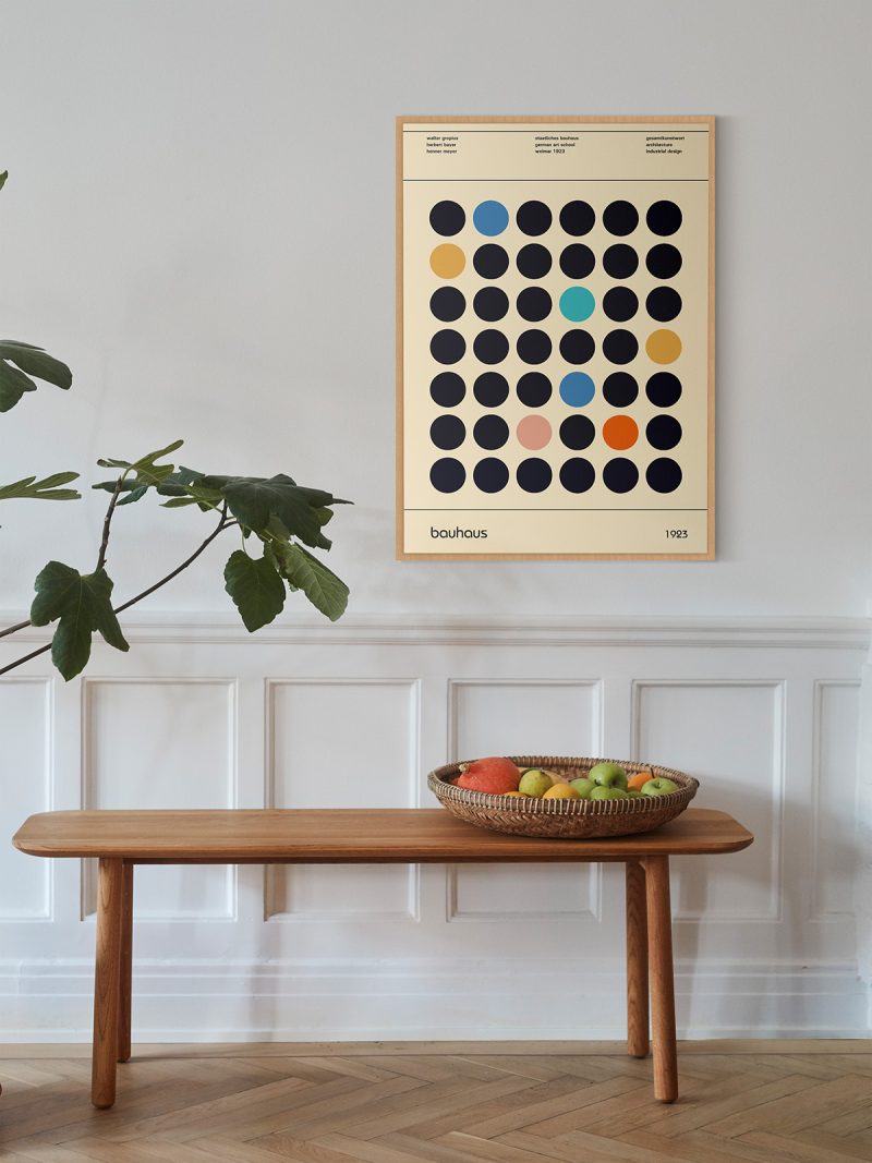
A composition of bars, rectangles and lettering fitted together on a strict grid, with colour used to separate one plane from another rather than to decorate. The sheet has no illustration in the ordinary sense: the arrangement is the image and the information is part of it.
Where it comes from
Bauhaus exhibitions were arguments made in public: the school needed to show that a method applied equally to a chair, a lamp and a printed sheet. The posters that announced those shows were designed under the same rules as the objects inside them, which is why they look like plans and why they still read as statements rather than as advertising.
On the wall
It suits a study, a stairwell or a hallway where a grid can be read in one glance. Because the composition is ordered, it holds its own beside bookshelves and dark furniture. In a modern interior it works as the piece that gives the wall structure rather than colour.
In company
Pairs well with architectural photography and other Bauhaus material and it tolerates strong wall colours. In a group it sets the rules: hang it first and place softer pieces around it. A narrow black frame keeps the fine type intact. A second sheet from the Bauhaus collection will sit beside it without argument.