Details
The image
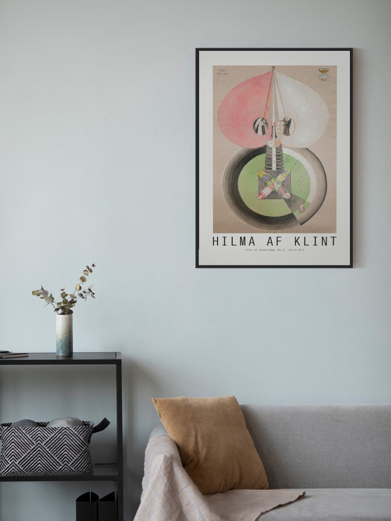
A heart reduced to geometry: two arcs and a point, drawn with an even contour and filled with one strong colour. Nothing is shaded and nothing is decorated, so the shape does the whole job and the lettering, if present, stays small beneath it.
Where it comes from
The heart is one of the few symbols that survived industrial design intact: it appears on playing cards, shop signs and stickers of the last three centuries without changing its outline. Graphic designers keep returning to it because it can be simplified to the point where it is no longer a drawing but a sign and it still reads.
On the wall
It suits a bedroom, a hallway or a child’s room and it works at almost any size. Because the composition is single and open, it needs a plain wall around it. In a group it should be the element that holds the centre.
In company
A second sheet from the Geometric collection will balance it rather than compete.In a group, avoid a second symbol nearby, two signs compete; a photograph or a landscape makes a better neighbour and the shape needs a metre of empty wall to be read as a sign rather than as decoration.