Details
The image
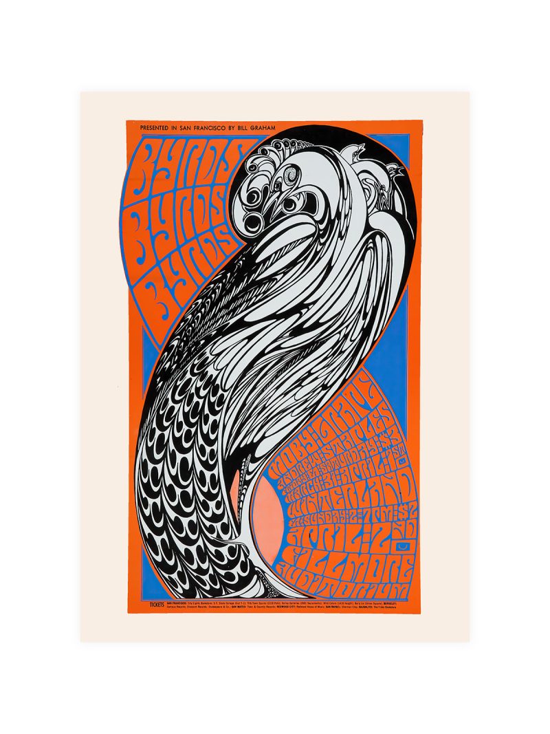
Lettering that behaves like an illustration: the band name drawn as a shape, curling around a central image, with colour printed in flat areas that overlap. The composition is dense and symmetrical and the eye is led in circles rather than along a line. Nothing is quiet.
Where it comes from
San Francisco in the late 1960s produced a poster style of its own: hand-drawn lettering, saturated colour, images that took time to decode. The Grateful Dead were at the centre of that scene and their posters were made by artists who treated a concert announcement as a piece of graphic art rather than as a notice.
On the wall
It fills a wall with energy, so it suits rooms that can take it: a studio, a hallway, a teenager’s room. Because the composition is dense, it needs a plain wall around it. At a large size the lettering becomes the subject; at a small one it reads as texture.
In company
Pairs well with record sleeves and with plain furniture, where the colour has contrast. In a group it should be the loudest piece, with quieter photographs around it. Avoid other dense graphics nearby, the style cancels itself out when repeated. The Music collection gathers prints made for the same kind of wall.