Details
The image
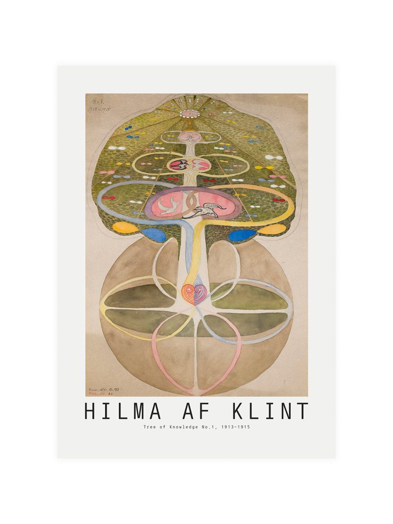
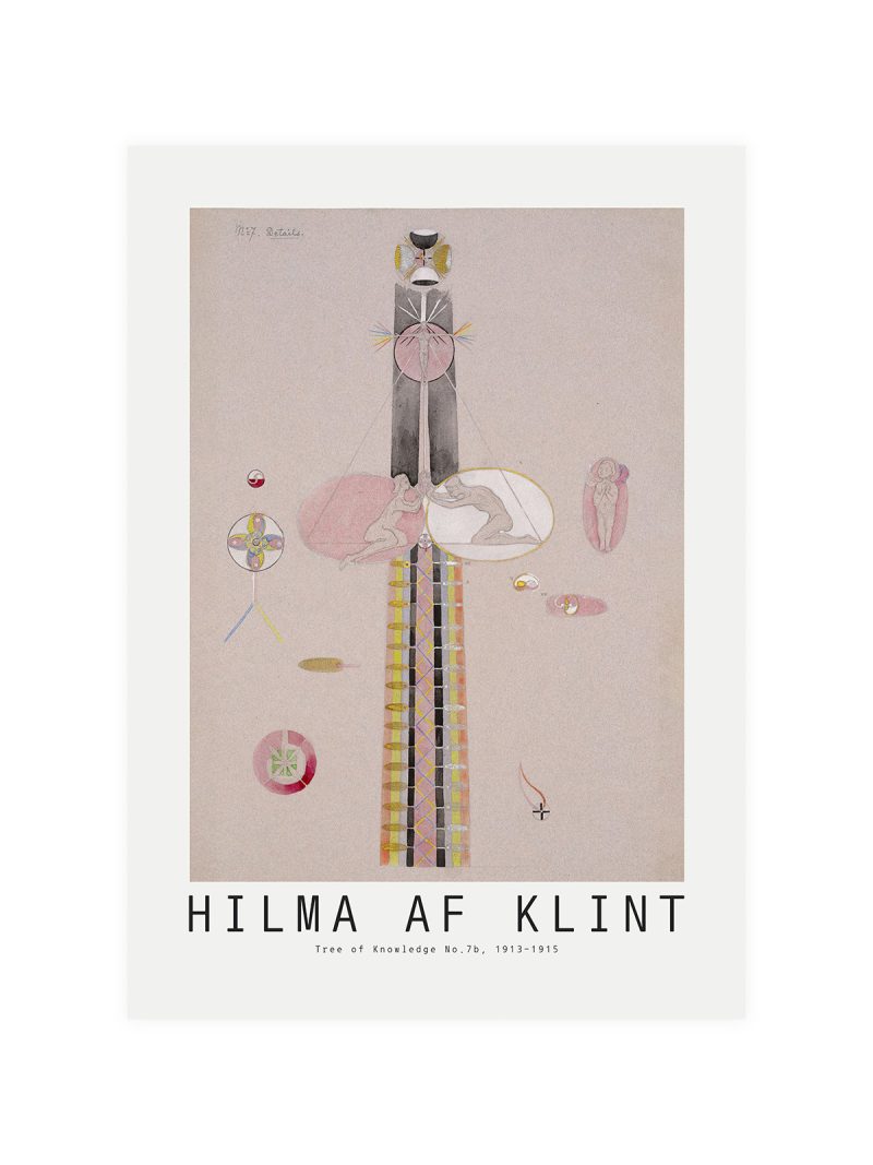
Lettering arranged as the primary subject, set in heavy capitals with a smaller line beneath and a single illustration held in the lower half. The palette is limited and the contrast strong, so the sheet reads across a room. The typography is the design, not a label on it.
Where it comes from
In the 1930s the printed sheet carried the weight that screens carry now: magazines, exhibitions and institutions announced themselves in type and designers treated letterforms as objects with weight and rhythm. Spanish and Latin American graphic design of that decade absorbed European modernism and gave it a harder, more popular edge.
On the wall
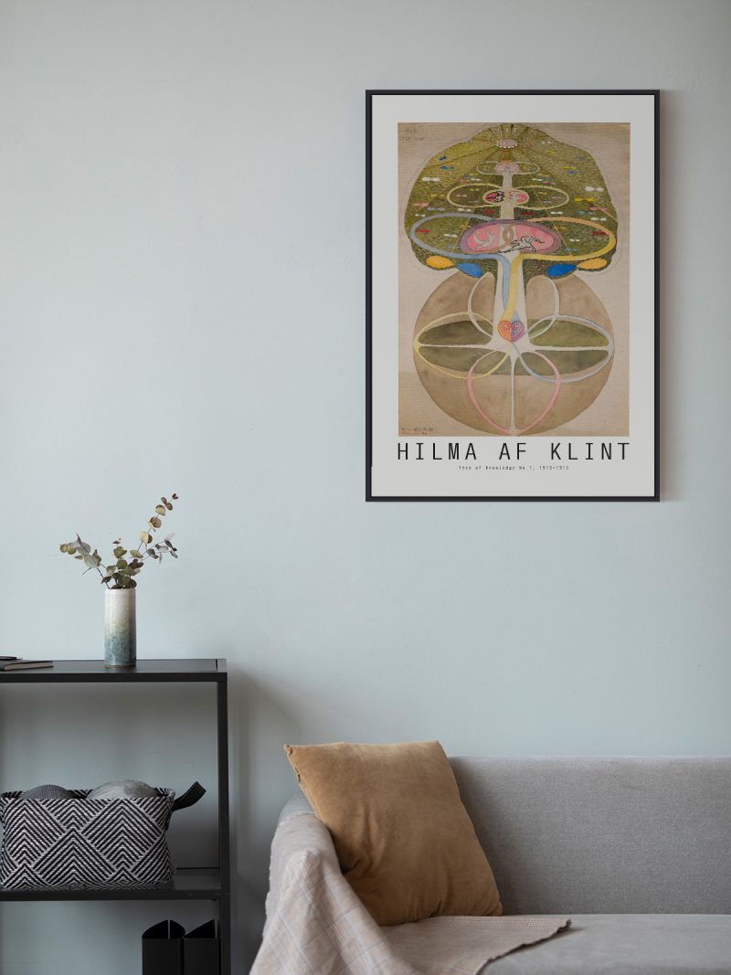
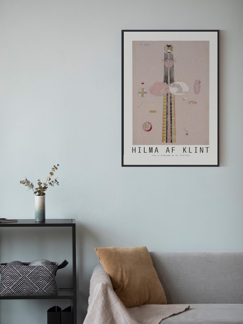
It works where a strong graphic can sit on its own: a hallway, a studio, a study. Because the lettering dominates, it should be hung at a height where it can be read comfortably, not above eye level. In a room with plain walls it provides structure without colour.
In company
Pairs well with photography and with industrial furniture and it holds a wall alone. Avoid hanging it beside other typographic posters, two sheets of type compete and both lose. A simple black frame keeps the letterforms crisp and it should be hung where the smaller line beneath the headline can still be read without stepping closer. The rest of the Floral collection holds pieces from the same years and the same printing habits.