Details
The image
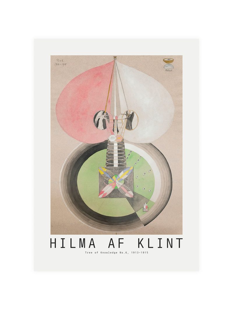
A graphic mark rather than an illustration: geometric lines and a strong central form, with the lettering set tight and formal. The palette is restrained and the contrast sharp, so the sheet reads as an announcement rather than a picture. Everything is ordered around a single axis.
Where it comes from
In 1966 the Metropolitan Opera moved to a new house at Lincoln Center and the opening season was presented as a cultural event of national weight. Posters for institutions of that kind were commissioned from graphic designers rather than illustrators and the result looked like architecture on paper, appropriate for a building that had just been built.
On the wall
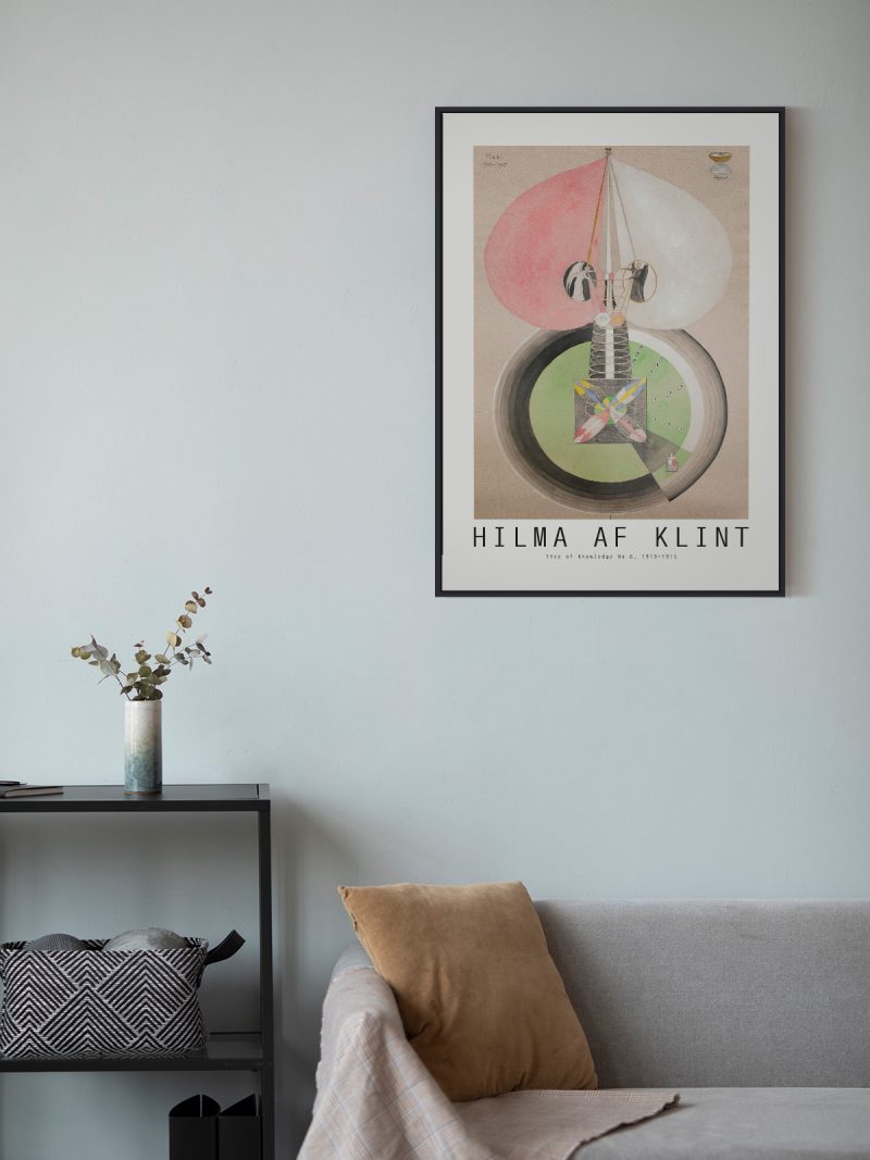
It suits a study, a hallway or a room with strong vertical lines, where its formality does not feel out of place. Because the image is quiet, it works beside bookshelves and dark furniture without being lost. In a minimalist interior it can be the single piece of structure on the wall.
In company
Pairs well with mid-century graphics and with photography of buildings and it tolerates a strong wall colour. In a group it should be placed centrally, since its symmetry wants an axis. A thin dark frame keeps the geometry tight without adding weight. For a larger wall, the Modern collection supplies the rest of the arrangement.