Bauhaus

Bauhaus posters: exhibition prints from Weimar and Dessau, typographic experiments and the geometry its teachers taught. For walls that need structure.

Showing all 18 resultsSorted by latest
Sort by
Show

Bauhaus Weimar 1923 Poster

From: 90,00 zł
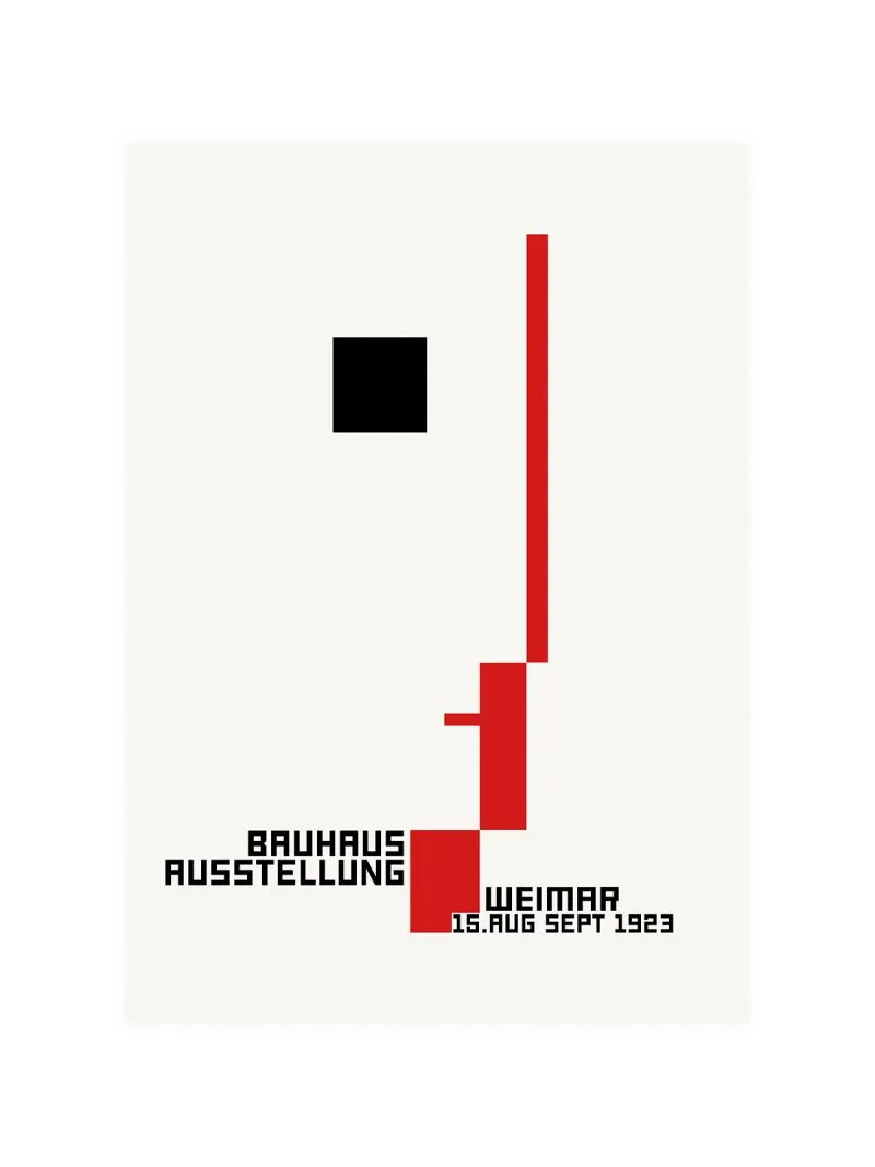
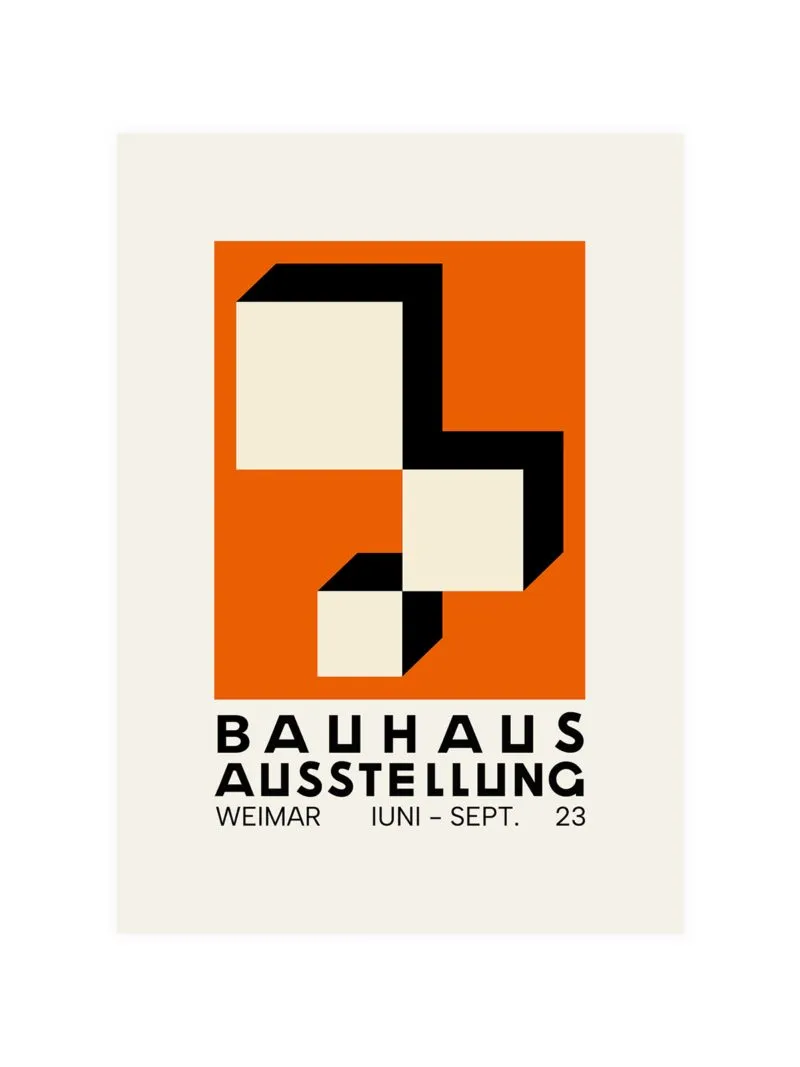
Weimar, summer of 1923: the Bauhaus opened its first public exhibition and designed the paper to argue the same case as the objects. Geometric forms on a central axis, lettering drawn as one of the shapes, colour used to separate planes rather than to decorate them. Nothing on it is

Bauhaus 1923 Poster

From: 90,00 zł
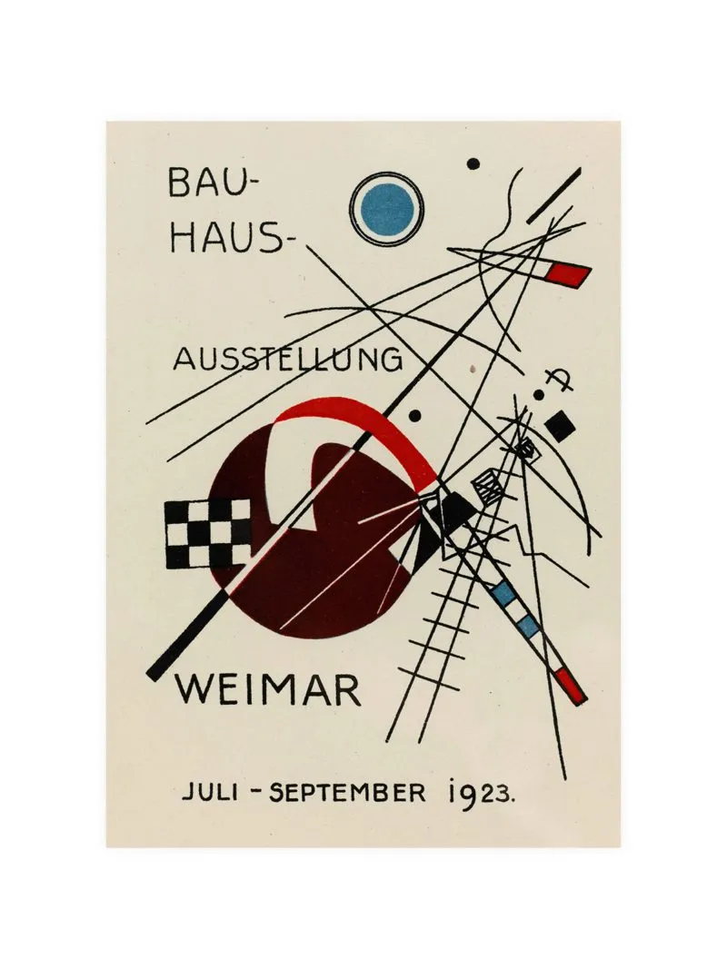
Weimar, 1923: the school was still arguing about what a poster should be, and the answer on this sheet is a diagonal arrangement of geometric shapes in strong colour. Type and form are treated as the same material, so the lettering belongs to the composition. It works in a study

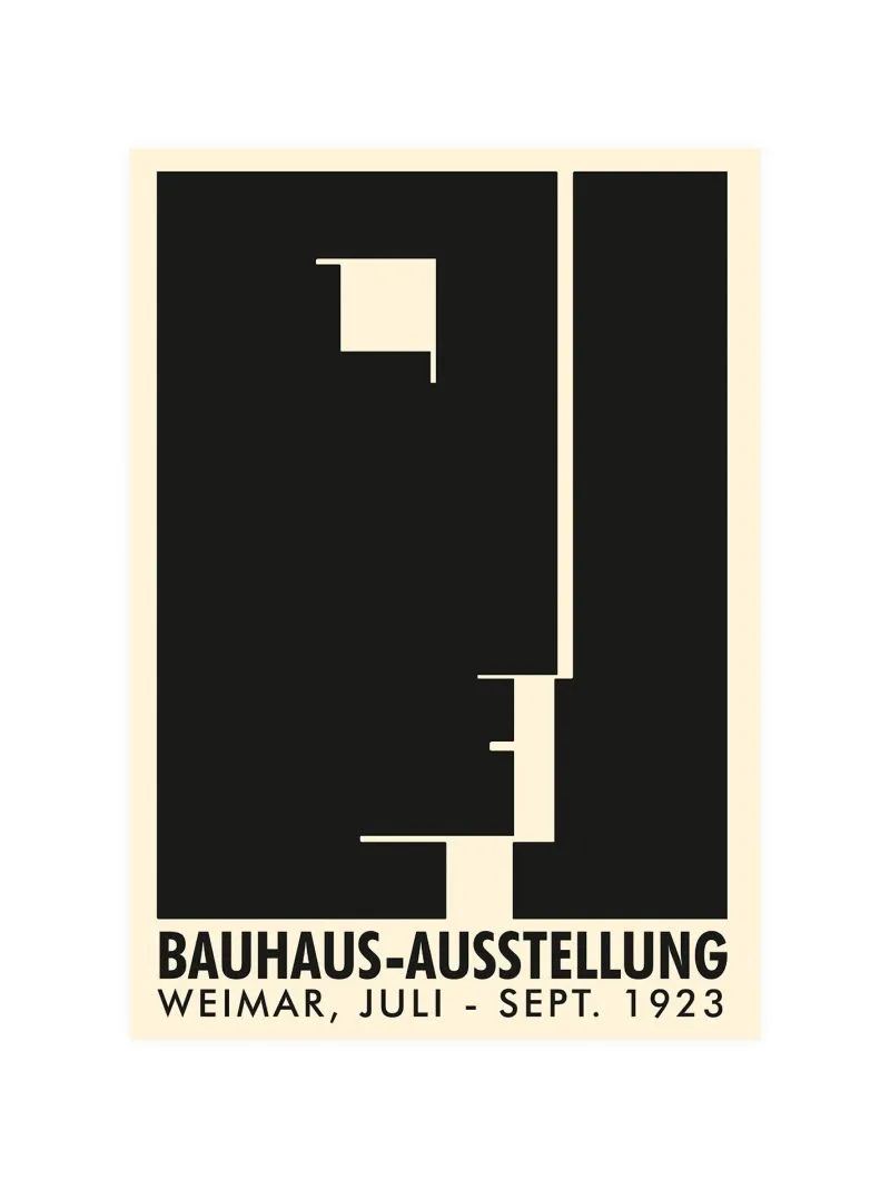
Bauhaus Exhibition 1923 Poster

From: 90,00 zł
The first Bauhaus exhibition ran in Weimar from July to September 1923 and its poster was drawn by Joost Schmidt, who lifted a stylised head from Oskar Schlemmer’s emblem and set it among geometric shapes. The head tilts, the grid holds it and the lettering works as part of the

Bauhaus Exhibition 1935 Poster

From: 90,00 zł
Bars, rectangles and lettering fitted on a strict grid, colour separating one plane from the next, no illustration in the ordinary sense. By the mid-1930s the school’s public life in Germany had ended but its method kept travelling through exhibitions abroad and through the designers it had trained.

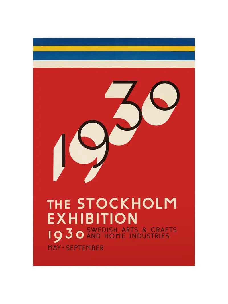
Stockholm 1930 Exhibition Poster

From: 90,00 zł
The Stockholm Exhibition of 1930 introduced functionalism to a wide Swedish audience and its graphics argued the same case as its buildings: information as architecture, decoration stripped away. Clean geometry, confident lettering, nothing added that does not carry meaning. The exhibition gave Swedish design a public argument and the poster

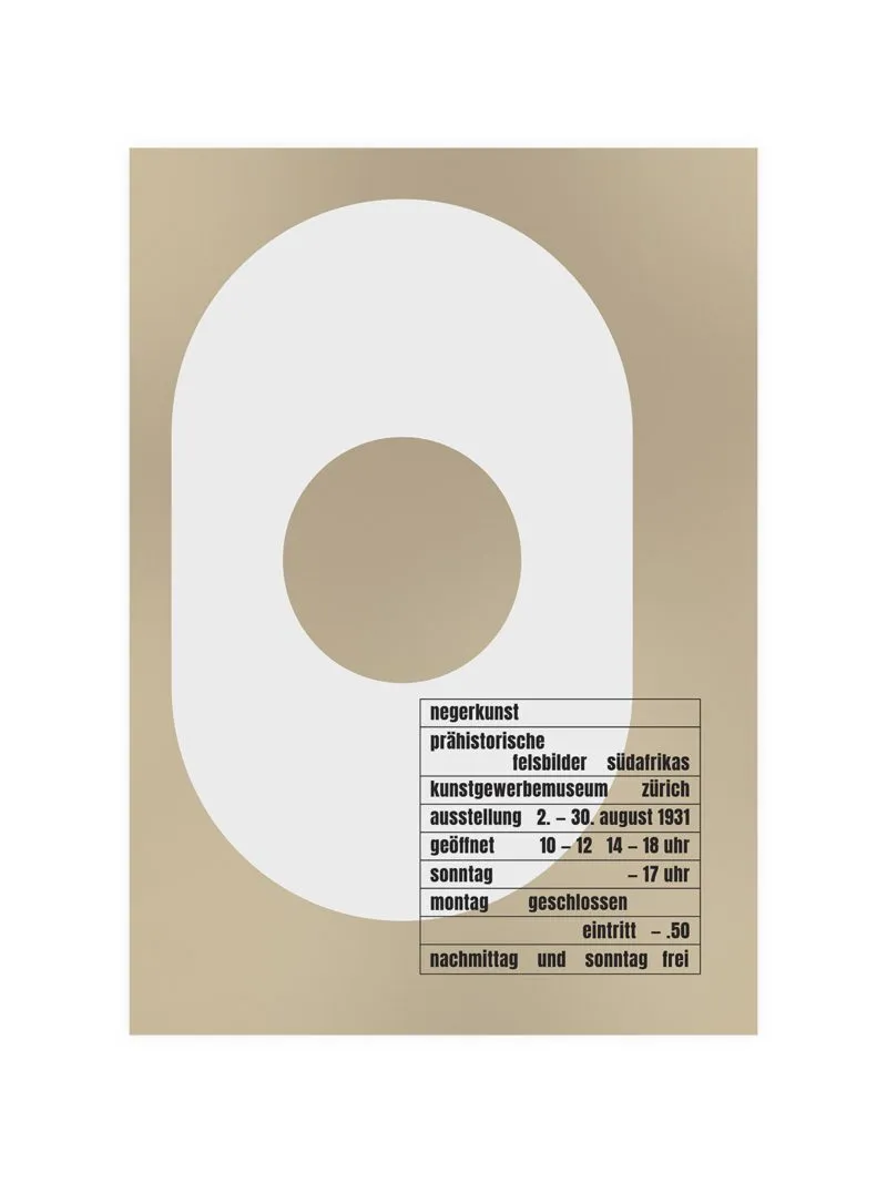
Bauhaus Exhibition Zurich 1931 Poster

From: 90,00 zł
Rectangles and bars with lettering set as one of the planes rather than placed on top, colour limited to a few strong notes, the whole sheet on a strict grid. By the early 1930s Bauhaus ideas were travelling and exhibitions abroad became the way of presenting the method to a

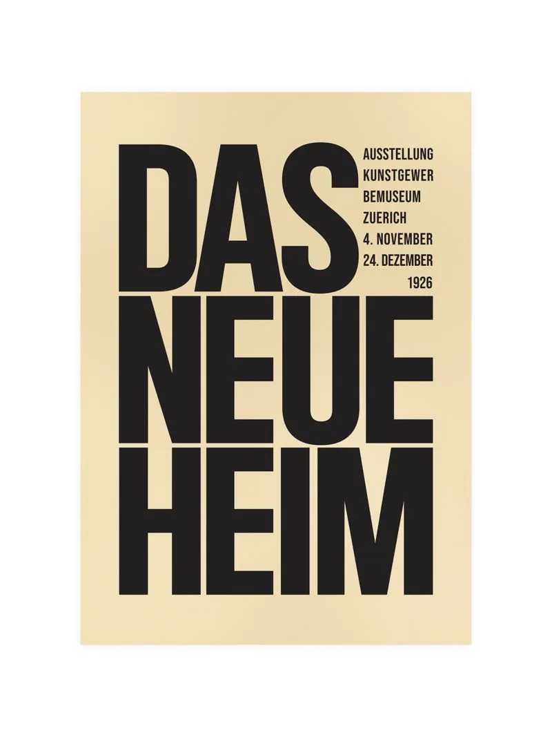
Das Neue Heim Exhibition Poster

From: 90,00 zł
Geometric lettering in stacked blocks with a few architectural forms behind it, restrained palette, strong contrast, everything on a grid. In the 1920s exhibitions about modern living were arguments about how people should live and their posters looked like plans rather than pictures, because the subject was a method.

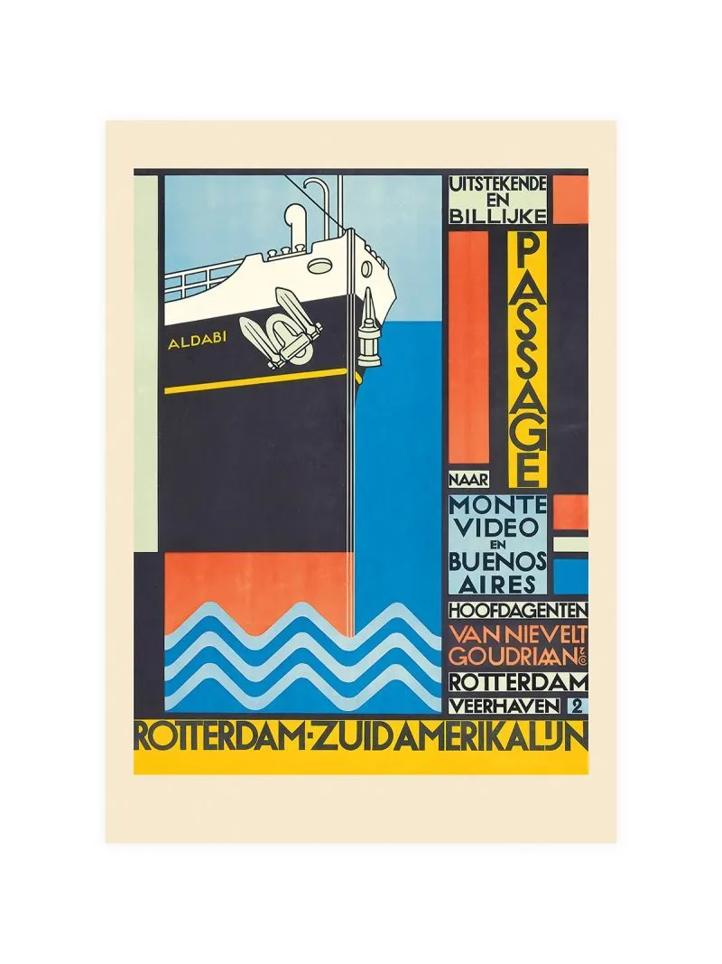
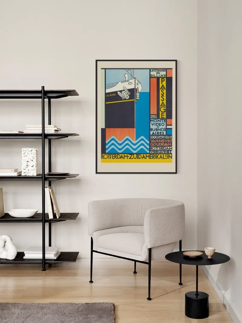
Rotterdam-South America Poster

From: 90,00 zł
Ocean liners sold distance the way airlines later sold speed and a route from Rotterdam to South America was a promise worth drawing. This one does it with modern lines, a ship reduced to silhouette and a horizon that tilts. It suits a study or a hallway with a travel

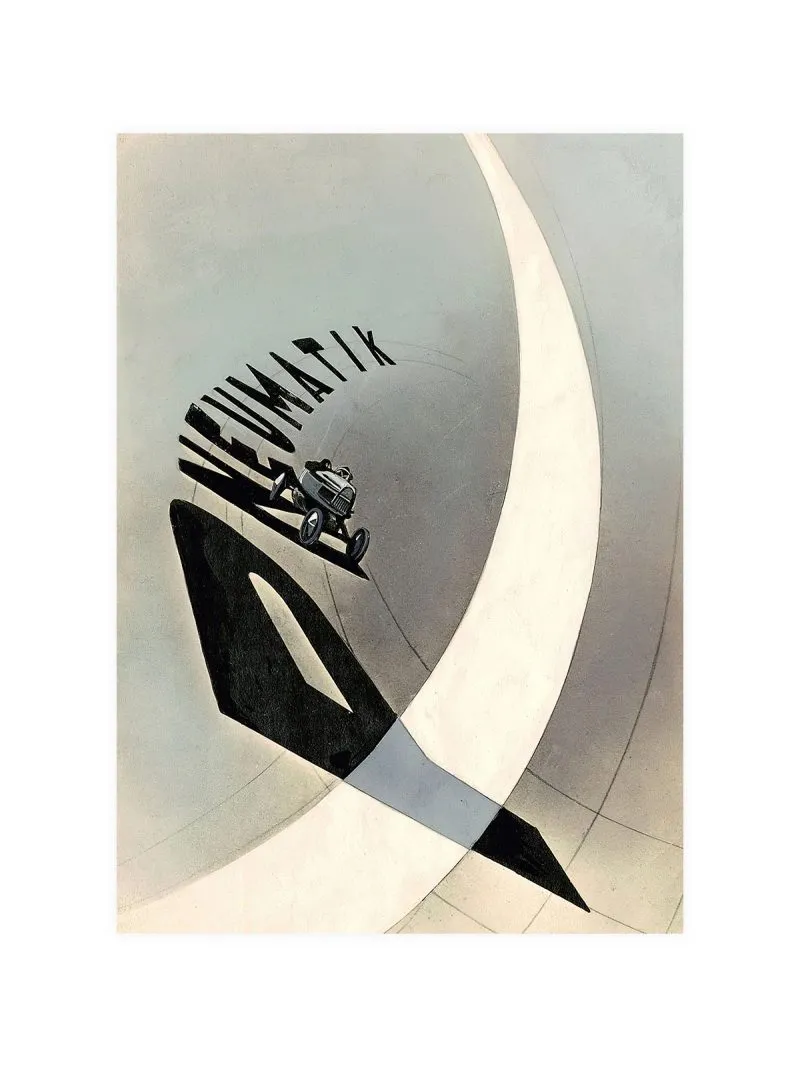
Bauhaus Pneumatik Poster

From: 90,00 zł
Lettering set along an arc, as though following the curve of a tyre, with a small car placed high to the left. In the 1920s advertising took up the Bauhaus argument that type is a constructed object, not a written line, here the word is the image and the arrangement

Bauhaus Ausstellung Poster

From: 90,00 zł
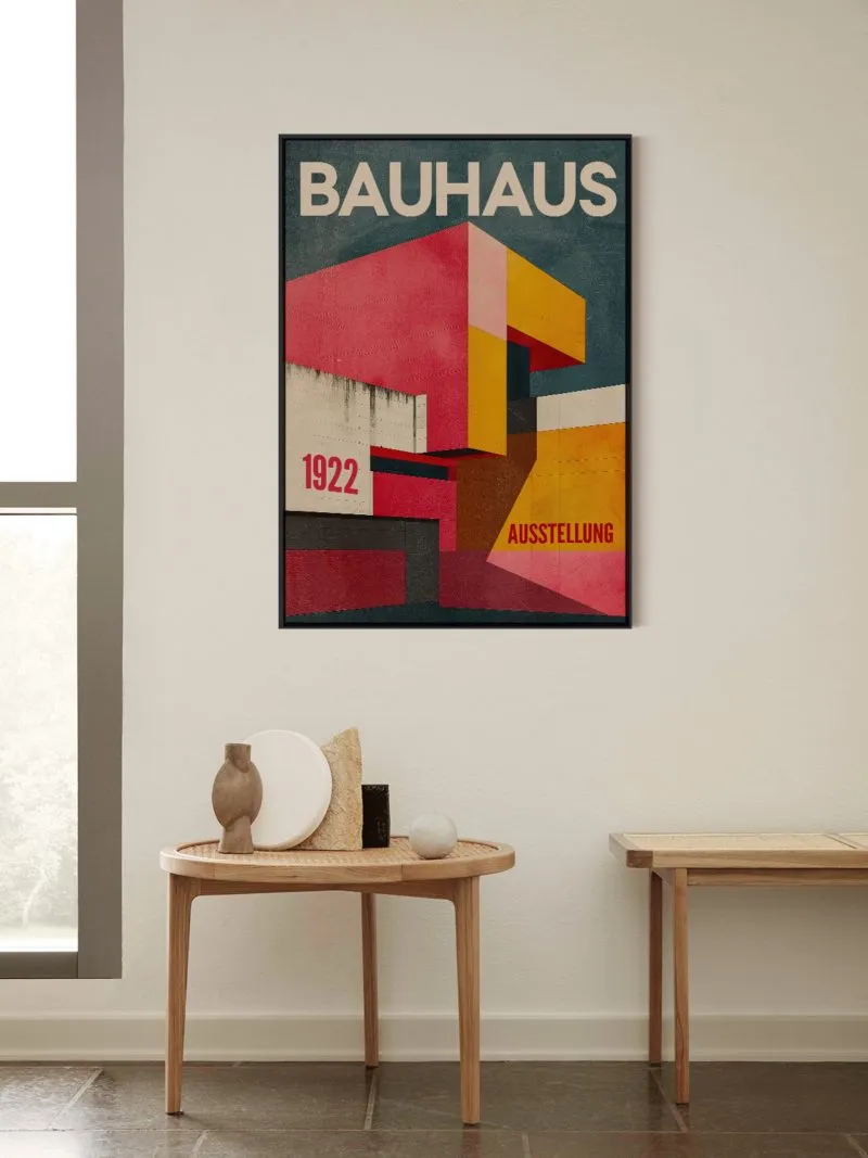
Bars, rectangles and lettering fitted on a strict grid, colour separating one plane from another rather than decorating. Bauhaus exhibitions were arguments made in public and the posters announcing them were designed under the same rules as the objects inside, which is why they look like plans. The lettering was

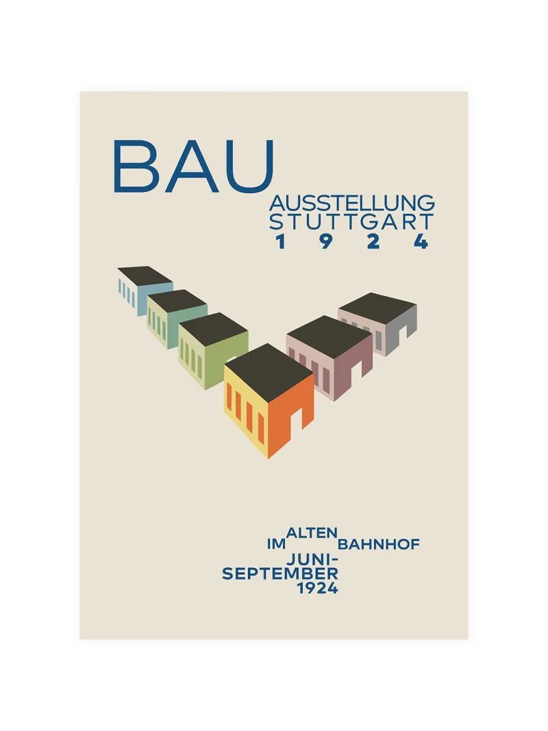
Bauhaus Ausstellung 1924 Poster

From: 90,00 zł
Geometric elements on a strict grid, lettering treated as one of the shapes, a handful of strong colour notes and nothing else. By the mid-1920s the printed sheet was the Bauhaus’s main argument in public: the school claimed that typography, layout and object belonged to a single discipline.

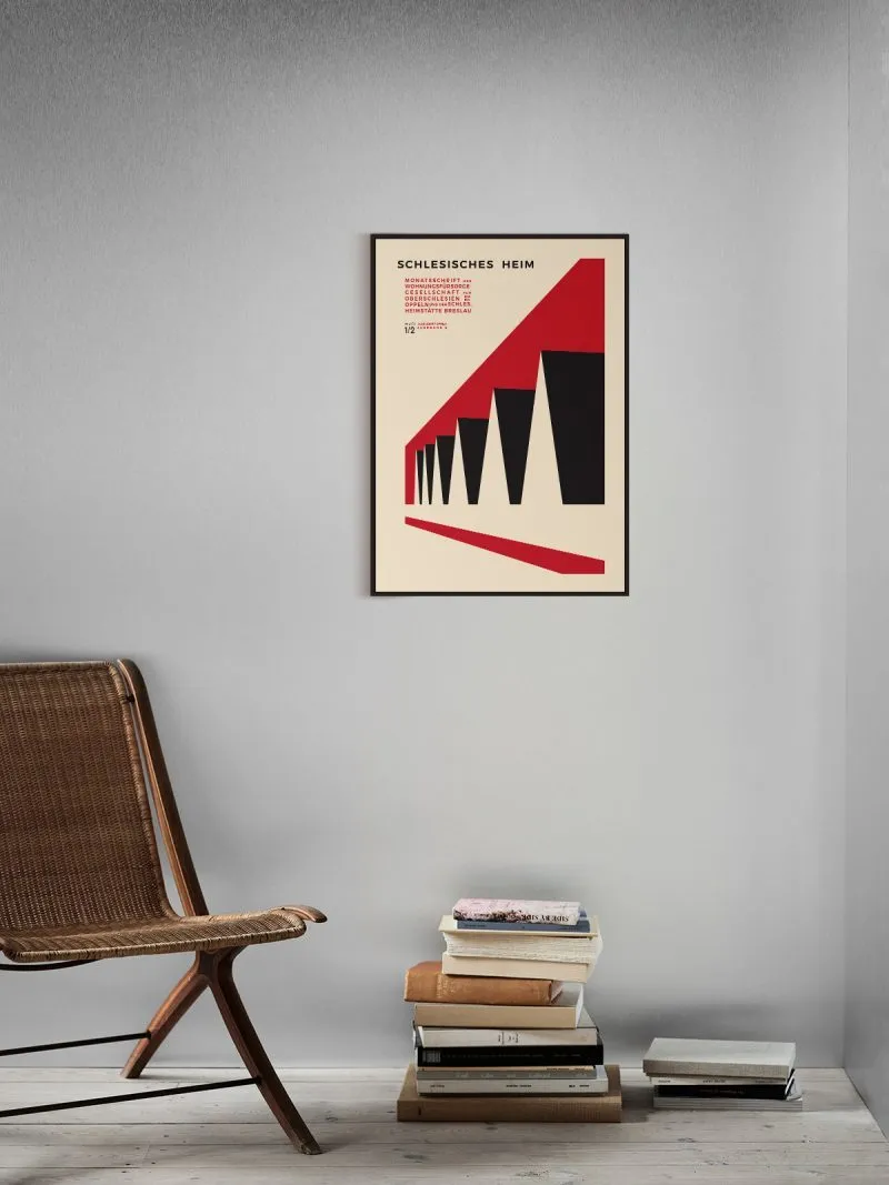
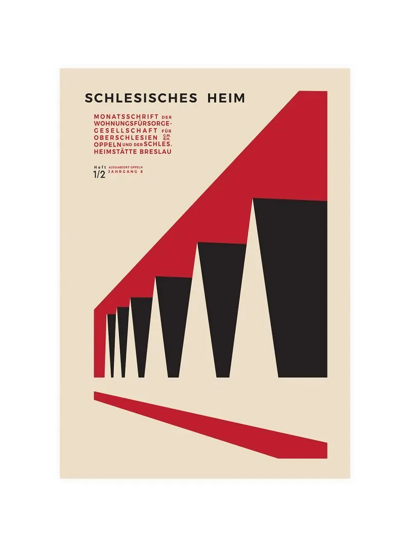
Bauhaus Bayer Poster

From: 90,00 zł
SCHLESISCHES HEIM in small type at the top left, and the rest is geometry: a red diagonal crossing the sheet, five black wedges growing along it, one thin red rule below. No image, no ornament — a poster built entirely from planes and angles. Pigment print on 210 gsm Hahnemühle paper,

Bauhaus Laszlo Poster - Iconic Modern Art Design Tribute

From: 90,00 zł
A composition built from one geometric idea: a circle divided, a rectangle cut at an angle, a diagonal holding two planes apart, colour limited to a few flat notes. László Moholy-Nagy taught at the Bauhaus and argued that design should work with light, space and construction rather than decoration.

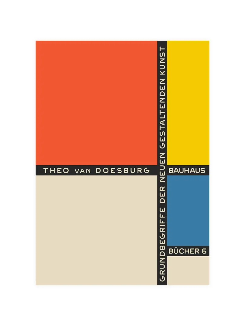
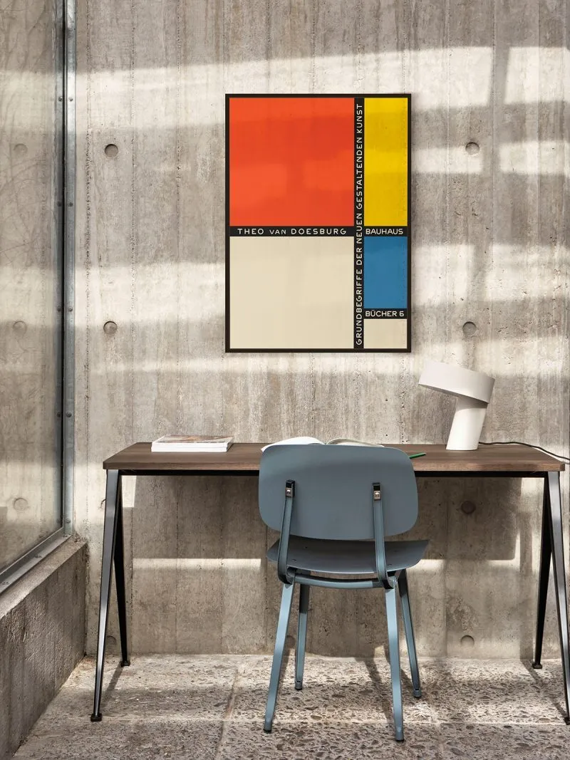
Theo van Doesburg Bauhaus Poster

From: 90,00 zł
Rectangles and lines on a strict grid, colour used as structure rather than decoration, the lettering in a geometric face that matches the shapes. Van Doesburg founded De Stijl and argued that painting, architecture and typography should obey one set of rules, then taught that at the Bauhaus.

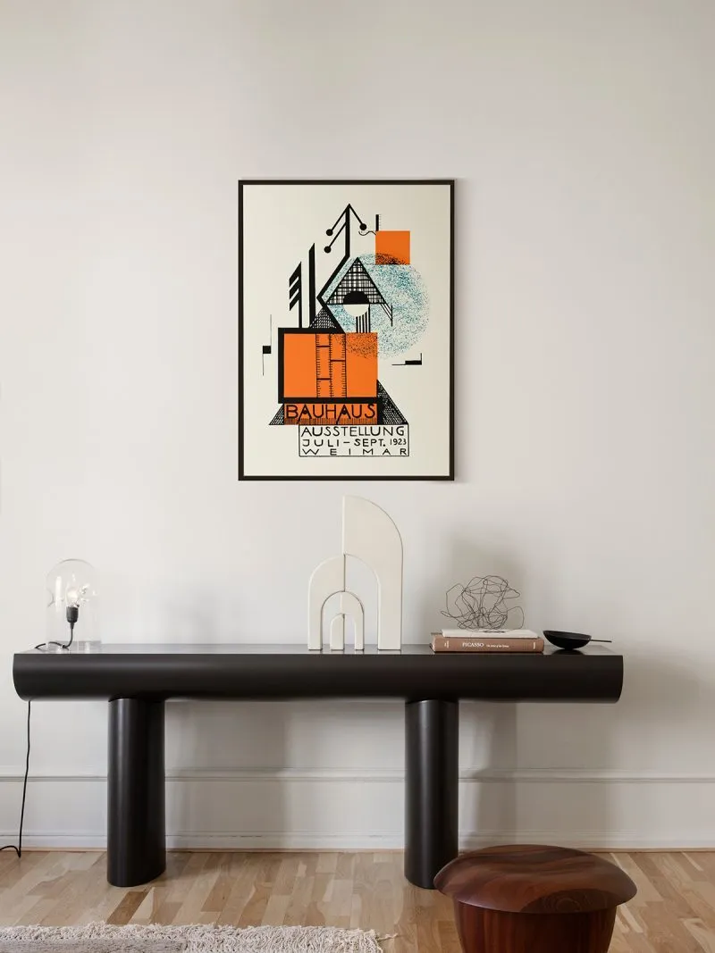
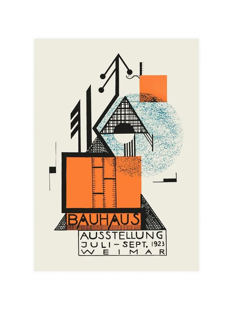
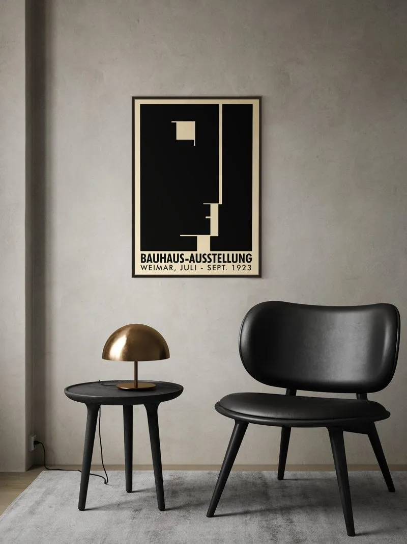
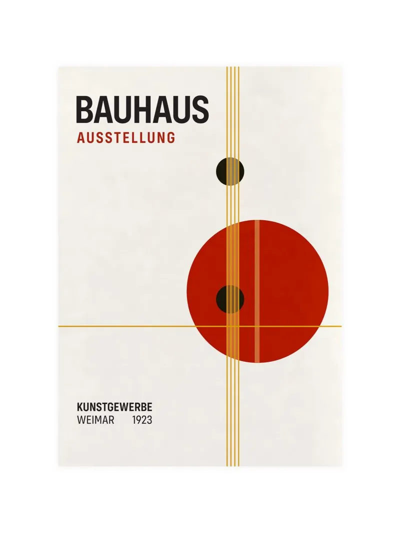
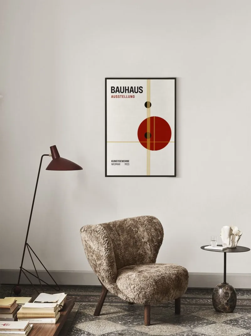
Bauhaus Ausstellung 1923

From: 90,00 zł
A composition on a strict grid with a strong vertical axis, geometric forms overlapping a central column, lettering drawn as one of the shapes. The school’s first public exhibition, held in Weimar in the summer of 1923, was designed as an argument in itself: buildings, products and printed matter obeying

Bauhaus Weimar Ausstellung Poster

From: 90,00 zł
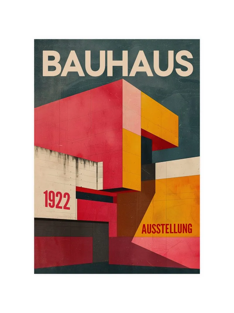
The Bauhaus Weimar Ausstellung poster is a striking visual homage to the revolutionary 1923 design exhibition, showcasing the minimalist aesthetic and innovative spirit of the Bauhaus movement. With its sharp geometric forms and a bold, reductive color palette, this poster captures the essence of a transformative era in design and

Bauhaus Circles Poster

From: 90,00 zł
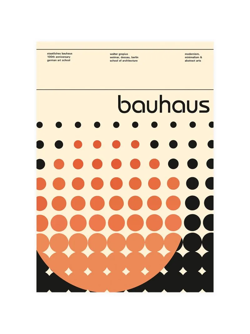
Circles of different sizes on a flat ground, overlapping in a rhythm that carries the eye across the sheet, colour applied solid with no shading at all. The Bauhaus taught that circle, square and triangle were the raw material of design and students spent months on these forms before composing

Bauhaus Dots Poster

From: 90,00 zł
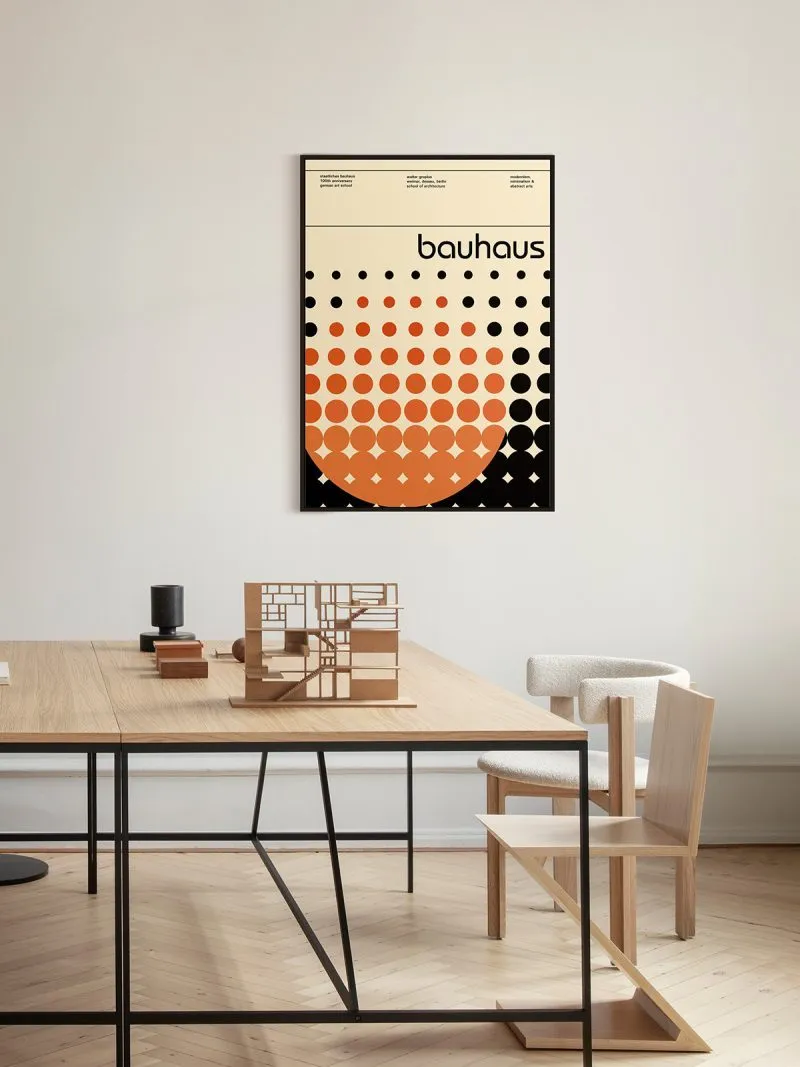
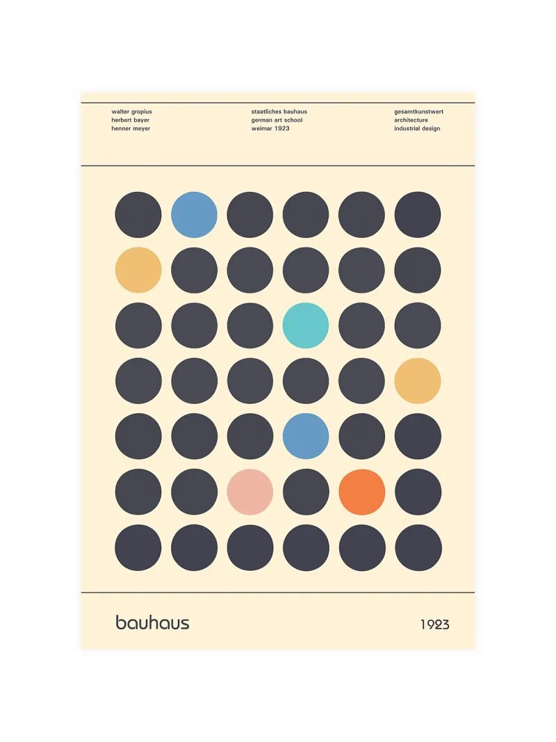
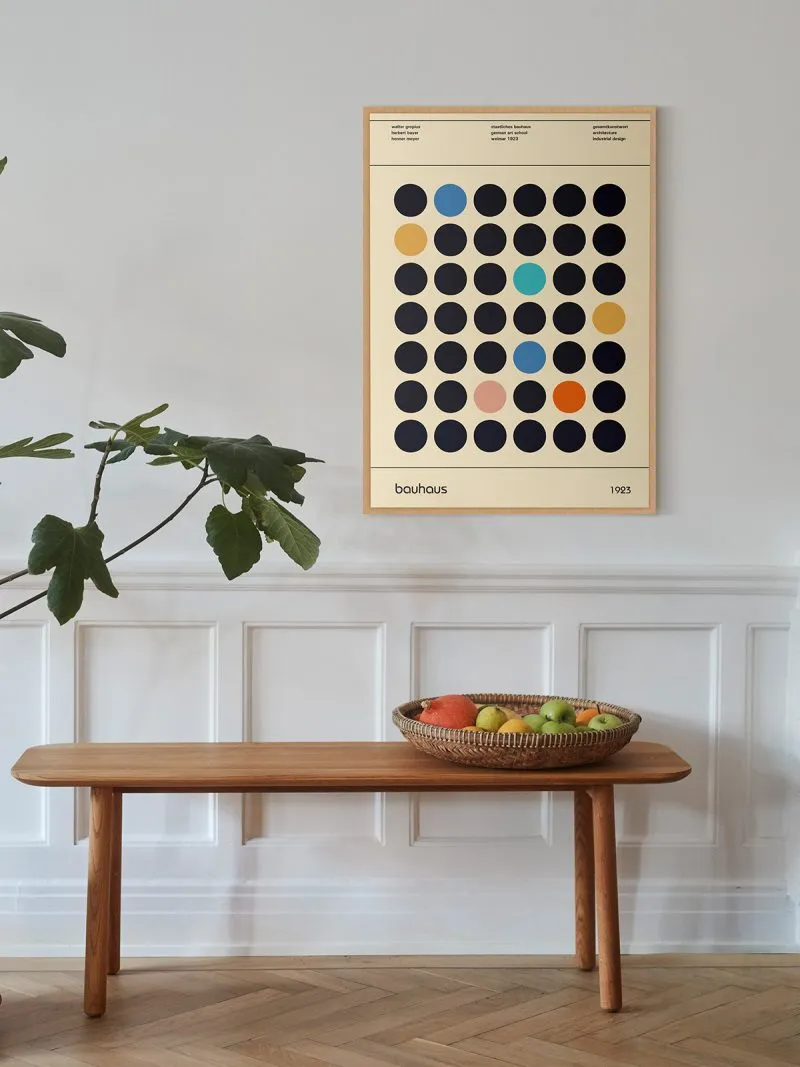
A field of circles on a grid, some filled, some open, sizes repeated in a rhythm across the sheet, no shading, no subject. The school taught that basic shapes were the raw material of design and that composition meant the relation between them, the arrangement is the picture.

Bauhaus posters: a school that redesigned the everyday

The Bauhaus was founded in Weimar in 1919, moved to Dessau in 1925 and was closed under pressure in 1933. In fourteen years it changed the way furniture, type, textiles and buildings were designed across Europe. Its posters were not advertising in passing: the school used print to explain itself, and the 1923 Weimar exhibition — staged under the slogan Art and Technology: A New Unity — was the moment it presented that idea to the public.

What is in this collection

How to choose one

The exhibition posters are typographic: heavy sans-serif lettering, red and black on cream, built to be read from a distance. They belong in a hallway or a study, framed thin. The geometric prints — Circles, Dots, Laszlo — are quieter and can go in a living room, where a typographic poster would compete with everything else.

Bauhaus work sits comfortably next to Kandinsky and Klee, who taught at the school, and next to Van Gogh when you want the contrast between a hand-painted line and a ruled one.

Sizes, paper and delivery

Every poster is printed on Hahnemühle paper and is available in sizes from 30×40 to 70×100 cm, plus A3 and A2. Orders leave the studio within 24 business hours, delivery in the EU takes 3–5 working days (3–6 outside the EU), and every parcel is tracked.

Why these posters are the best record of the school

The Bauhaus argued in print. Its posters and brochures were where theory met the public, and they carry the actual typefaces, grids and colour decisions of the people who made them. Hanging one is hanging a piece of the argument.

Browse the whole shop or see all artists.

Search for products (0)

Back to Top
Product has been added to your cart