Details
The image
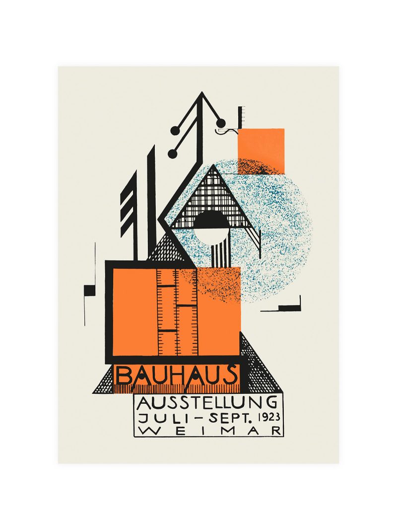
Rectangles and lines arranged on a strict grid, with colour used as a structural element rather than as decoration. The composition is asymmetric but balanced and the lettering is set in a geometric face that matches the shapes. Nothing is curved.
Where it comes from
Theo van Doesburg founded De Stijl and spent years arguing that painting, architecture and typography should obey the same rules: straight lines, primary colour, no ornament. He taught at the Bauhaus in the early 1920s and brought that argument with him, influencing a generation of students who had been trained to think in materials rather than in styles.
On the wall
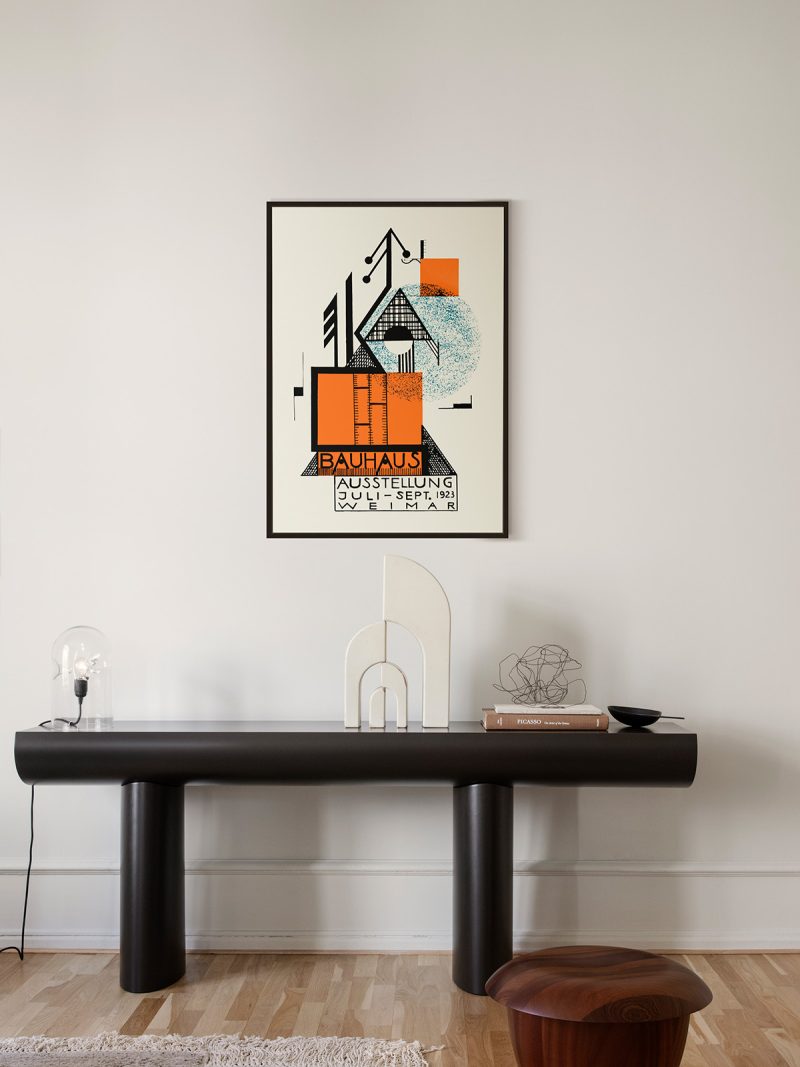
It suits a study, a stairwell or a hallway where a grid can be read as a whole. Because the palette is limited and the shapes are strong, it holds a wall without needing company and tolerates almost any furniture. In a modern interior it works as the piece that provides structure.
In company
Pairs well with other De Stijl and Bauhaus material and with plain, disciplined furniture. In a group it sets the rules, hang it first and place softer work around it. A narrow black frame keeps the lines sharp. For a wall that will carry more than one, the Bauhaus collection supplies the rest.