Details
The image
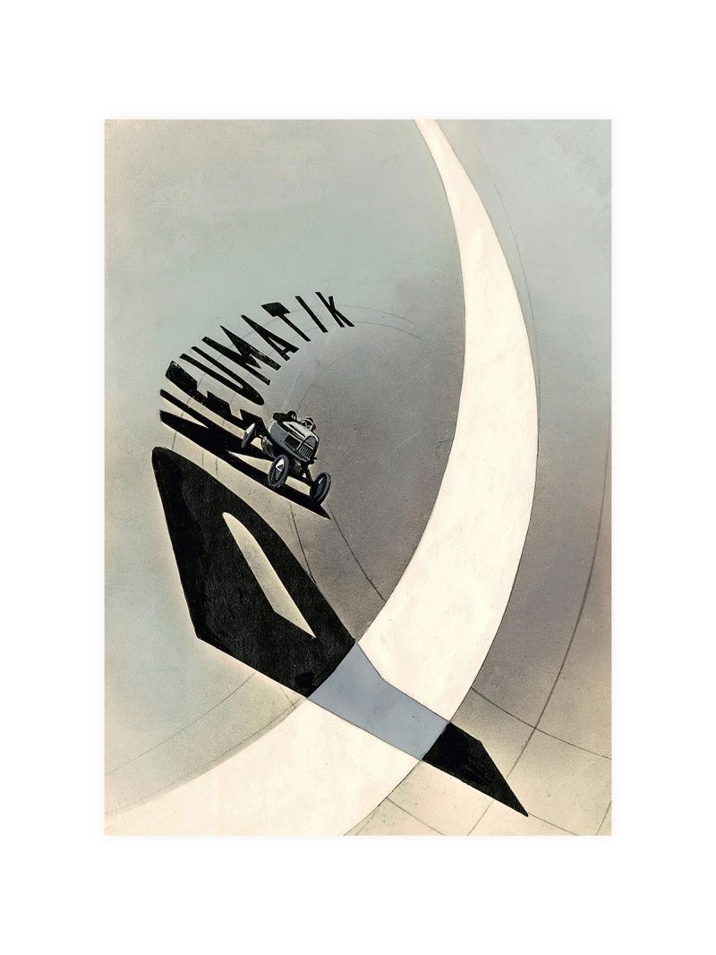
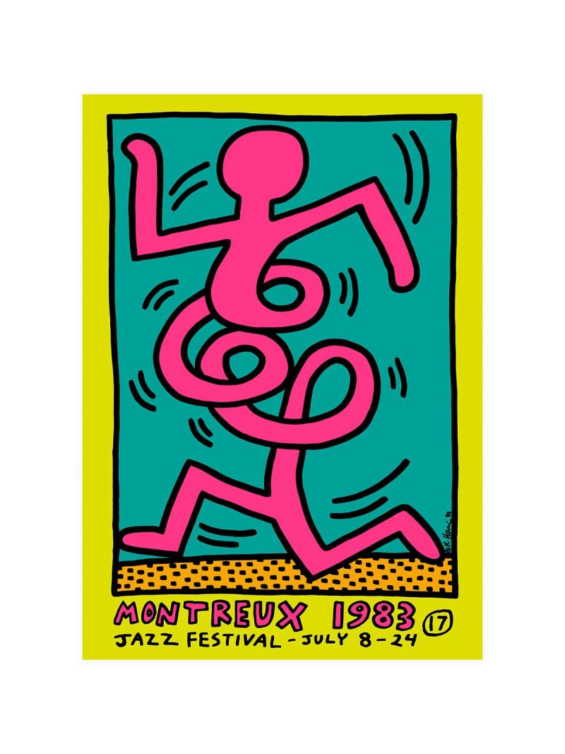
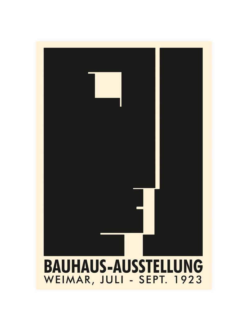
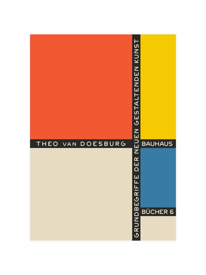
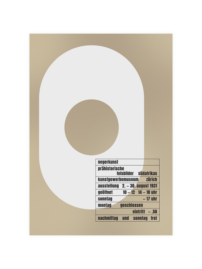
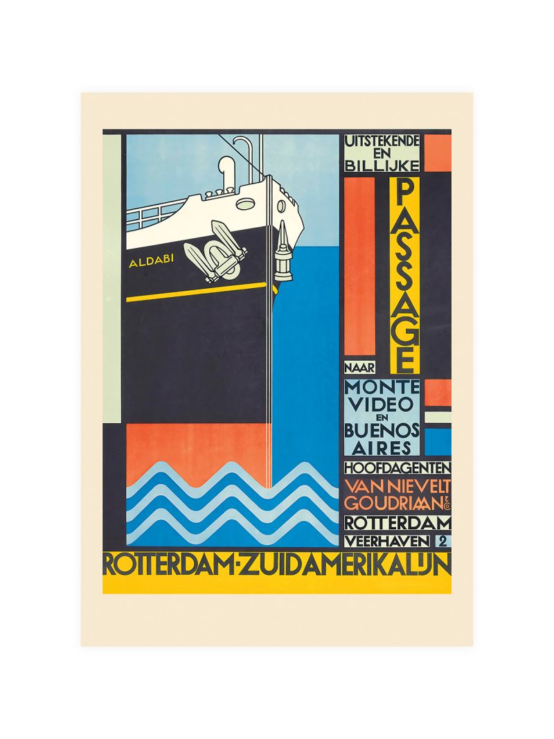
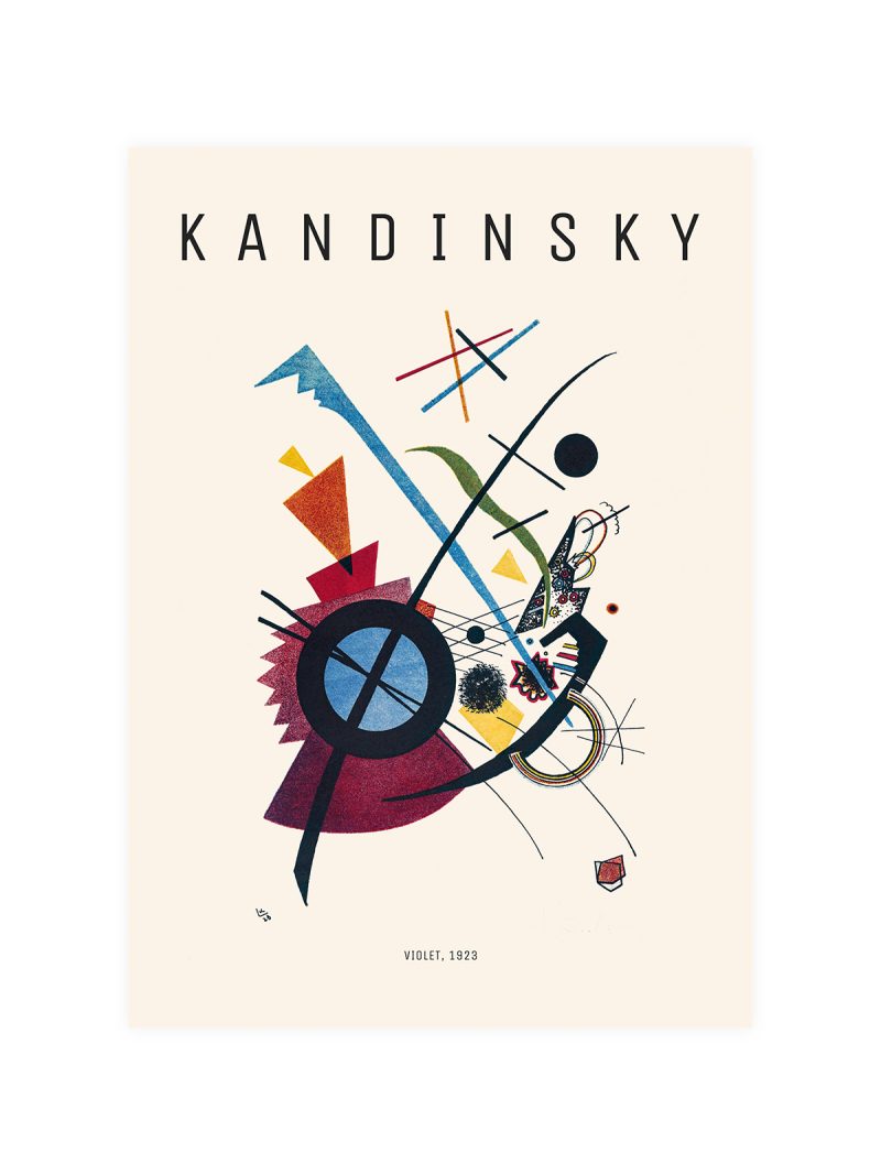
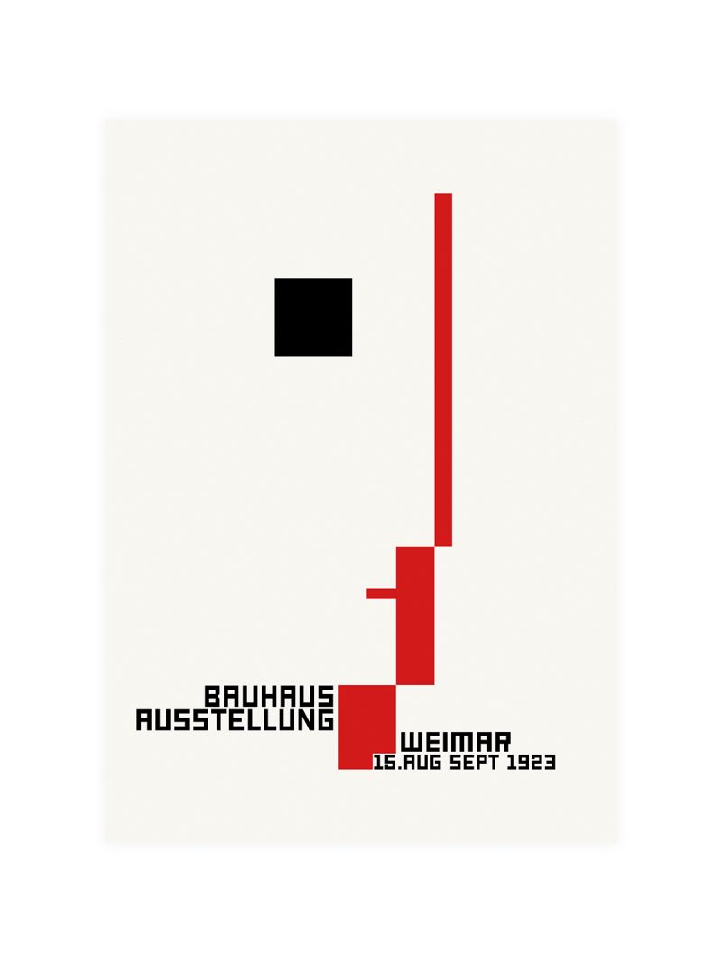
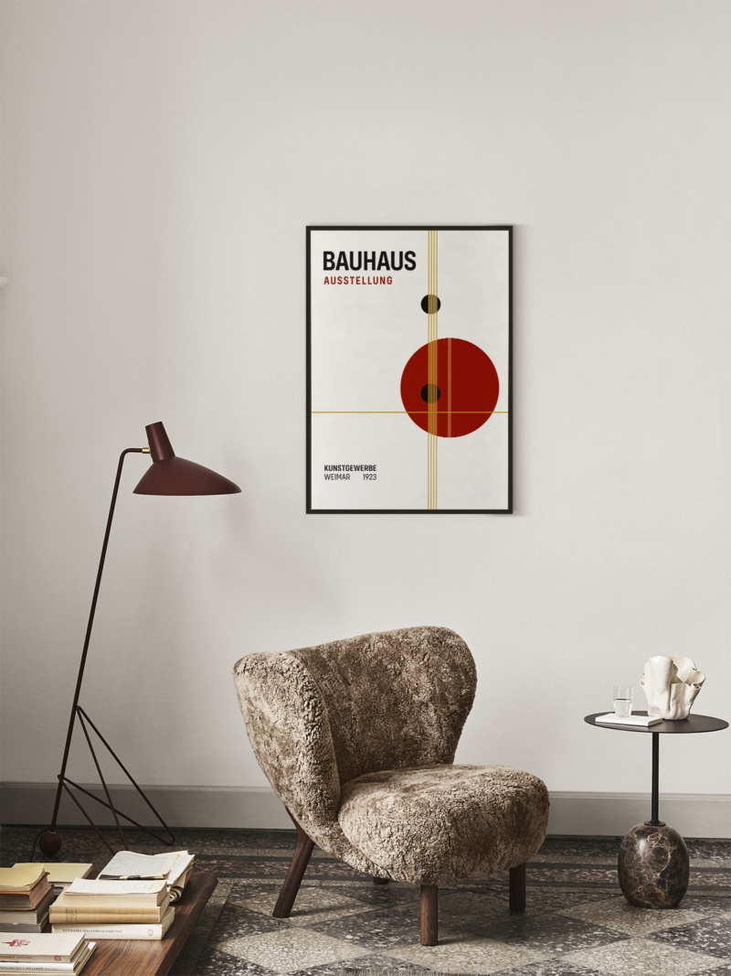
Geometric forms arranged around a central axis, with the lettering drawn as one of the shapes rather than set beside them. Circles and bars carry the eye across the sheet; the colour is limited to a few notes that separate one plane from the next. The whole composition is built to be understood in one glance.
Where it comes from
Weimar in the summer of 1923 hosted the school’s first public exhibition, part demonstration of method, part argument for the funding that kept it alive. The printed material was designed to do the same work as the objects on display: to show that typography, layout and image were a single discipline. What the Bauhaus argued in writing, these sheets argued on paper.
On the wall
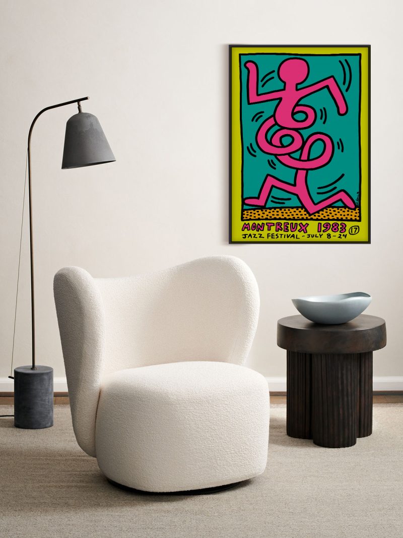
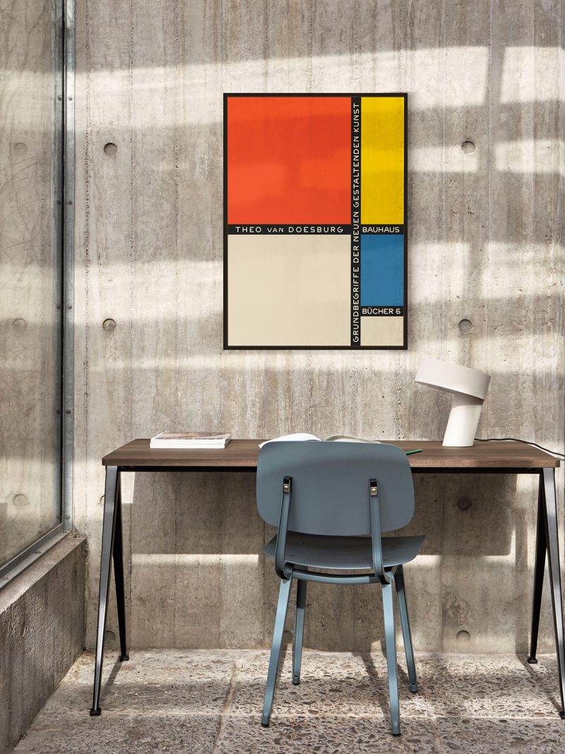
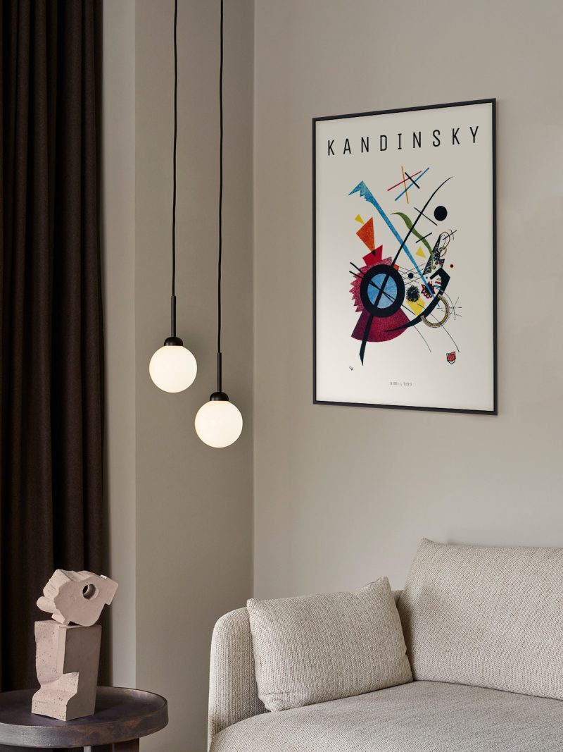
It suits a study, a stairwell or a hallway where a diagonal has room to travel. Because the image is dense and ordered, it holds its own beside bookshelves and dark furniture. In a modern interior it works as the piece that explains the rest of the wall rather than the one that shouts first.
In company
Pairs well with architectural photography and other Bauhaus prints and it tolerates a strong wall colour because the palette is limited. In a group it sets the rules; hang it first and place softer pieces around it. A narrow black frame keeps the delicate bars at the edges intact. Hung beside another piece from the Bauhaus collection, it reads as part of a series rather than a single picture.