Details
The image
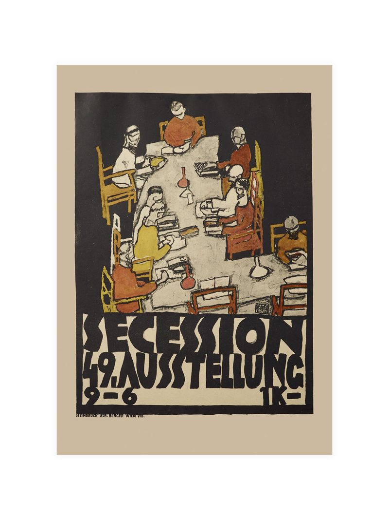
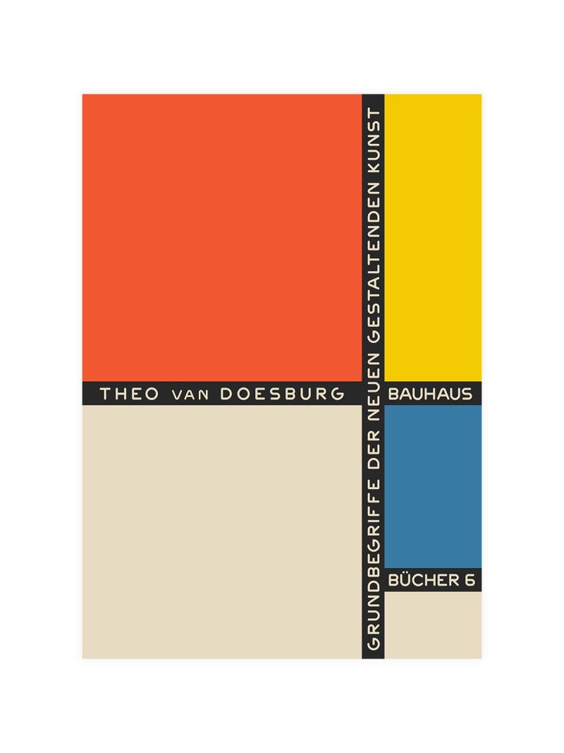
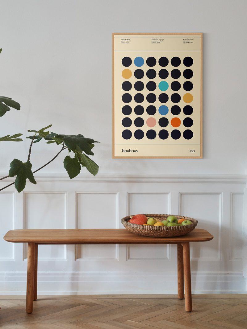
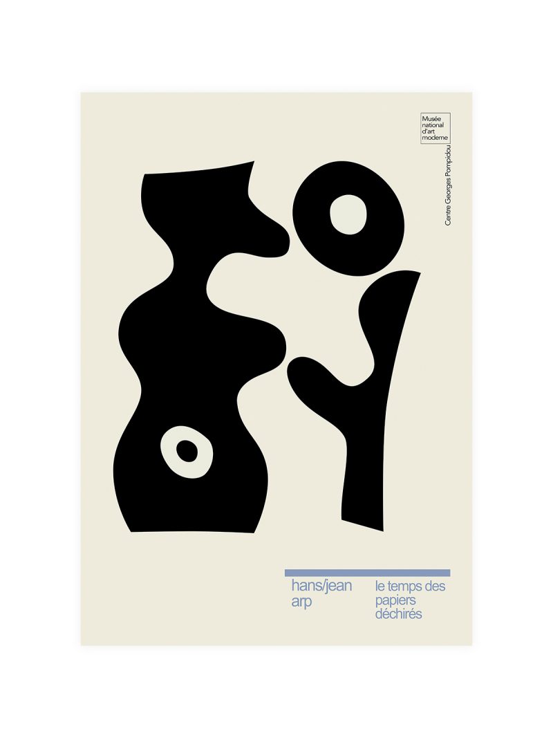
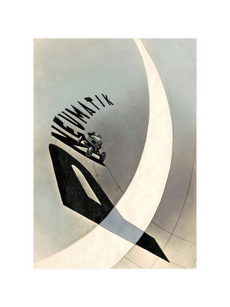
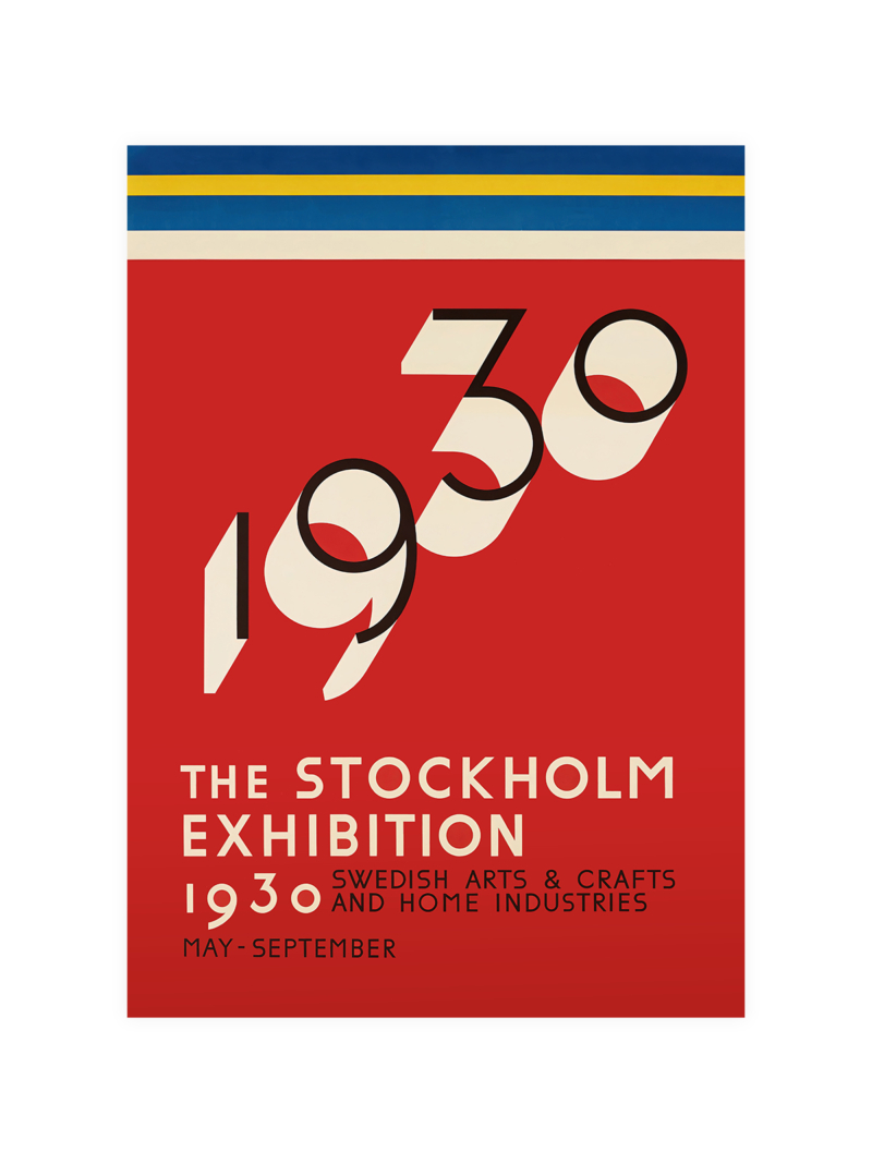
Geometric lettering arranged in stacked blocks, with a few architectural forms suggested behind it. The palette is restrained and the contrast strong, so the sheet reads at a distance, as an announcement rather than as an illustration. The whole composition sits on a grid.
Where it comes from
In the 1920s, exhibitions about modern living became arguments about how people should live: light, air, standardised furniture and fewer objects. The posters that announced them looked like plans rather than pictures, because the subject was a method, not a product. German graphic design of the period treated type as building material.
On the wall
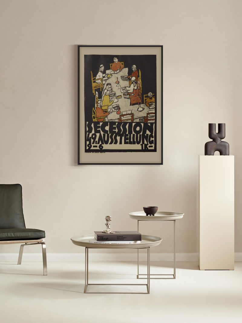
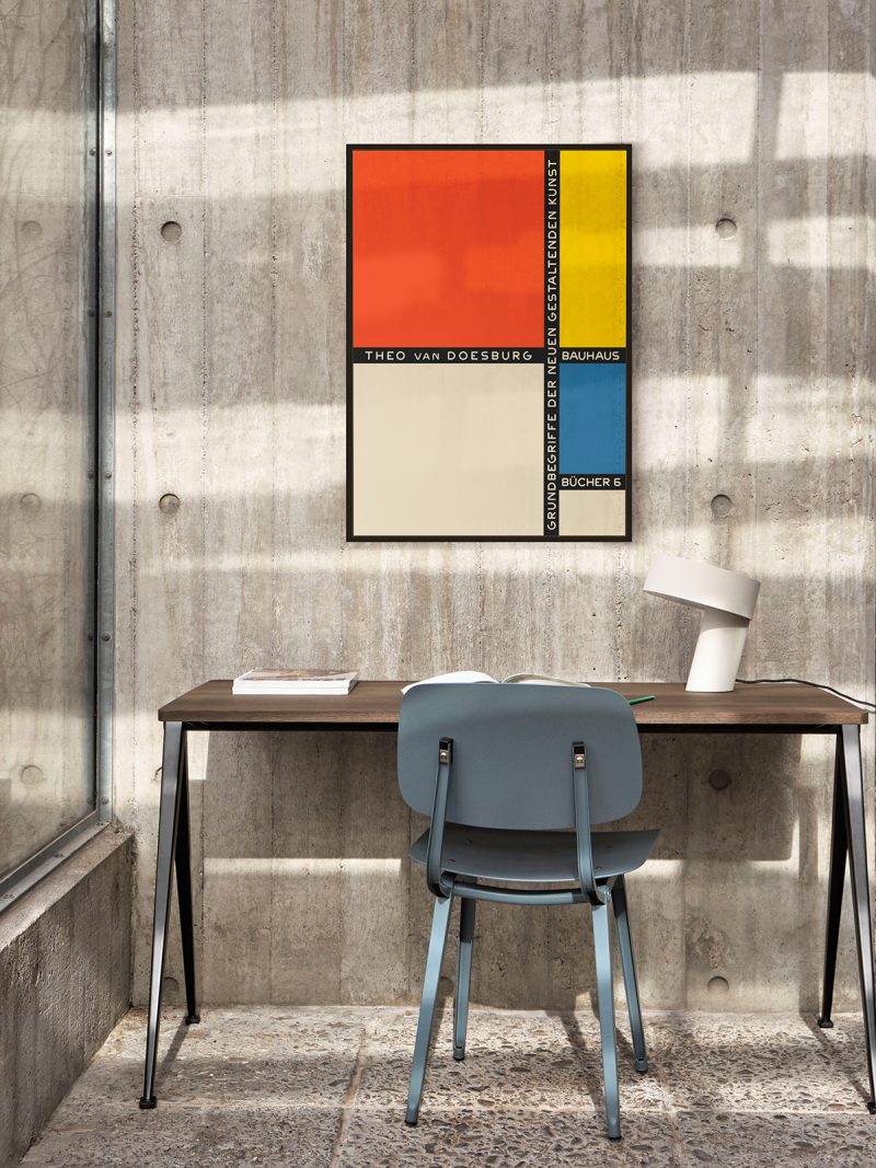
It suits a study, a stairwell or a hallway where a grid can be read as a whole. Because the sheet is ordered, it holds its own beside bookshelves and dark furniture without being lost. In a modern interior it works as the piece that gives the wall structure rather than colour.
In company
Pairs well with architectural photography and other Bauhaus-era material and it tolerates strong wall colours. In a group it sets the rules: hang it first, then place softer pieces around it. A narrow black frame keeps the fine lettering intact. The information is set small because the image was meant to carry the argument alone. The spacing and the weight of line carry across the whole Bauhaus collection.