Details
The image
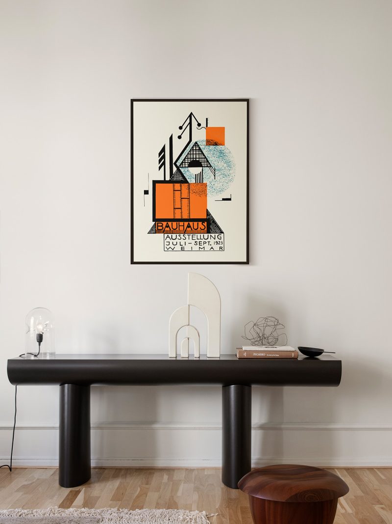
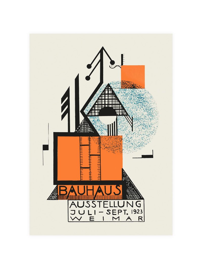
Typography as the subject: lettering stacked in a narrow column, weights changing from line to line, a small block of colour holding the composition together. There is no illustration beyond a mark or two and the whole sheet is built to be read on a wall at street level.
Where it comes from
Exhibition posters of the Vienna Secession treated a notice as a piece of design: type drawn rather than set, space used as an active element, ornament removed. Schiele’s own work belongs to the same city and the same years and the severity of these sheets matches the paintings, spare, frontal, unwilling to please. More of that work sits in the Egon Schiele collection and the portrait poster carries the same confrontation in a different register.
On the wall
It suits a study, a hallway or a room with plain walls, where typography can be read as structure. Because the composition is narrow and vertical, it makes a small room feel taller. In a group it should be the most formal piece.
In company
Pairs well with black-and-white photography and with dark wood and it holds a wall on its own. Avoid hanging it beside decorative work, the type needs silence around it. A thin black frame keeps the severity intact.