Details
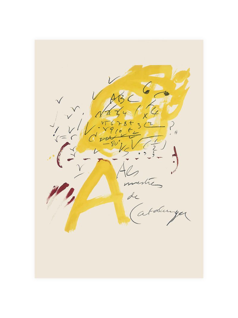
The image
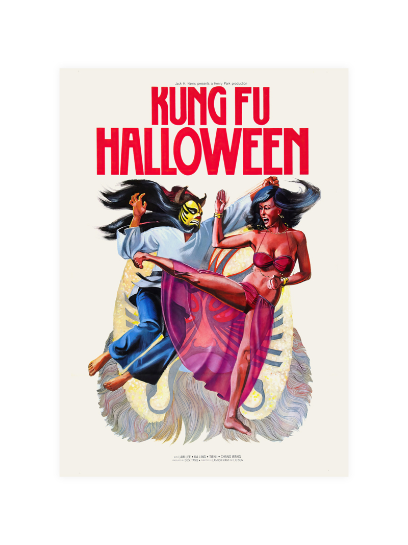
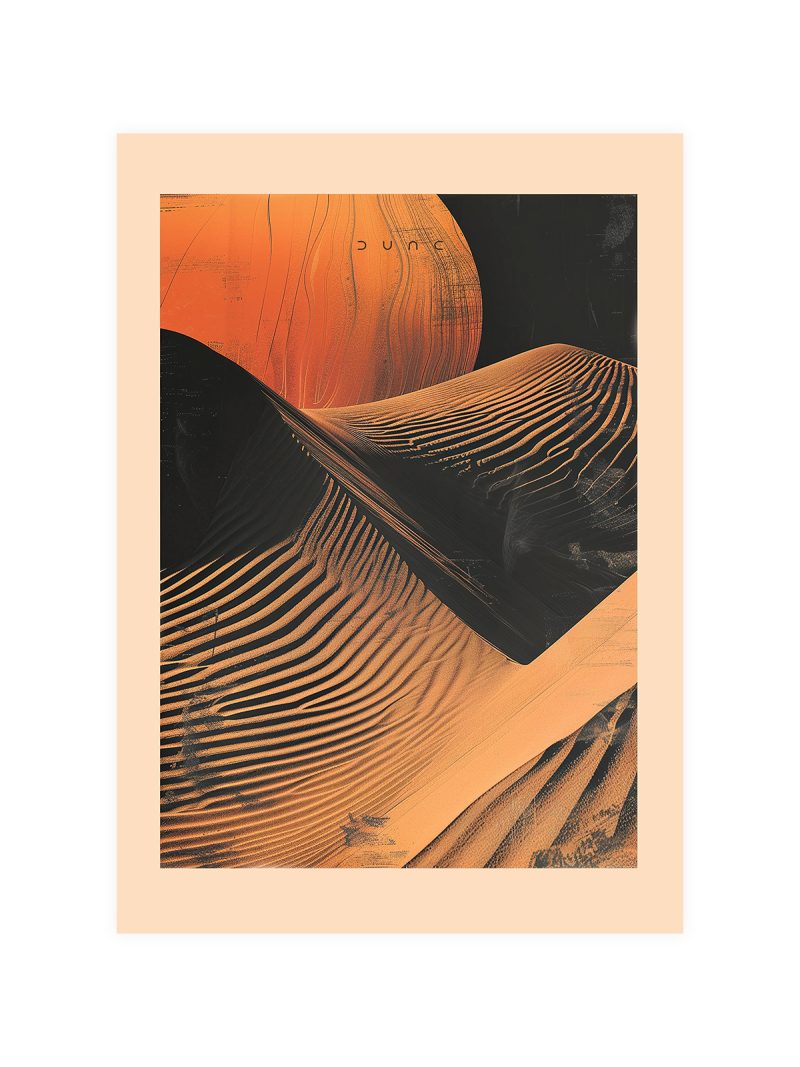
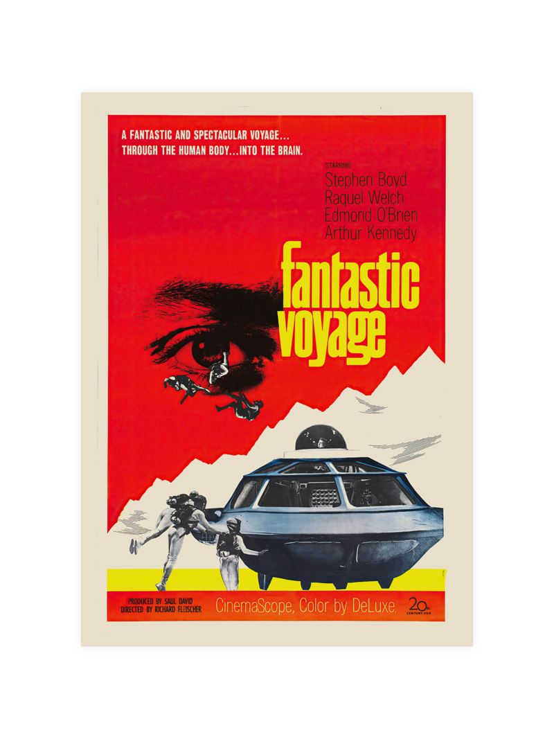
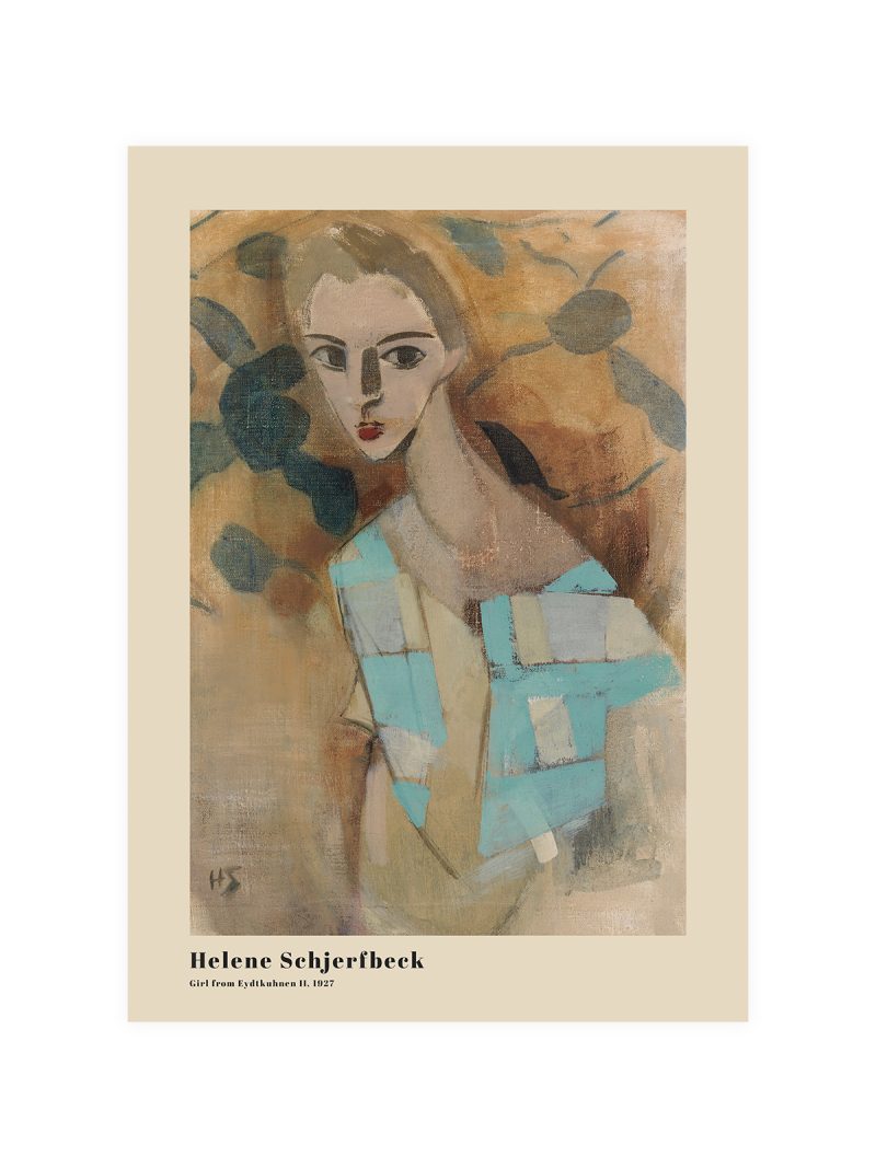
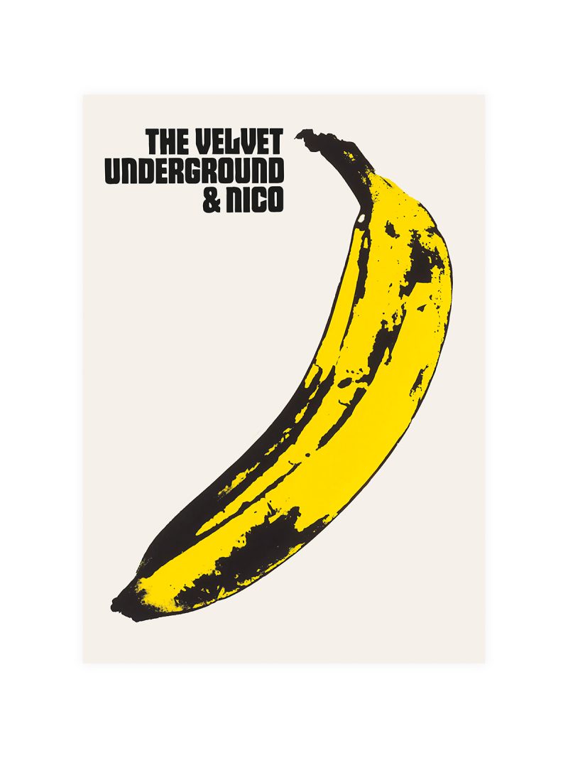
Psychedelic shapes arranged around a central object, colour pushed to maximum saturation, lettering drawn as part of the illustration. The composition is crowded on purpose and the perspective is decorative: the sheet looks like a record sleeve that grew to poster size.
Where it comes from
The late 1960s produced a brief and total marriage between music graphics and film advertising: animation, hand-lettering and colour that ignored printing conventions. It belonged to a moment when a band’s visual identity was as important as its records and when a poster could sell a film to an audience that had not read a review.
On the wall
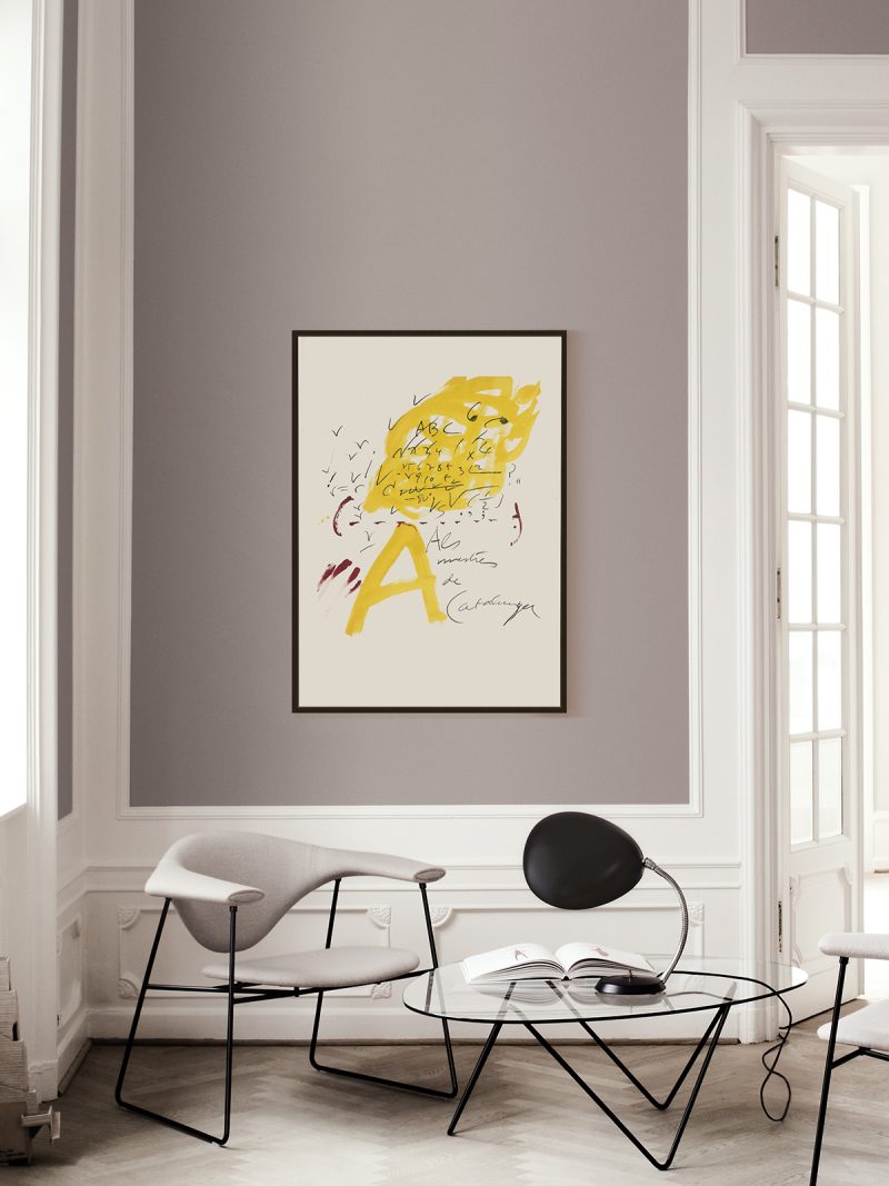
It brings pure colour into a room, so it suits a studio, a child’s room, a hallway or any wall that needs light rather than calm. Because the image is dense, it needs a plain surface around it. In a group it should be the loudest piece by some distance.
In company
Hung as a pair with something from the Movie collection, it gains rather than loses.Avoid hanging it beside muted work, the saturation would flatten everything next to it and give it a wall of its own if the room can spare one.