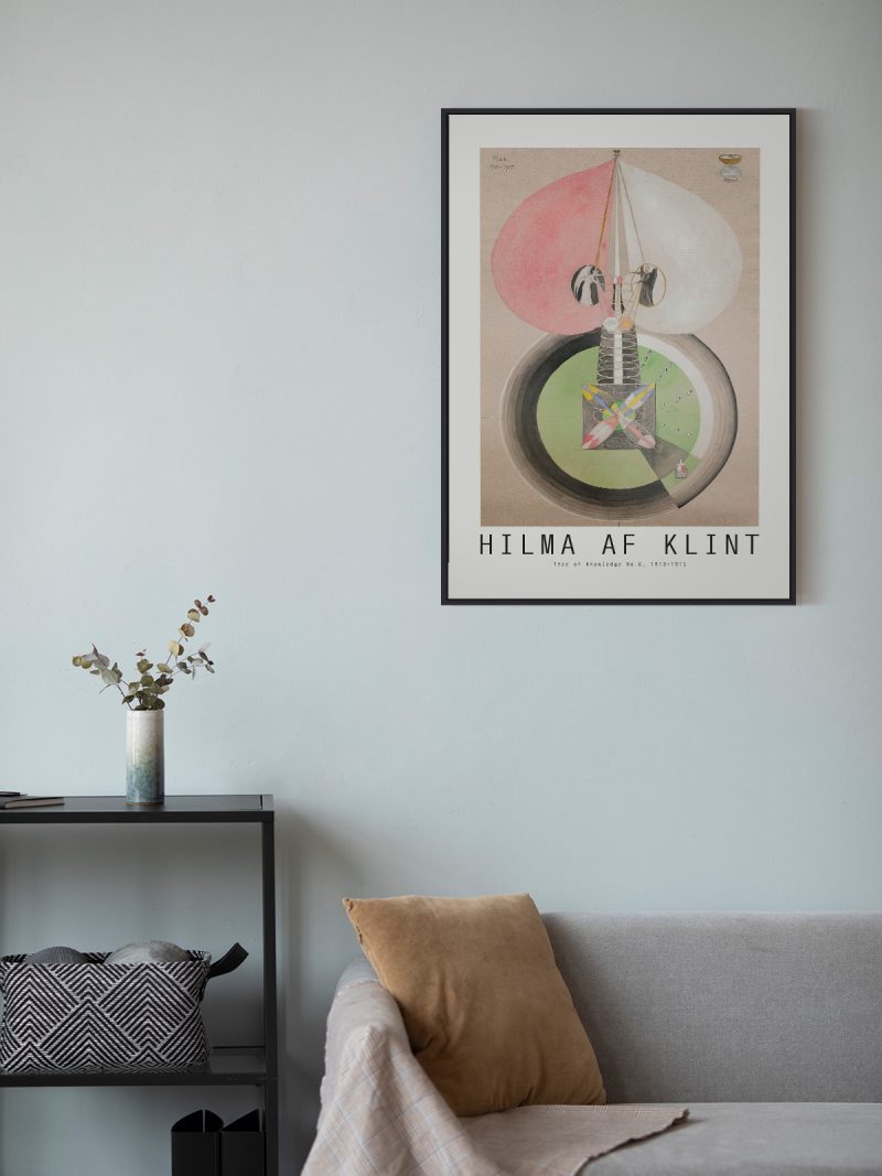
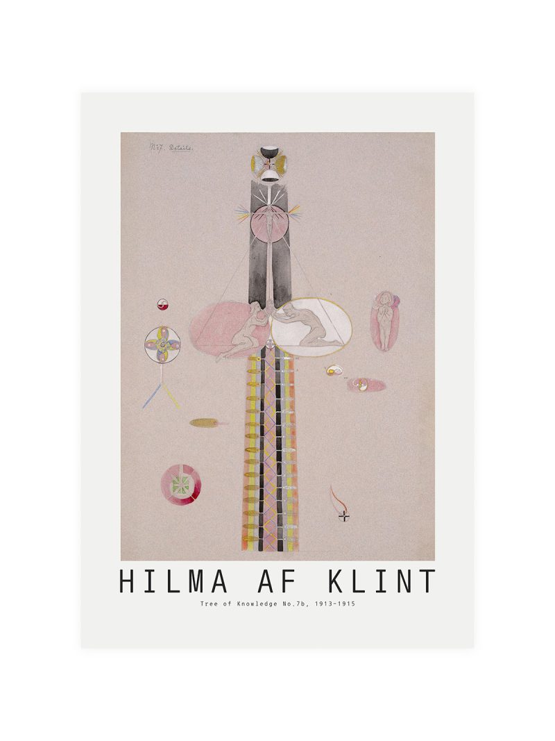
Details
The image
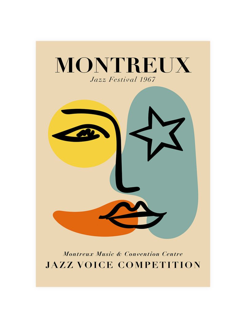
A graphic reduced to a few shapes and one idea: a form that suggests a screen, a beam or an eye, set on a flat ground with the title in clean type. There is no photograph and no illustration in the ordinary sense and the composition is built from the space between elements rather than from the elements themselves.
Where it comes from
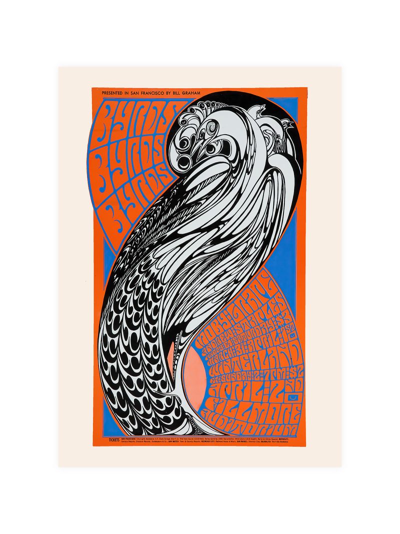
The poster belongs to the graphic tradition that grew out of film title design in the 1950s and 1960s, when a generation of designers began treating the opening credits as a short film in their own right, cut-out shapes, moving type, a single strong colour. The same vocabulary was applied to festival posters, which had to suggest cinema without showing a film: an aperture, a beam, a rectangle of light. The San Francisco festival commissioned work in that idiom for decades and its posters became a record of the style.
On the wall
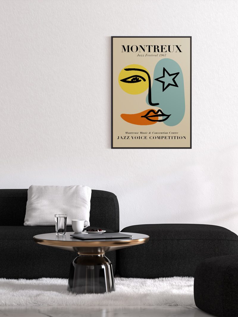
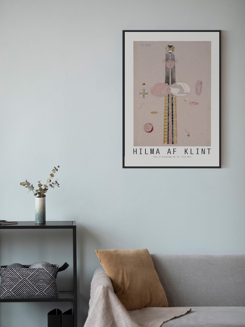
It suits a study, a hallway or a living room with modern furniture, where a spare graphic gives a wall structure. Because the composition is open and the palette limited, it holds a large wall without filling it. In a group it should be the piece that sets the spacing.
In company
Printing of this period is what the Movie collection is made of.Avoid hanging it beside dense illustration, the restraint is the point and needs protecting.