Details
The image
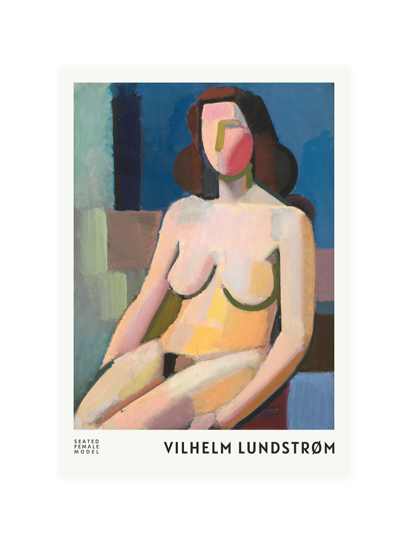
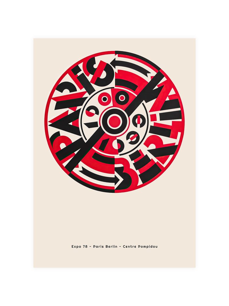
A bold abstract composition, with large shapes in a few strong colours and the exhibition details set in a modern face. The sheet is laid out on a grid but the shapes break it deliberately, so the result looks ordered and restless at the same time. Nothing is illustrated.
Where it comes from
By the 1980s the exhibition poster had become a form of its own: commissioned from graphic designers, sold in museum shops, collected. Designers of that period worked with large flat colour and aggressive cropping, partly because printing allowed it and partly because the audience for posters had begun to buy them as objects rather than read them as notices.
On the wall
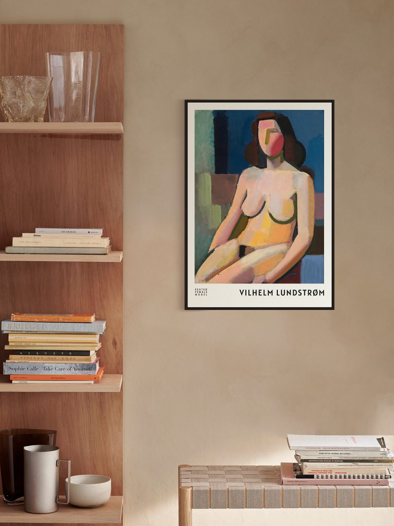
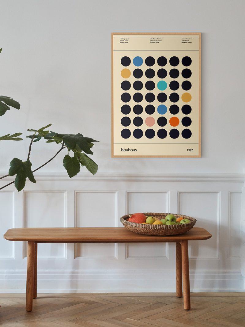
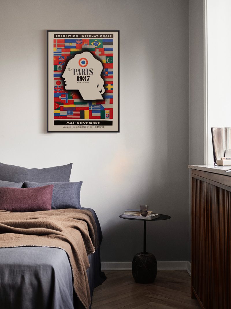
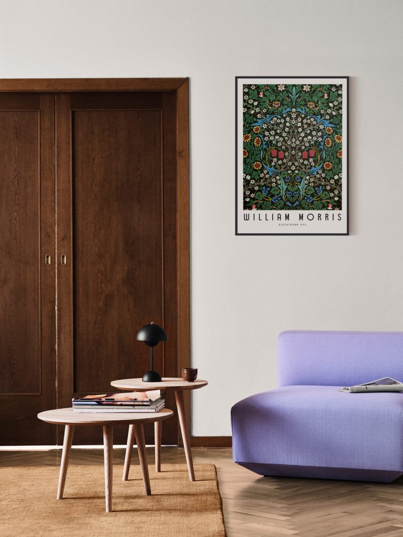
It suits a studio, a hallway or a room with strong furniture, where a graphic with hard colour can hold its own. Because the shapes are large and the palette blunt, it needs a plain wall around it. In a large room it works as the loudest element; in a small one it may be the only picture.
In company
Pairs well with photography and with modern furniture and it can carry a group on its own. Avoid hanging it beside softer, older posters, the contrast turns into a chronology nobody asked for. A thin black frame keeps the intensity. Other sheets in the Exhibition collection work the same way on a wall.