Details
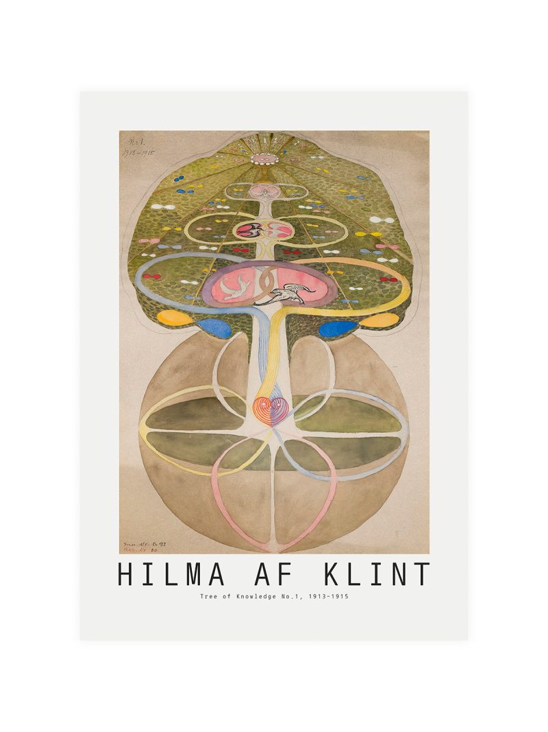
The image
Abstract shapes in warm colour arranged on a diagonal, with lettering set by hand rather than in a standard face. The composition is loose and musical: nothing is measured, everything leans. Colour is printed flat in four or five notes and the sheet has no border to hold it in.
Where it comes from
Jazz festivals discovered early that the poster could be part of the performance: commissioned from artists rather than illustrators, printed in small runs, sold at the door. Aspen’s winter jazz weekends attracted that kind of commission in the 1960s, when American graphic design was loosening up and letting colour and lettering behave like improvisation.
On the wall
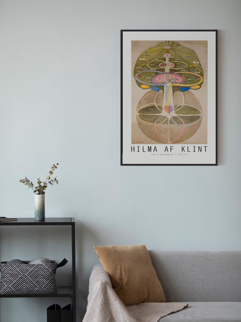
It brings rhythm to a room, so it suits spaces that can take a bit of noise: a studio, a hallway, a living room with dark furniture. Because the composition is loose and the colour warm, it needs a plain wall around it to avoid clutter. It reads well at a distance, which is how a poster should work.
In company
Pairs well with black-and-white photography and with record sleeves and it looks right at eye level. In a group it should be the liveliest piece. Avoid hanging it beside very structured graphics, the improvisation only reads as such next to something ordered. Other sheets in the Music collection work the same way on a wall.