Details
The image
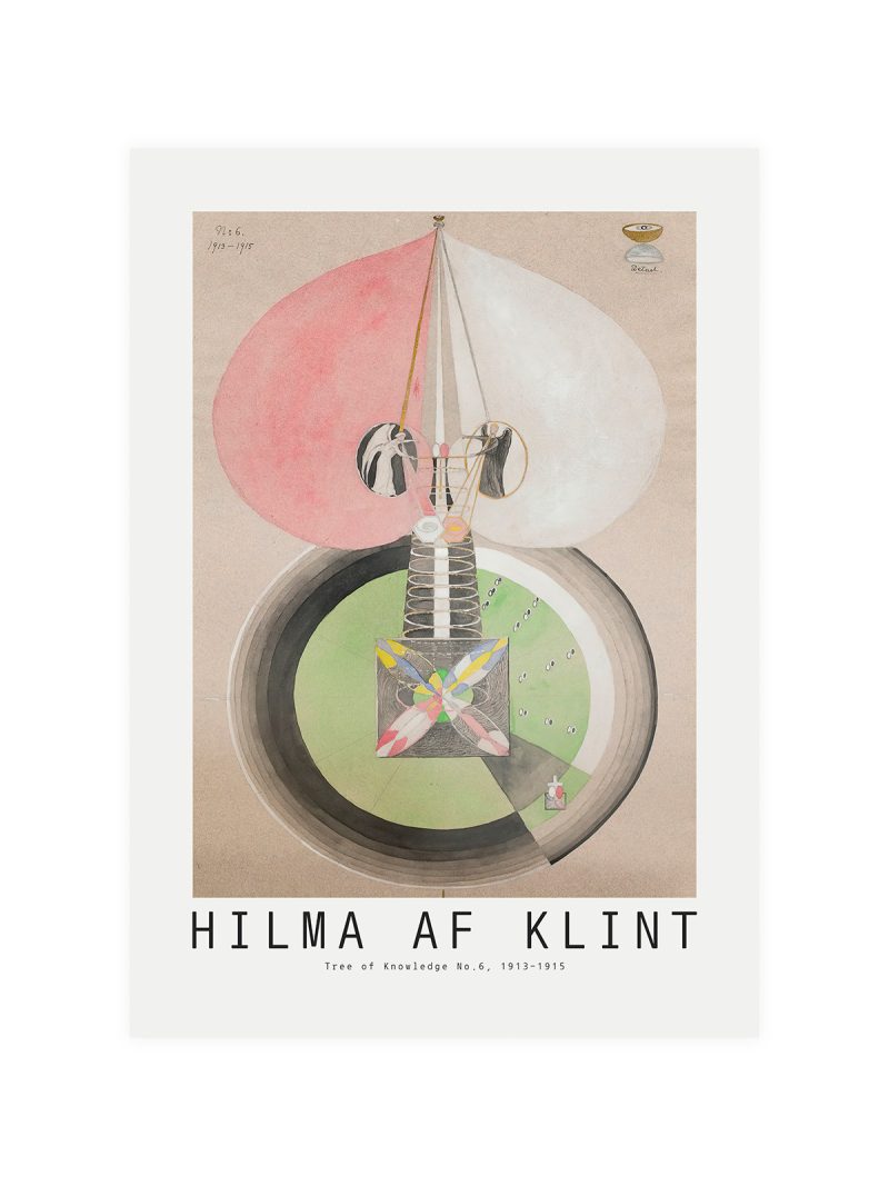
Fruit drawn at the size of a face, the skin suggested by a single flat colour and the shadow by nothing at all, with lettering set vertically beside it. The composition is close and frontal, so the sheet behaves like a sign in a market rather than like a still life.
Where it comes from
Food graphics have always worked by exaggeration: a fruit bigger than a hand, a colour brighter than the real thing, a shape simplified until it can be recognised at speed. The approach belongs to market signage and to the illustrated grocery posters of the early twentieth century and it survived into modern packaging unchanged.
On the wall
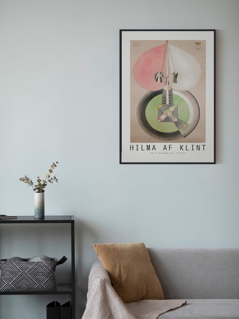
It suits a kitchen, a dining corner or a pantry door, where a bright shape makes sense and does not need company. Because the palette is warm and the composition is tight, it works in small rooms without crowding them. In a group it should be the piece that supplies the colour.
In company
The Colorful collection keeps to a narrow range, which is what makes it work as a set.Avoid hanging it beside a second oversized object, two exaggerations on one wall stop being jokes.