Details
The image
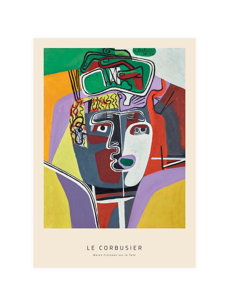
A vertical stack of shapes that seems to balance without being symmetrical: a curve here, a dark rectangle there, a small accent near the top. The palette is limited and the drawing schematic, so the sheet reads as a construction rather than as a depiction of an object.
Where it comes from
The image reproduces Composition pour Sculpture Totem, a design by Le Corbusier for a vertical sculpture assembled from simple solids. Modern architecture’s visual language was built from exactly those elements, a stack, a proportion, an interval and its posters carried the vocabulary onto paper, where it survives as a way of composing without a subject. The approach belongs to the mid-century argument that a building and a printed sheet could obey the same rules.
On the wall
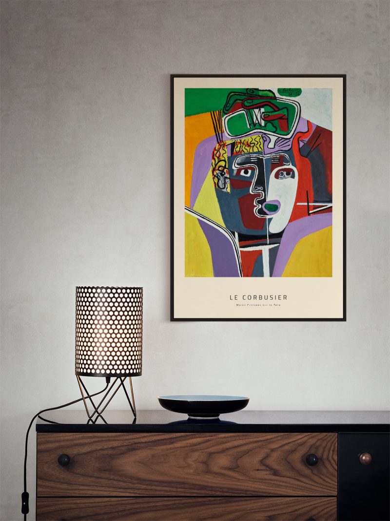
It suits a study, a hallway or a modern living room, where a vertical construction gives a wall rhythm and height. Because the forms are large and the palette limited, it holds a narrow wall particularly well. In a group it should be the piece that sets the vertical axis.
In company
Hung as a pair with something from the Geometric collection, it gains rather than loses.Avoid hanging it beside a busy pattern, the proportions would stop reading as a decision.