Details
The image
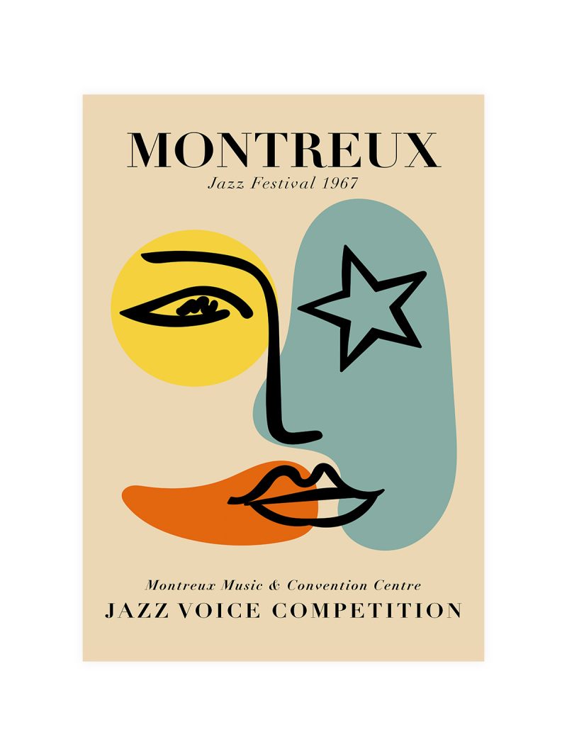
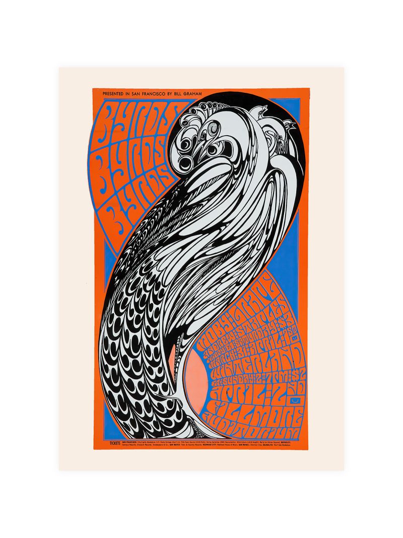
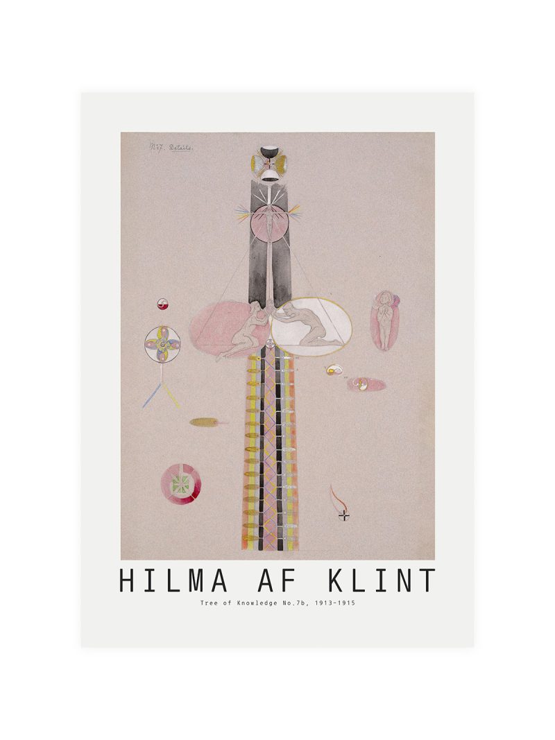
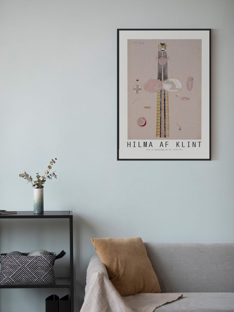
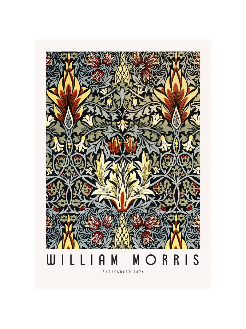
A composition of flat planes in strong colour, with the gallery name set in a modern sans-serif across the top and the dates tucked small beneath. The image is abstract but ordered: shapes overlap at angles and the lettering sits on the same grid as the forms rather than above them.
Where it comes from
Gallery posters of the post-war decades did a specific job: they announced a show to a street, in a season when dozens of other shows were being announced in the same way. Designers answered with abstraction and strong colour, because those read from across a road and with tight typography, because the information had to survive at a glance.
On the wall
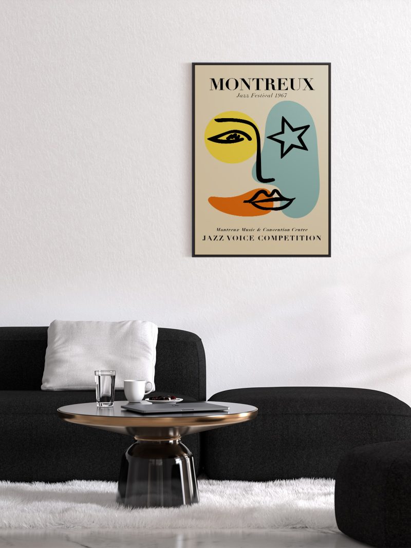
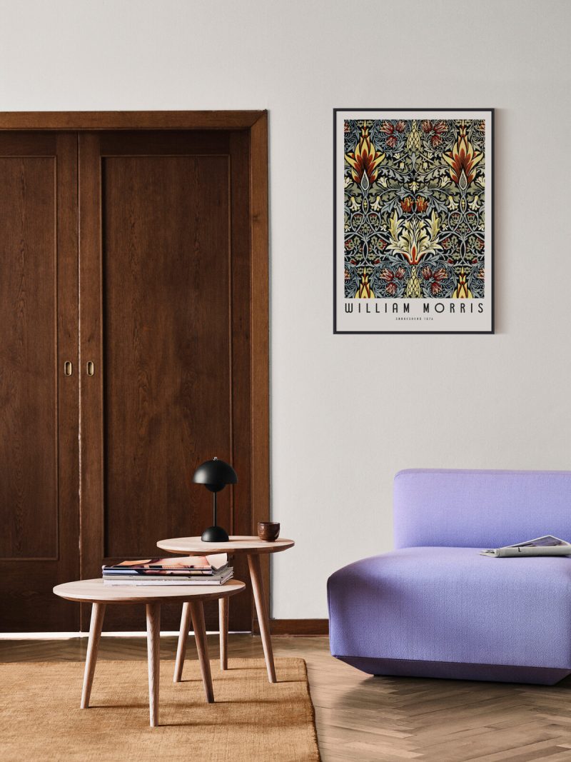
It suits a hallway, a study or a wall beside a bookshelf, where a graphic with strong colour and clear structure can hold its own. Because the composition is abstract, it tolerates furniture in almost any style. In a room with plain walls it provides the colour; in a busy one it should be given space.
In company
Pairs well with other exhibition posters and with photography in black and white. In a group it should be the piece that introduces colour rather than the one that responds to it. A thin frame without a wide mount keeps the composition tight. A second sheet from the Exhibition collection will balance it rather than compete.