Details
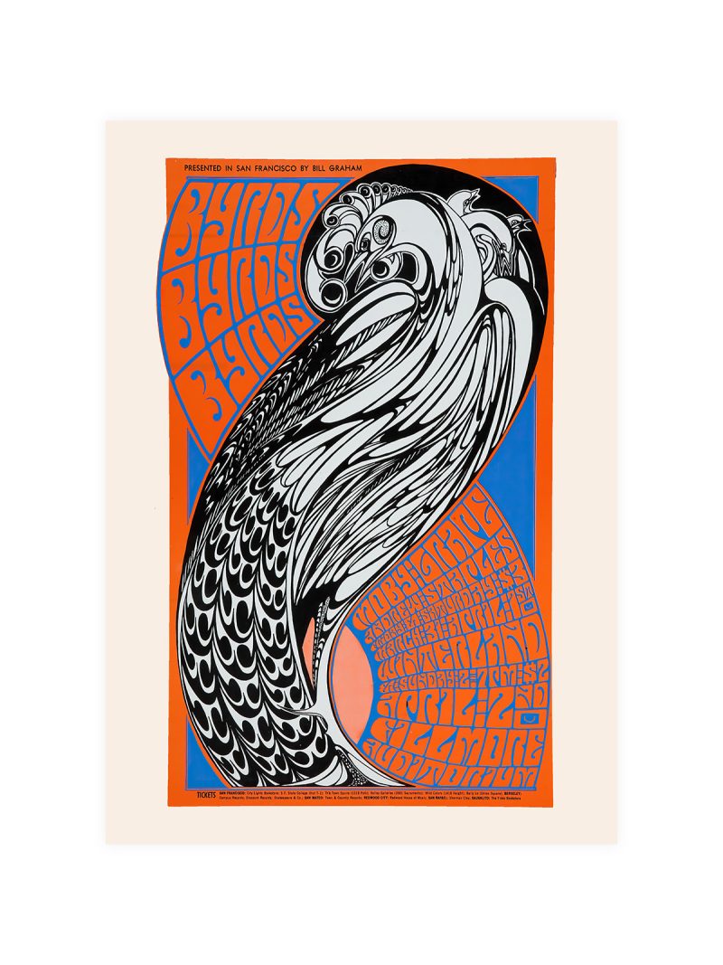
The image
Black lines of different weights dividing a white ground into rectangles, a few of them filled with primary colour. Nothing is shaded and nothing is centred: the balance comes from unequal parts rather than from symmetry. The surface looks built rather than painted.
Where it comes from
De Stijl argued that painting should abandon representation altogether and work with the elements of the medium itself: straight line, plane, primary colour. The argument belonged to the years around the First World War and spread from painting into furniture, architecture and print, where it became the grammar of a whole century of graphic design.
On the wall
It suits almost any interior, which is its reputation and its risk: the grid is so familiar that it can disappear into a room. It works best on a plain wall, hung at eye level, with nothing decorative nearby. In a study or a hallway it gives a wall structure without adding colour.
In company
Pairs well with modern furniture and with plain white or grey walls and it can hold a group on its own. Avoid hanging it beside other geometric prints, the grammar repeats and both lose. A thin black frame is the only sensible choice. For a larger wall, the Geometric collection supplies the rest of the arrangement.