Details
The image
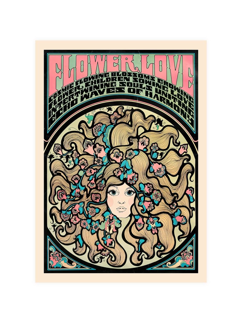
Two heads in the foreground, drawn large and flat, with the room behind them compressed into blocks of colour and line. The scale is deliberately wrong: the listeners take up more space than the stage, because the music is what fills the sheet.
Where it comes from
The picture paints jazz the way jazz sounds: things at different distances pressed flat against each other, a rhythm set up by repetition and interruption rather than by perspective. That translation of sound into structure was one of the central arguments of modernist painting, and it worked particularly well in a country whose music was already built on syncopation. The joke about the size of the audience is part of the method, not a slip.
On the wall
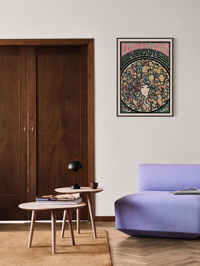
It suits a studio, a living room or a hallway with strong furniture, where a dense composition gives the wall rhythm. Because the colour is warm and the forms are large, it needs a plain surface around it. In a group it should be the piece that sets the volume.
In company
If you want company for it, the Music collection is where to look.Avoid hanging it beside a second crowd scene, where two dense compositions would cancel each other out.