Details
The image
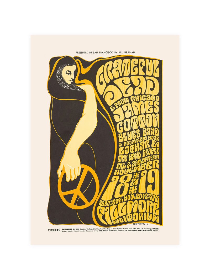
A portrait pushed into high-contrast colour, the face broken into areas of flat ink rather than modelled in light. Lettering wraps around the figure instead of sitting above it and the whole sheet is built on a single strong diagonal. Nothing is realistic, the picture is a shout, not a likeness.
Where it comes from
The late 1960s concert poster was a practical object made under pressure: printed cheaply, pasted on walls, torn down within weeks. Designers answered with saturated colour and lettering that curled into the image, partly because psychedelic culture asked for it and partly because the printing allowed it. The Jimi Hendrix Experience stood at the centre of that moment and its posters became the visual record of it.
On the wall
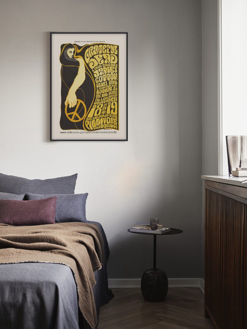
It brings energy into a room immediately, so it suits spaces that can take noise: a studio, a hallway, a teenager’s room. Because the colour is saturated and the composition dense, it needs a plain wall around it to avoid visual clutter. In a living room it works as the one loud piece among quieter things.
In company
Pairs well with black-and-white photography and with plain furniture, where the colour has contrast rather than competition. Two concert posters from the same era hung side by side read as a small archive. Avoid hanging it beside other saturated prints, the period style cancels itself out when repeated. Hung as a pair with something from the Music collection, it gains rather than loses.