Details
The image
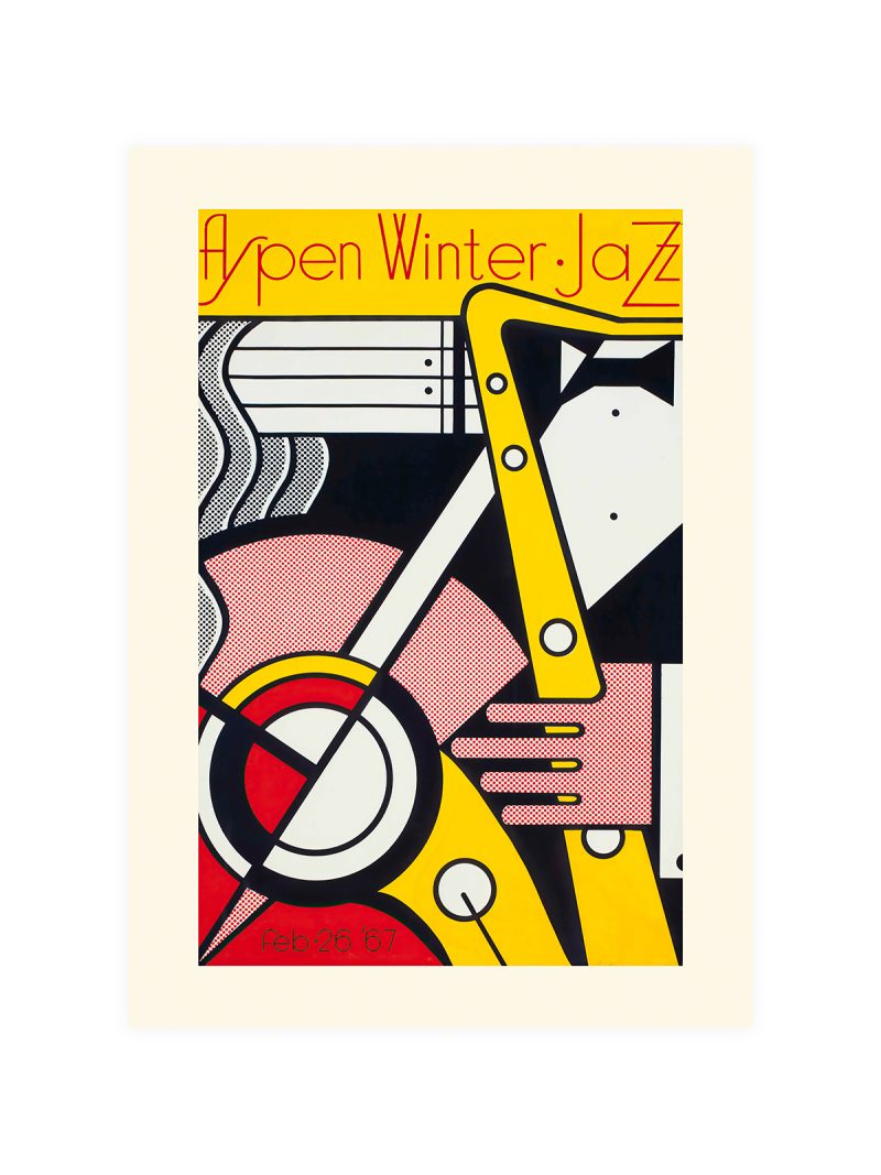
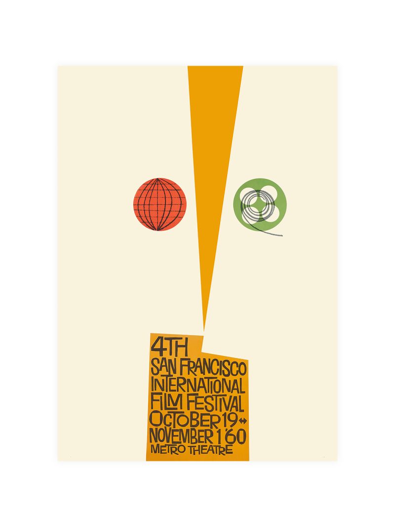
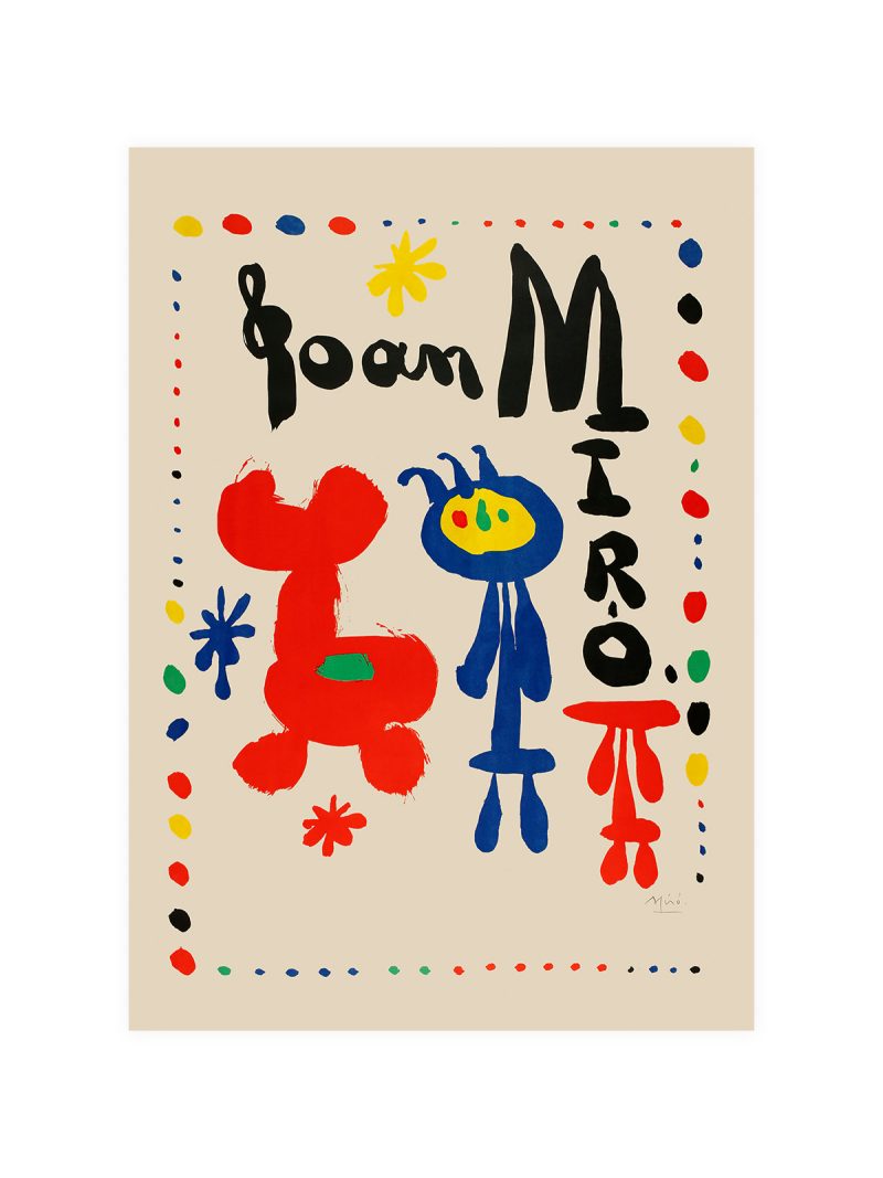
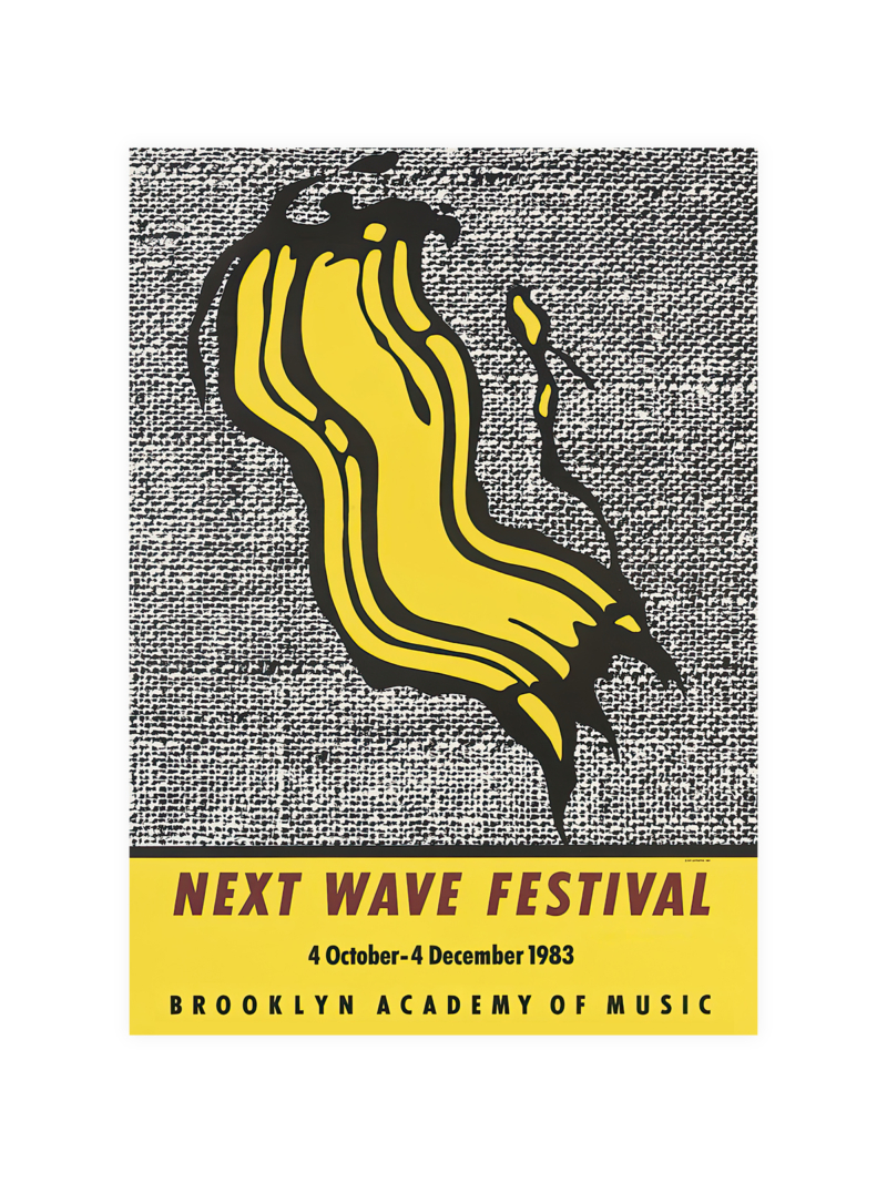
A composition that looks like sound: overlapping shapes, warm and cool colour pushed together, lettering set by hand and slightly irregular. The image has no subject in the ordinary sense, no instrument, no face, only movement and rhythm held inside a frame.
Where it comes from
Jazz Jamboree was the annual festival in Warsaw that, from the late 1950s, brought American and European musicians behind the Iron Curtain and gave Polish graphic designers a subject they could take seriously. The Polish school of poster design was already famous for treating a commission as an artwork and festival posters were its best outlet: abstract, witty and printed in colour that could be seen from across a street.
On the wall
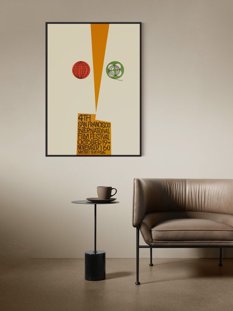
It brings movement into a room, so it suits a studio, a hallway or a living room with dark furniture. Because the composition is dense and warm, it needs a plain wall around it. It reads well at a distance, which is how festival posters were meant to work.
In company
Pairs well with photography and with record sleeves and it looks right at eye level. In a group it should be the liveliest piece. Avoid other dense graphics nearby, the improvisation only reads as such next to something ordered. The Music collection is the obvious place to look for a neighbour.