Details
The image
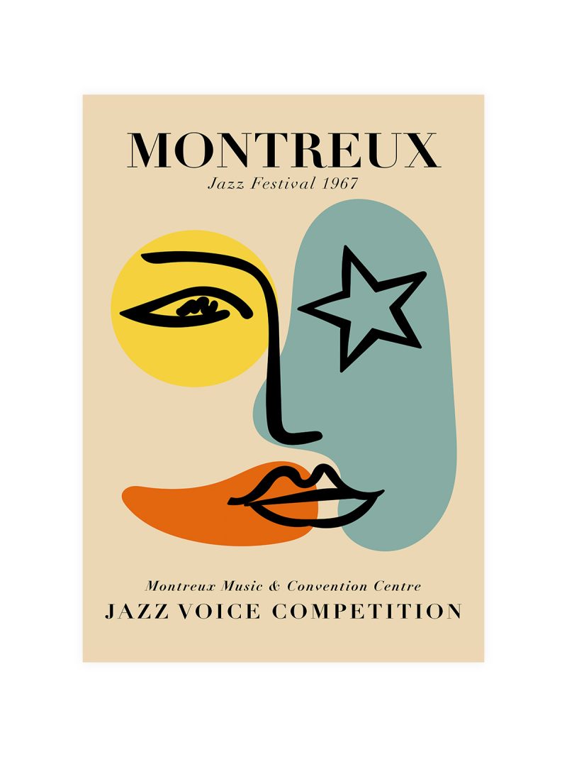
A crowd drawn as a field of small shapes, a stage suggested rather than described, the lettering set large in a hand-drawn face that refuses the grid. The palette is warm and limited and the composition is crowded on purpose, the sheet is about numbers, not about a view.
Where it comes from
Music festivals of the late 1960s produced a poster language of their own: hand-lettering, flat colour, illustration that looked made in a tent rather than in a studio. The sheets were printed cheaply for an event that lasted a weekend and they became the visual record of an era that had no film running for most of it.
On the wall
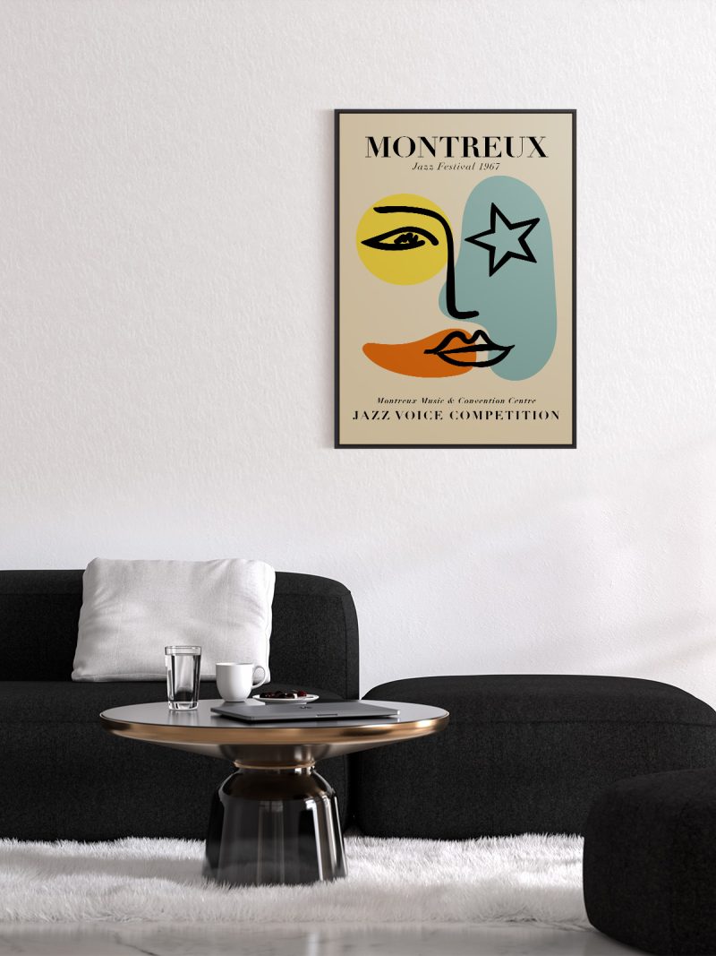
It brings energy and warmth into a room, so it suits a studio, a hallway or a living room with dark furniture. Because the composition is dense and the lettering is loud, it needs a plain wall around it. In a group it should be the piece that sets the volume.
In company
Hung as a pair with something from the Music collection, it gains rather than loses.In a group it should be the busiest sheet, with photography or a quiet landscape as its neighbour.