Details
The image
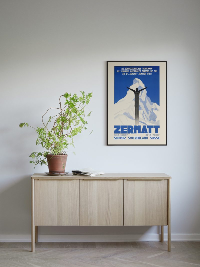
A landscape reduced to bands: a viaduct or a track in the foreground, hills behind, sky left almost empty, lettering small and disciplined at the base. The colour is flat and the perspective slightly raised, so the scene reads as a diagram of a journey rather than a view.
Where it comes from
French railway companies commissioned posters for a practical reason, to sell seats and gave the work to painters and designers who treated the sheet as an artwork. The results of the 1920s and 1930s are among the reasons the travel poster is taken seriously as a form: flat colour, strong silhouette and a landscape arranged so that the destination looks like the only sensible place to be.
On the wall
It behaves like a window, pulling the eye towards the far edge of a room. A hallway, a study or a bedroom suits it, especially where the palette is already light. Because the composition is calm, it holds a large wall without shouting.
In company
Pairs well with other travel posters and with photography of landscape and it looks right at the end of a corridor. In a group it should be the quietest element. A pale wood frame keeps the sky reading as sky. Other sheets in the Travel collection work the same way on a wall.