Details
The image
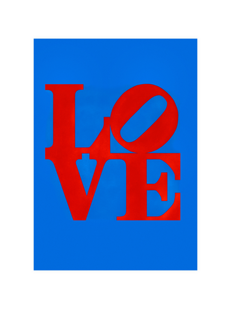
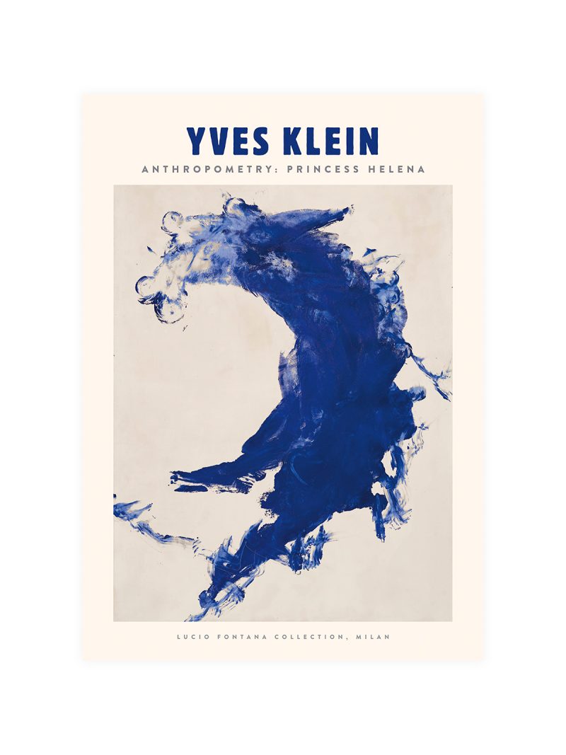
Three letters filling the sheet, their forms cut and stacked so that the counters read as shapes in their own right. The colour is limited to one tone on a plain ground and there is nothing else on the paper: no image, no rule, no frame.
Where it comes from
Typographic posters of the mid-century treated letters as objects with weight, edge and interval rather than as carriers of a sentence. Designers working with metal type discovered that a single word set very large could do everything a picture did and the experiment has been repeated ever since by anyone who has had to make a wall say something with almost nothing.
On the wall
It suits a study, a hallway or a modern living room, where a word at the scale of a picture gives a wall structure. Because the composition is tight and the palette is single, it holds a small wall as well as a large one. In a group it should be the most graphic piece.
In company
A second sheet from the Minimal collection will balance it rather than compete.Avoid hanging it beside decorative lettering, two typographic jokes on one wall cancel out.