Details
The image
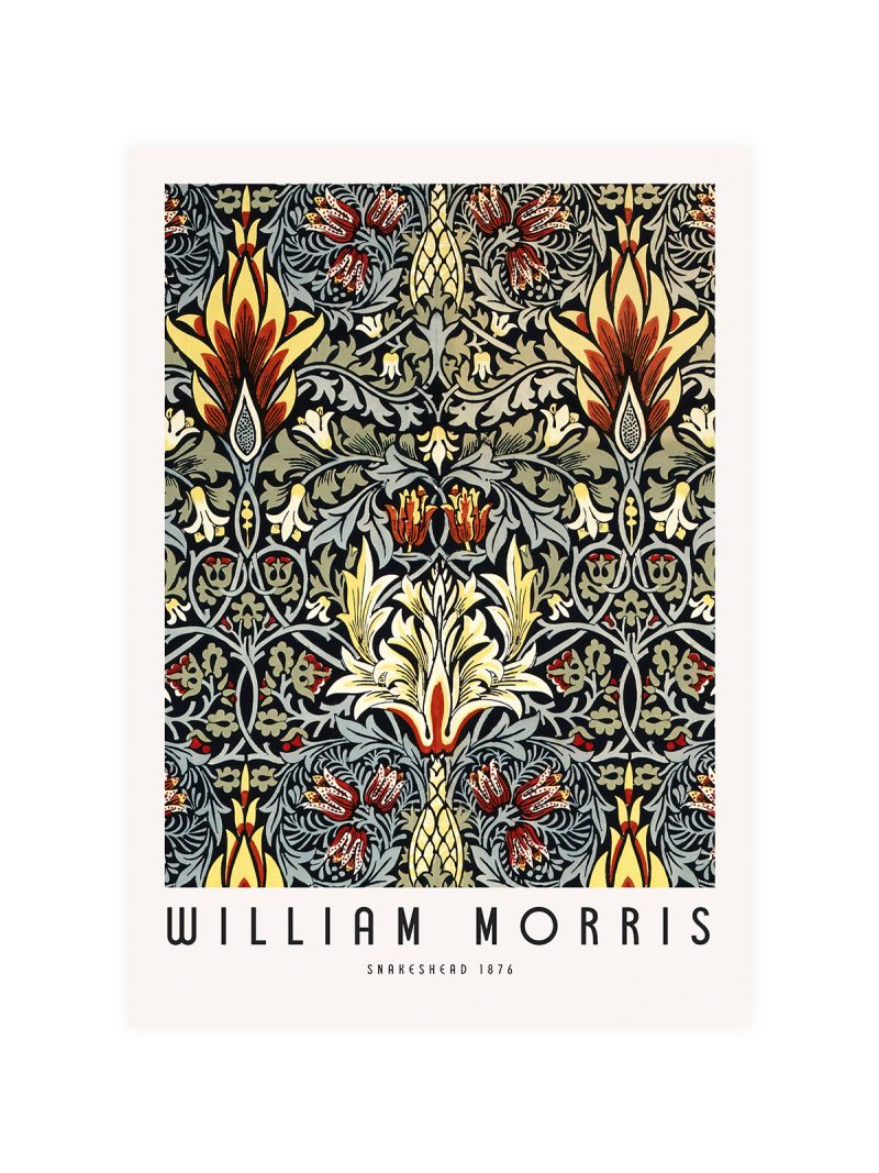
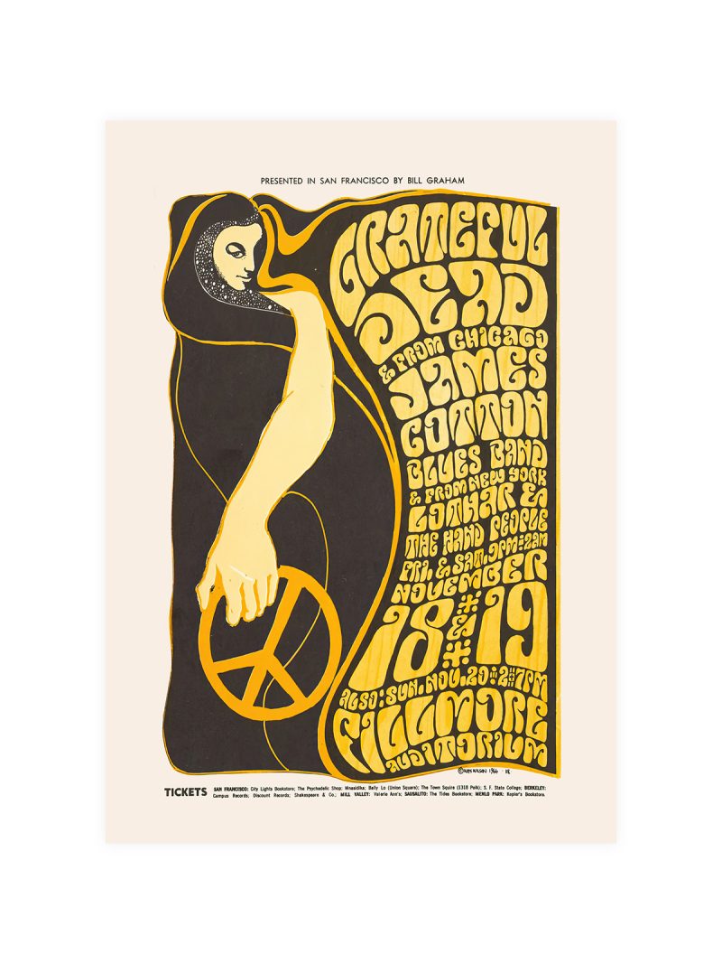
A composition built from repetition rather than from a subject: a shape or a face repeated across the sheet, colour laid on flat, lettering pressed into the pattern until it is almost absorbed. The image looks like a poster for something you were not meant to understand from the street.
Where it comes from
New York in the second half of the 1960s produced a graphic language that refused the cheerful psychedelia of the West Coast: harder edges, colder colour, imagery taken from the city rather than from a dream. The scene around the Factory treated a poster as part of the work rather than as advertising for it and the results were reproduced, torn, pasted over and collected in equal measure.
On the wall
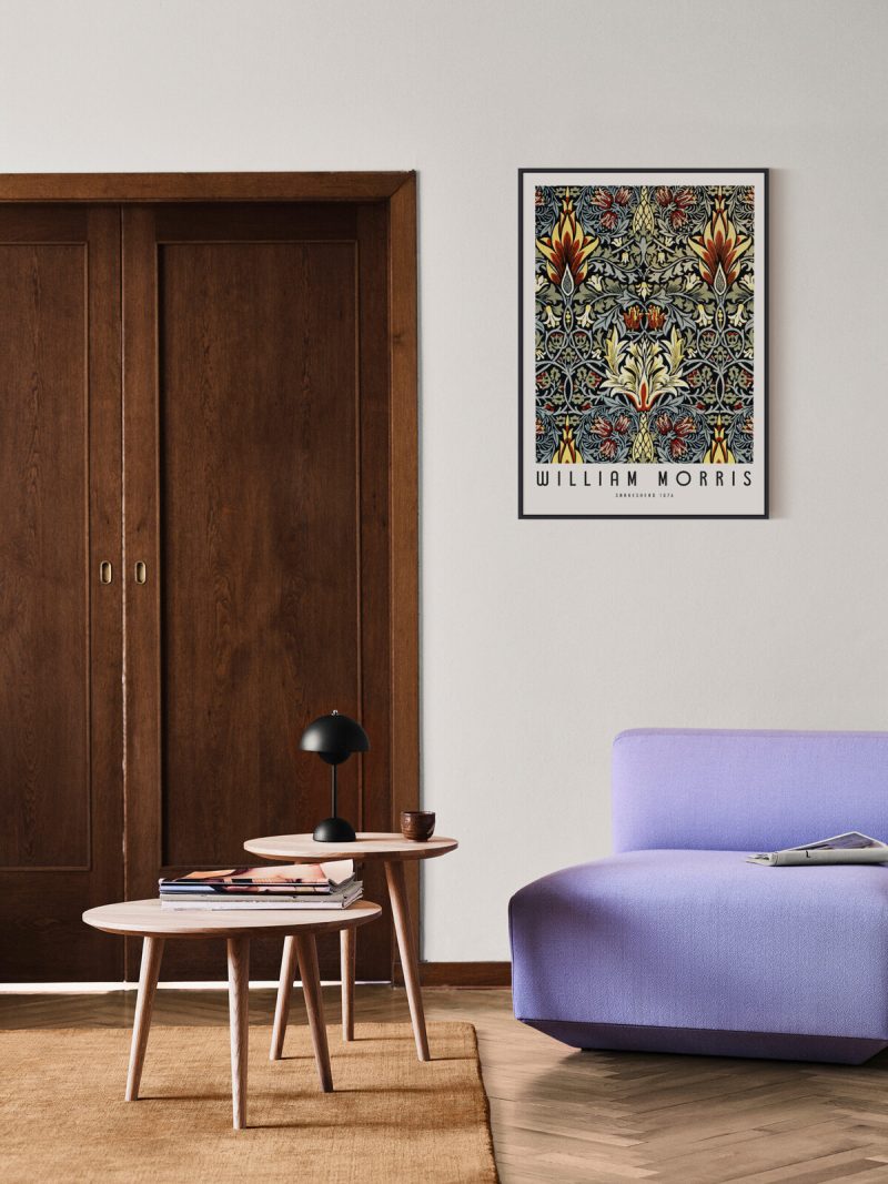
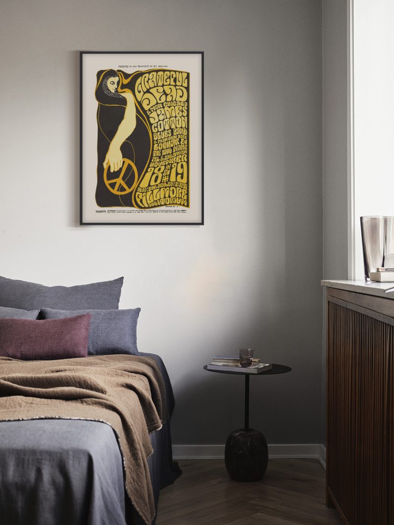
It suits a studio, a hallway or a room with industrial furniture, where a repetition reads as rhythm rather than as decoration. Because the composition is dense and the palette cold, it needs a plain wall around it. At a large size the pattern becomes architecture; at a small one it reads as a single striking shape.
In company
Pairs well with black-and-white photography and with metal and it looks deliberate beside concrete or brick. In a group it should be the piece that sets the temperature, hang it first and let warmer prints answer. A thin black frame keeps the repetition tight and stops it drifting into ornament. The Music collection gathers prints made for the same kind of wall.