Details
The image
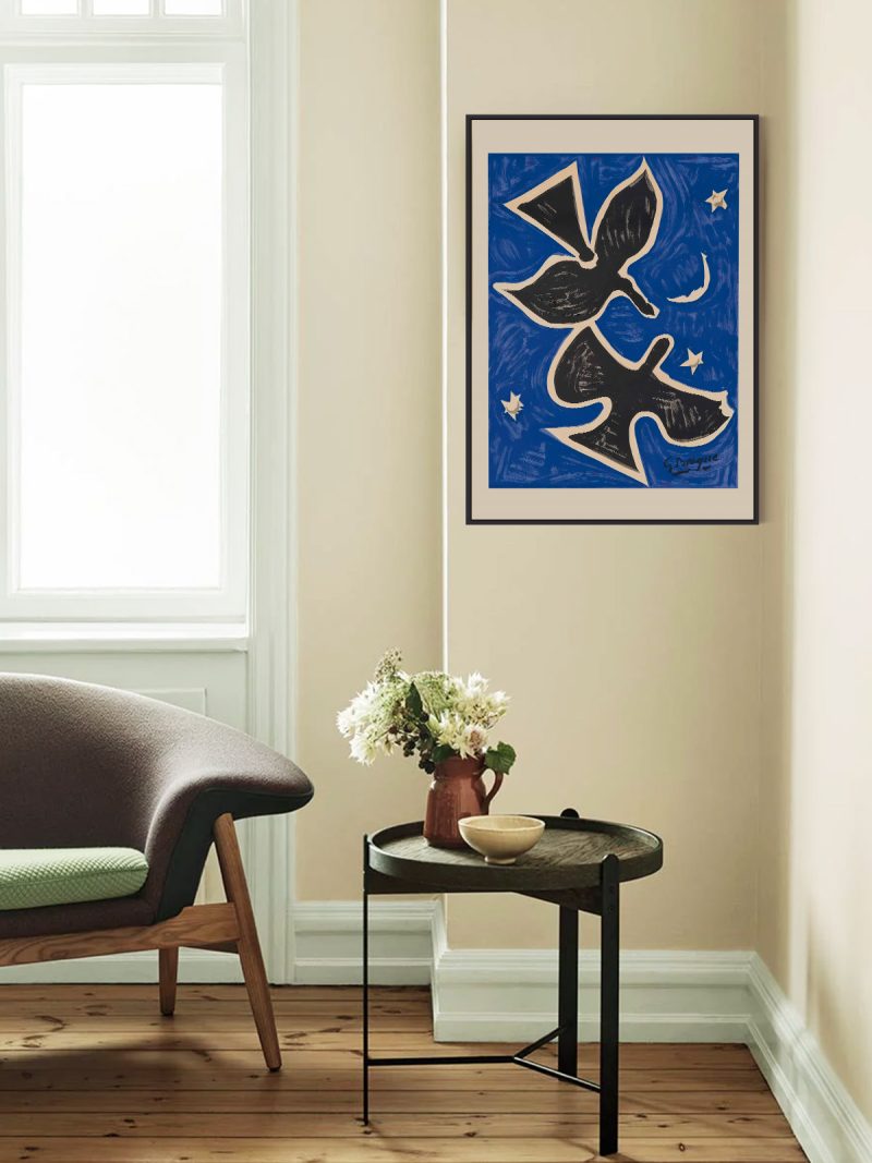
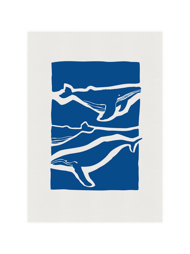
A composition built on a vertical rhythm: a few shapes stacked on a narrow axis, colour applied in flat areas, lettering kept small and set to one side. The sheet is quiet but not empty, the spaces between the shapes carry as much weight as the shapes themselves.
Where it comes from
Japanese exhibition posters of the post-war decades developed an approach that Western designers admired and borrowed: generous empty space, a single strong idea and typography that behaves like a mark rather than a sentence. The restraint was partly a matter of tradition and partly a practical response to small printing budgets.
On the wall
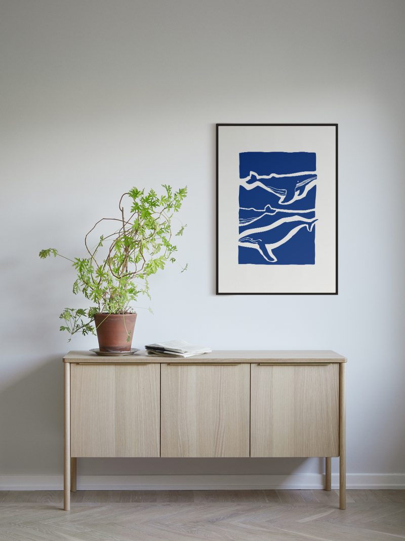
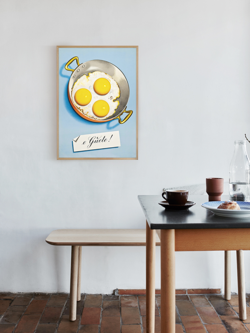
It suits narrow walls: beside a door, between windows, at the end of a shelf. Because the composition is vertical and quiet, it makes a small room feel taller rather than busier. In a large room it works as one element in a group rather than as the centre.
In company
Pairs well with other Japanese graphics and with pale wood and it looks right at eye level. In a group it should be the calmest piece. A simple frame without a mount preserves the empty space that makes it work. The sheet rewards being seen from close range, where the spacing becomes the subject. The Japanese collection repeats the same construction in different colours.