Details
The image
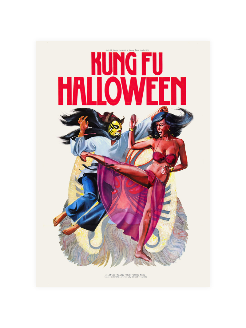
A graphic built around a central emblem with lettering arranged symmetrically above and below, the palette limited and the drawing formal. The sheet looks ceremonial rather than commercial: an announcement made for an occasion, not for a shop window.
Where it comes from
The Cannes Film Festival held its first edition in 1946, after years of postponement caused by the war, and its early posters were designed as cultural statements rather than as advertising. The style belongs to that moment: confident typography, restrained colour and a belief that a festival should look like an institution from the first day.
On the wall
It suits a hall, a study or a living room with strong furniture, where a formal graphic does not look out of place. Because the composition is symmetrical, it wants a wall where it can sit on its own axis. In a group it should be placed centrally.
In company
Pairs well with photography and with mid-century furniture, and it holds a wall alone. In a group it sets the axis rather than following it. A simple dark frame supports the ceremonial tone without adding decoration, and it should be hung higher than the furniture so the symmetry is not broken by a sofa or a lamp. Hung as a pair with something from the Vintage collection, it gains rather than loses.