Details
The image
A warning reduced to a graphic: a figure or an object drawn simply, lettering set large and blunt, colour used to demand attention rather than to please. The composition is frontal and unmissable, designed to be read by someone walking past at speed.
Where it comes from
Civic signage of the mid-twentieth century developed a visual language of its own: bold type, flat colour, simple drawing, no decoration. These sheets were printed by cities and building owners to keep stairwells and fire escapes usable and the best of them applied the same discipline as commercial posters, because the message had to work without anyone choosing to look.
On the wall
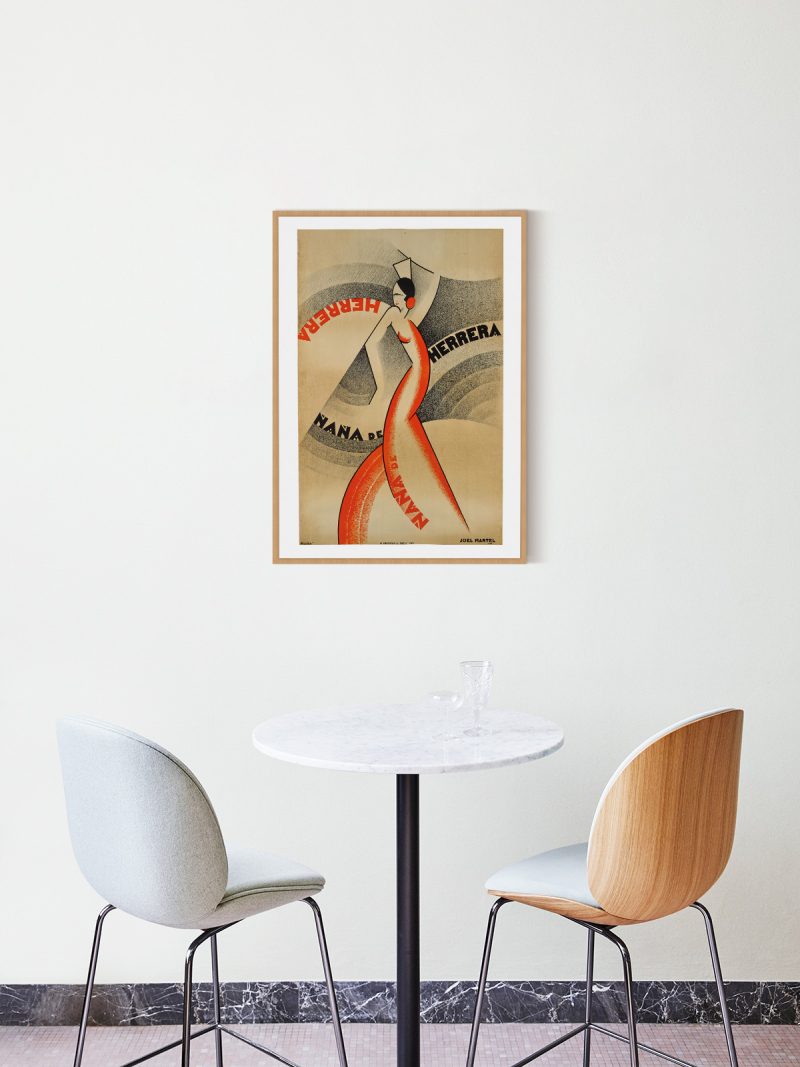
It works as an industrial graphic in an interior that can take it: a studio, a hallway, a kitchen with metal fittings. Because the type is large and the colour is blunt, it holds a wall without needing company. In a domestic room it functions as a deliberate contrast rather than as decoration.
In company
Pairs well with photography, with metal furniture and with other signage. In a group it should be the most graphic element and it looks best in a simple frame that does not soften it. Avoid pale, quiet walls where the message becomes too loud to live with. For a larger wall, the Vintage collection supplies the rest of the arrangement.