
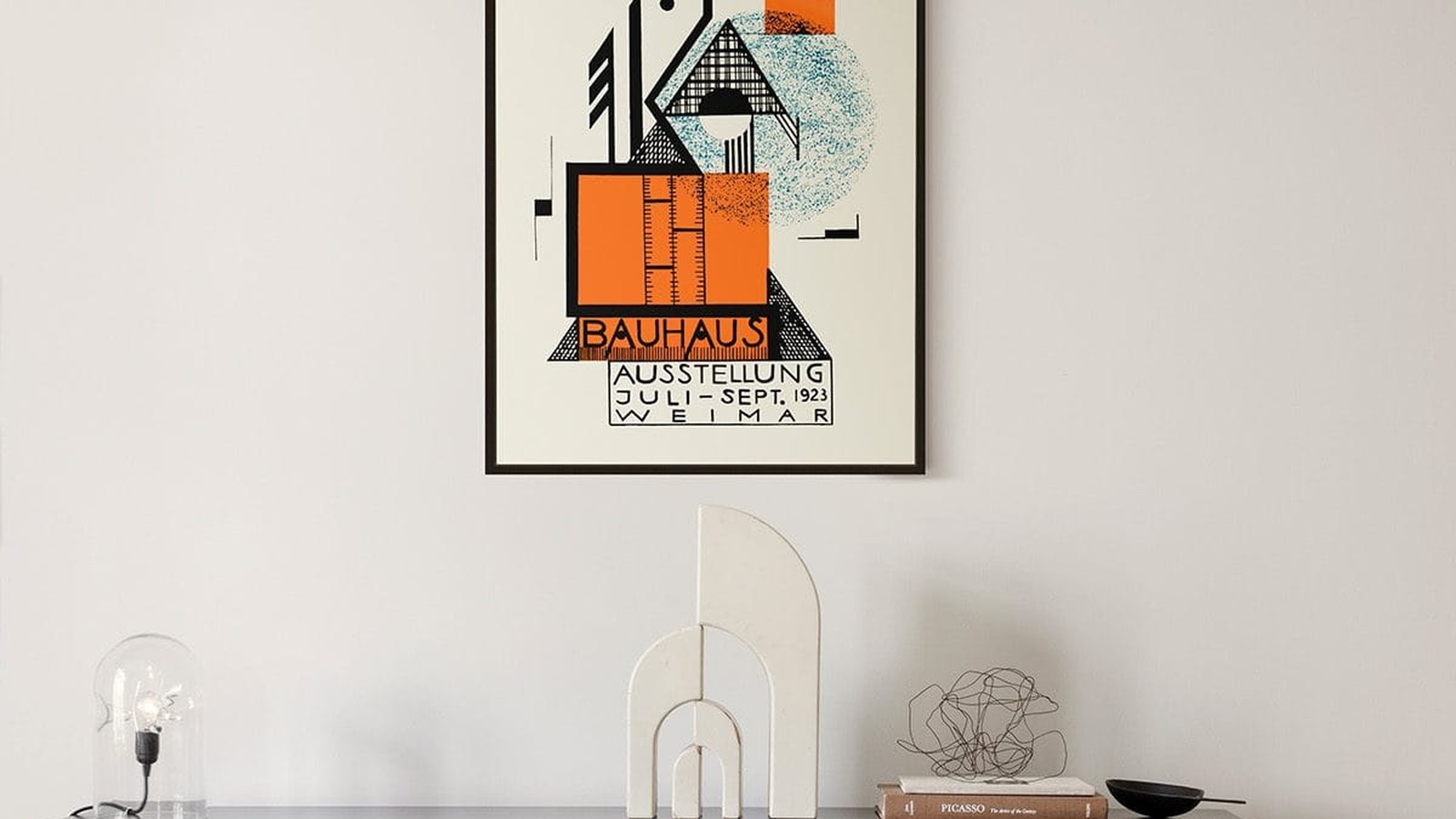
Bauhaus Posters and the Grid Behind Them
Bauhaus prints look simple and are unforgiving. A circle, a band of colour, one block of type, all placed on a visible grid. Nothing is decorative, so nothing hides a mistake, including the way you hang it.
This is how to put them on a wall so the geometry still reads.
What makes a Bauhaus poster different
The work comes out of a school of art and design that treated printing, furniture and buildings as one problem. That is why the posters look like plans. Proportions are deliberate, spacing is deliberate, and the type is set in a plain sans-serif instead of something decorative.
When you look at one of these prints, you are looking at a decision about alignment. The composition is usually built from a few shapes aligned to a margin, and the eye finds that alignment immediately.

Hang them in odd numbers
One Bauhaus print on a large wall looks like a diagram that lost its page. Three works, because three shapes on a wall repeat the logic of the print itself.
Hang three in a row with 5 to 8 cm between frames, centre the row at 145 to 150 cm from the floor, and keep the gaps identical. A row of three Bauhaus prints is one of the few arrangements that looks better than a single large print in the same space.
Alignment is the whole job
Because the images are geometric, a two millimetre difference between frames is visible from across the room. Use a spirit level, not the ceiling line, and not the top of the furniture.
If the frames are identical, align the outer edges. If the prints differ in size, pick one line to share and keep the rest free: either tops, bottoms, or centres.

Colour and the wall
Bauhaus palettes are narrow. Black, white, one red, one blue, sometimes a sand tone. That means the wall colour does more work than usual.
- White or off-white. The safest, and the closest to how these prints were meant to be seen.
- Pale grey. Good with black and red prints, because the grey softens the contrast without competing.
- Deep colour. Only if the print is mostly light. A dark print on a dark wall disappears.

Frames should not add a shape
A Bauhaus print already contains enough rectangles. A slim frame in black, natural wood or white keeps the count low. An ornate frame adds a shape the designer never drew and pulls the eye away from the grid.
No mount board, or a very narrow one. Wide mounts push the composition away from the wall and make the print look like a document in a museum case.
Where they work best
Hallways, studies, stairs and kitchens, where the print is read at a glance and the geometry does the work. In a living room they work above a low sideboard, because the horizontal line of the furniture repeats the horizontal of the print.
The full set is in the Bauhaus collection.
Prints From the Bauhaus Collection


FAQs
Is the poster a reproduction?
Yes. We print reproductions on matte paper, in the formats listed on each product page. We do not sell originals.
What size works best?
Above a sofa or a sideboard, 50 x 70 cm. On a wall of its own, 70 x 100 cm. Our guide to poster sizes lists every format with the space each one needs.