
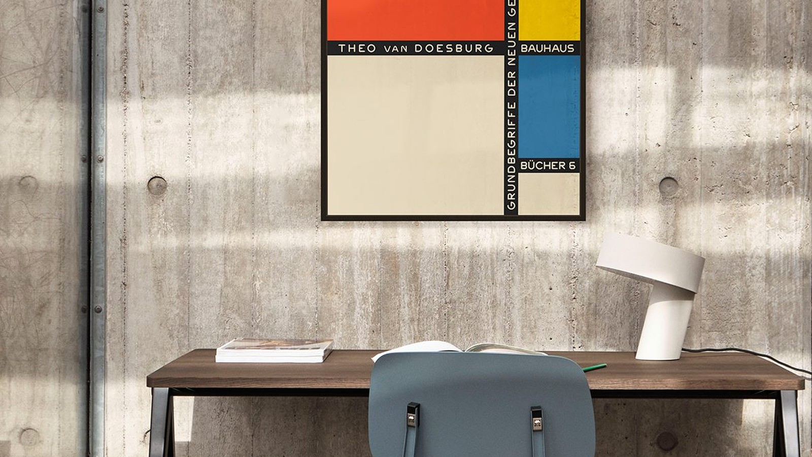
Theo van Doesburg and the Bauhaus Argument That Shaped Its Posters
Theo van Doesburg never held a permanent teaching post at the Bauhaus, and he still changed how the school looked. He arrived as a lecturer, argued with Walter Gropius about which direction the school should take, and left behind a set of ideas that ended up on paper: grids, plain type, primary colour and a refusal of ornament.
You can see the result on the wall. The Bauhaus posters we print carry that argument in their layout, which is also why they are so easy to hang badly. Below is what the connection actually was, and what it asks of a room.

What De Stijl wanted
Van Doesburg founded and edited De Stijl, a journal and a movement built on a narrow idea: strip the image down to straight lines, rectangles and the primary colours, then use those elements to build something universal rather than personal. No brushwork, no shading, no decoration hiding inside the composition.
Applied to a page, that attitude produces exactly what Bauhaus printing became: a visible grid, heavy sans-serif type, blocks of colour that do a job rather than decorate.
Tension was the point
Bauhaus was not a single style. It was a school with internal disagreements about whether design should serve industry, art or daily life. Van Doesburg pushed one answer hard, from outside the staff and inside the classroom, and students listened to him more than to some of their own teachers. What survived in print is the compromise that argument produced.

Why the posters look like plans
Look at a Bauhaus poster and you can usually find its construction: a margin, a column of type, a diagonal, one circle. Nothing is placed to fill space, so nothing can be moved without the arrangement falling apart. That is the practical difference between this work and ordinary commercial design of the period.
The diagonal, and why it still reads
Van Doesburg used diagonals to break the calm of a rectangle. On a wall, a diagonal does something useful: it moves the eye across the print instead of letting it settle in the middle. That is why these posters can carry a large format without becoming heavy, and why they look wrong when they are hung too small.

Hanging rules that come out of the design
Because the composition is built from alignments, the frame has to be thin and neutral: black, white or natural wood, twenty to twenty five millimetres. A wide or ornate frame adds a shape nobody drew and pulls the eye off the grid.
Hang it straight and level, and check with a spirit level rather than the ceiling line. Two millimetres of slope is invisible on a photograph and obvious on a wall with a hard geometric print on it.
Colour, and how much wall to give it
These prints use a narrow palette, usually black, off-white and one strong colour. That means the wall does more work than usual. White and off-white are the safest, pale grey calms a red print, and deep colours should be avoided unless the print is mostly light.
One wall, one print
A Bauhaus print does not need company. Put two next to each other and the eye starts comparing arrangements instead of reading one. If you own several, give each its own wall, or hang three in a row in identical frames with 5 to 8 cm between them.
Centre the print between 145 and 150 cm from the floor, leave 20 to 30 cm above the furniture, and keep the surround empty. All of this is the same rule as for any poster. It matters more here, because a print built on alignment makes a messy wall look messier.
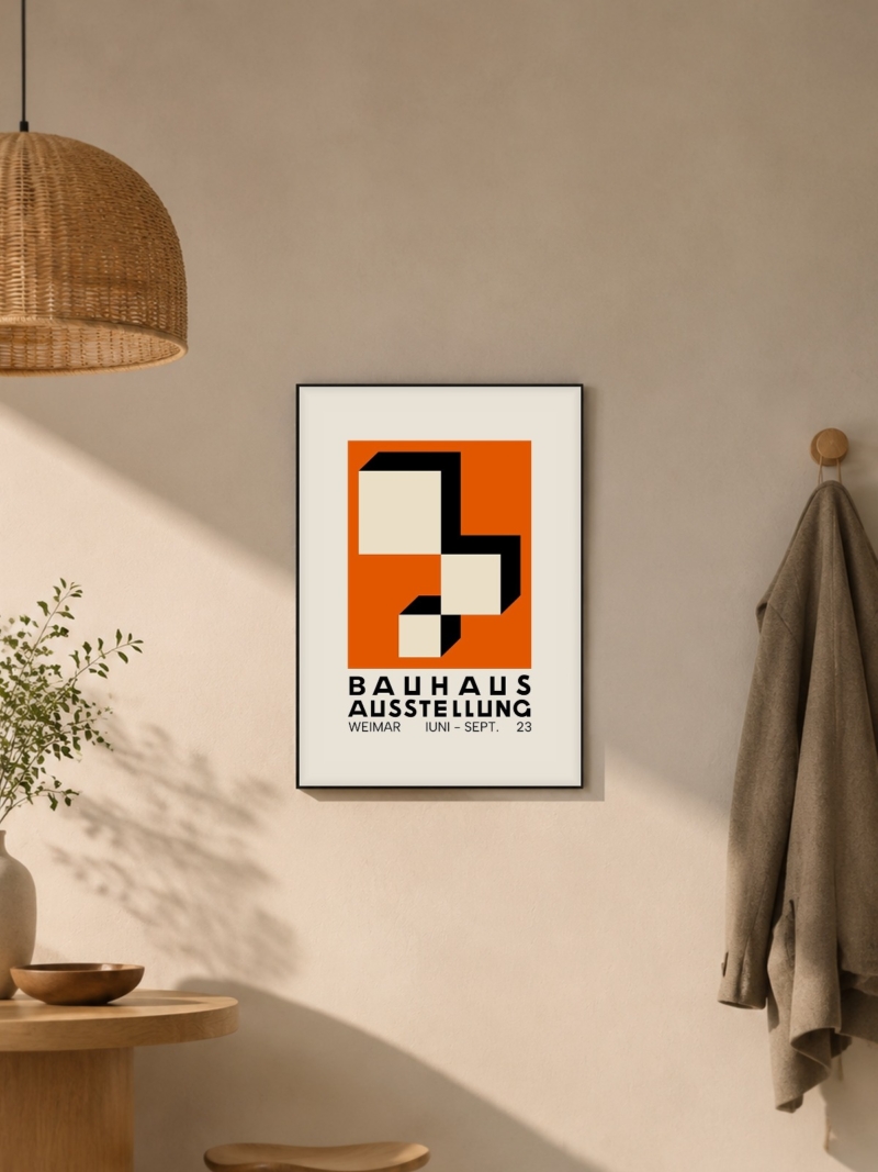
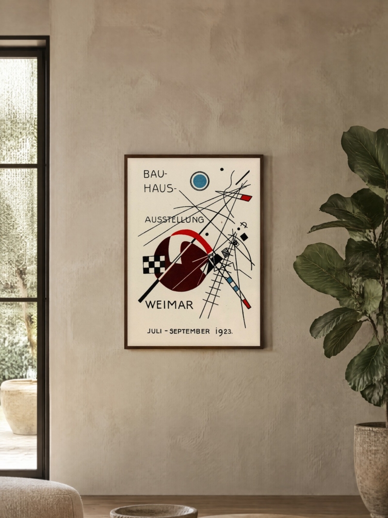
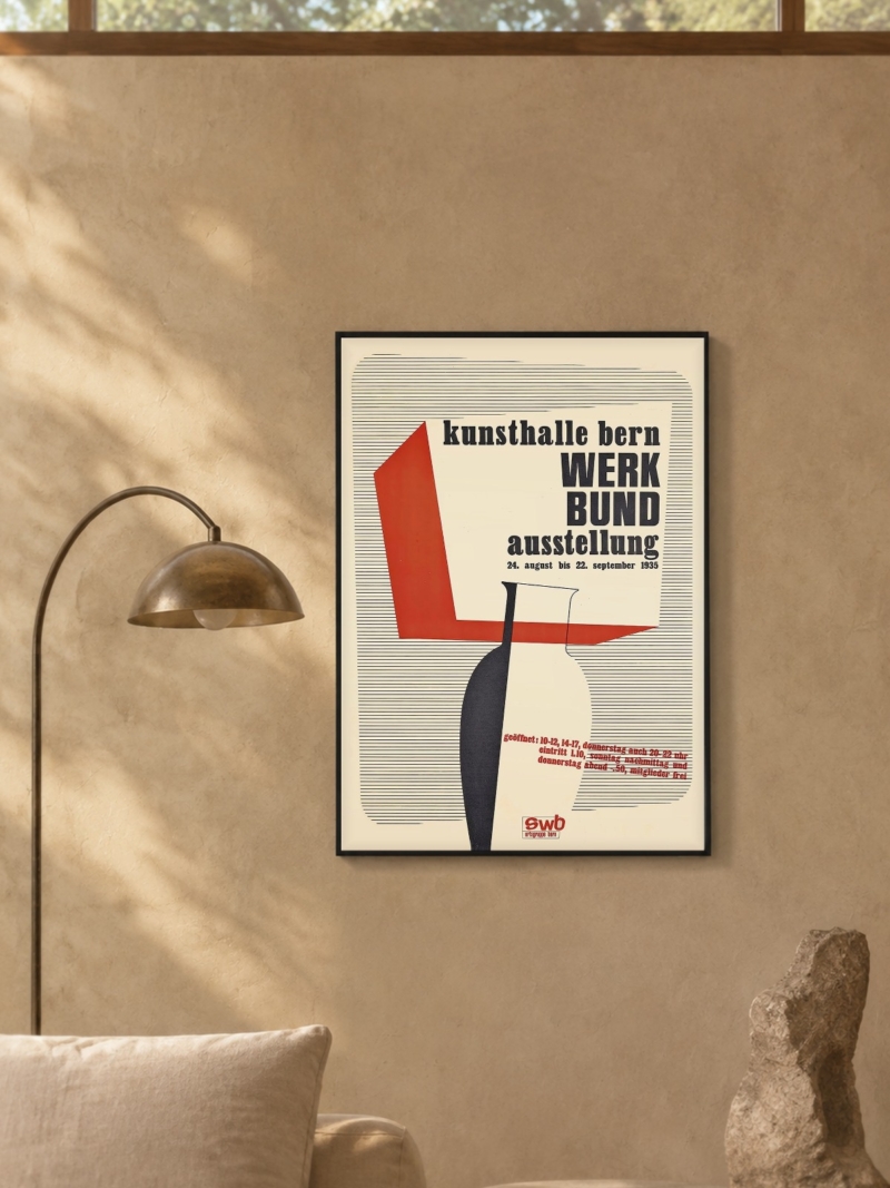
Prints From the Bauhaus Collection




FAQs
Are these original Bauhaus posters?
No. We print reproductions on matte paper in the formats listed on each product page. We do not sell originals.
What size suits a Bauhaus print?
50 x 70 cm above furniture, 70 x 100 cm where the print has a wall of its own. Our guide to poster sizes lists every format we print.
What frame should I use?
A thin black, white or natural wood frame without a wide mount. The print already contains the geometry; the frame should not add more.