Details
The image
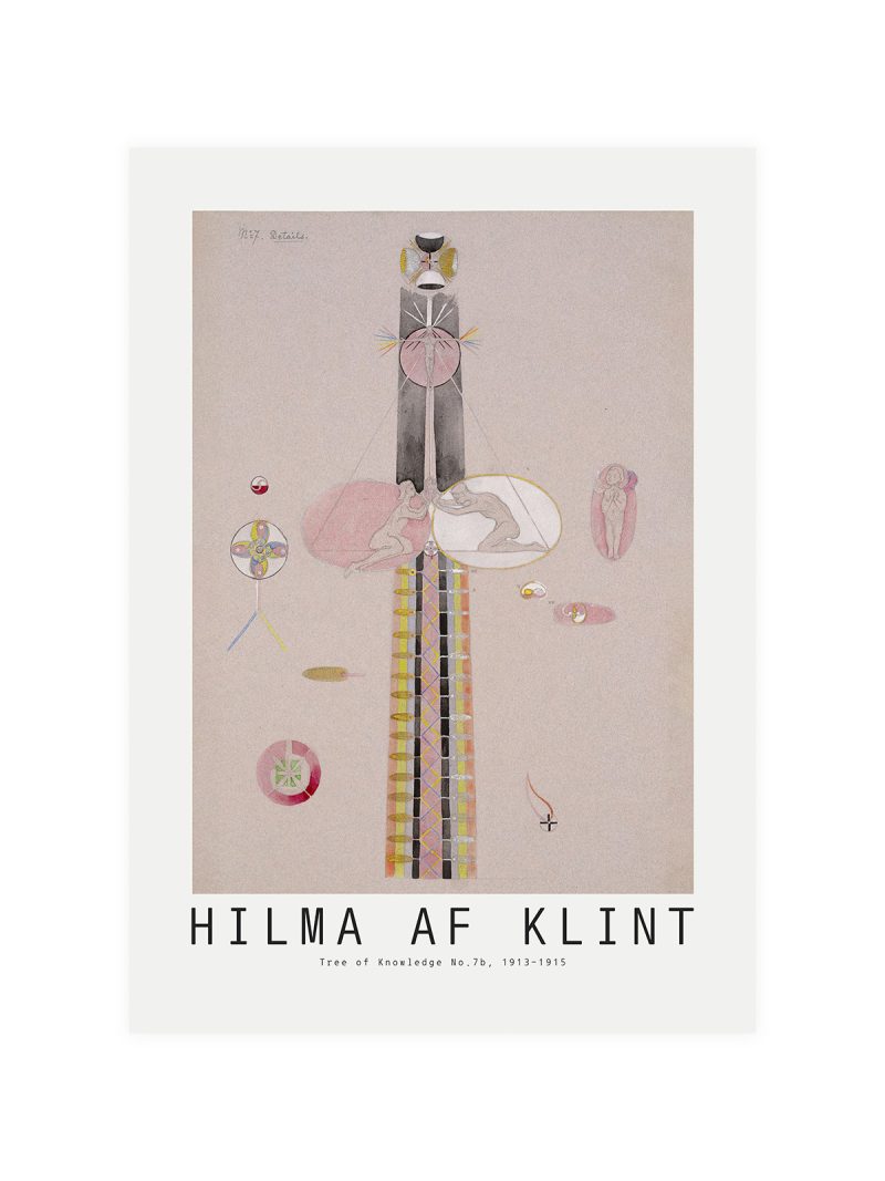
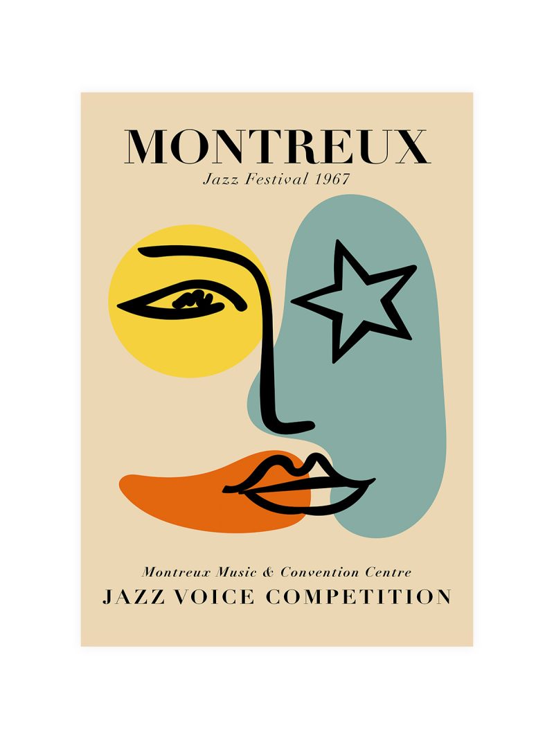
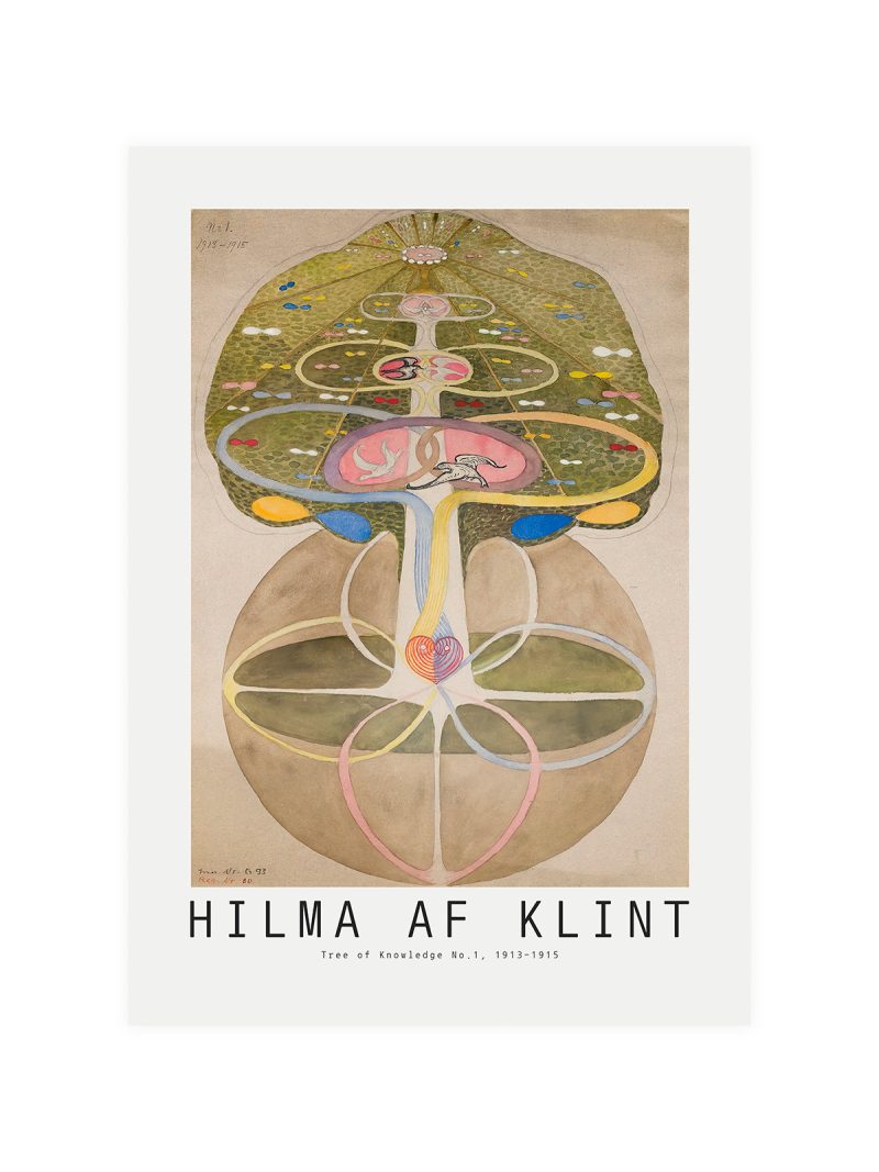
A composition built from a few bold shapes set off-centre, with the institution’s name running along the base in a modern sans-serif. Colour is used in flat blocks and the whole sheet is sparse. There is nothing decorative anywhere on it.
Where it comes from
American art museums in the 1960s began commissioning their posters from the designers and artists they exhibited, rather than from printers and the result was a series of sheets that looked like the work inside. The approach made an announcement into a piece of graphic design and it is the reason so many of these posters are collected today as examples of the period rather than as souvenirs.
On the wall
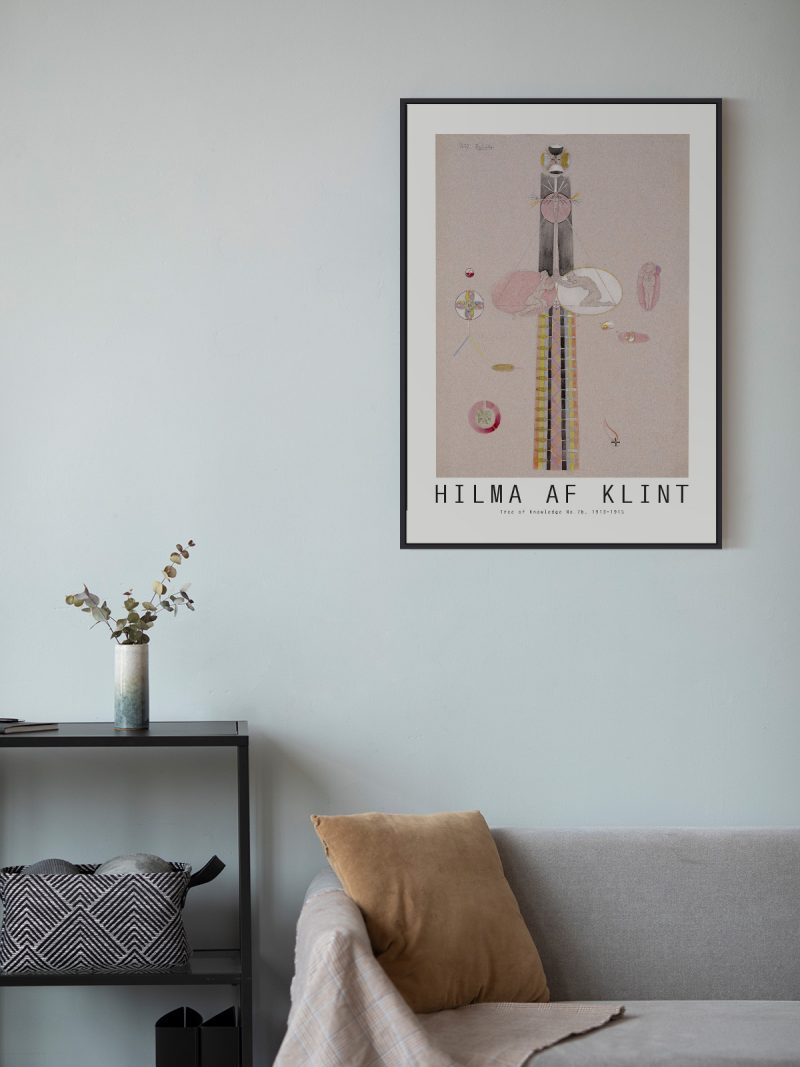
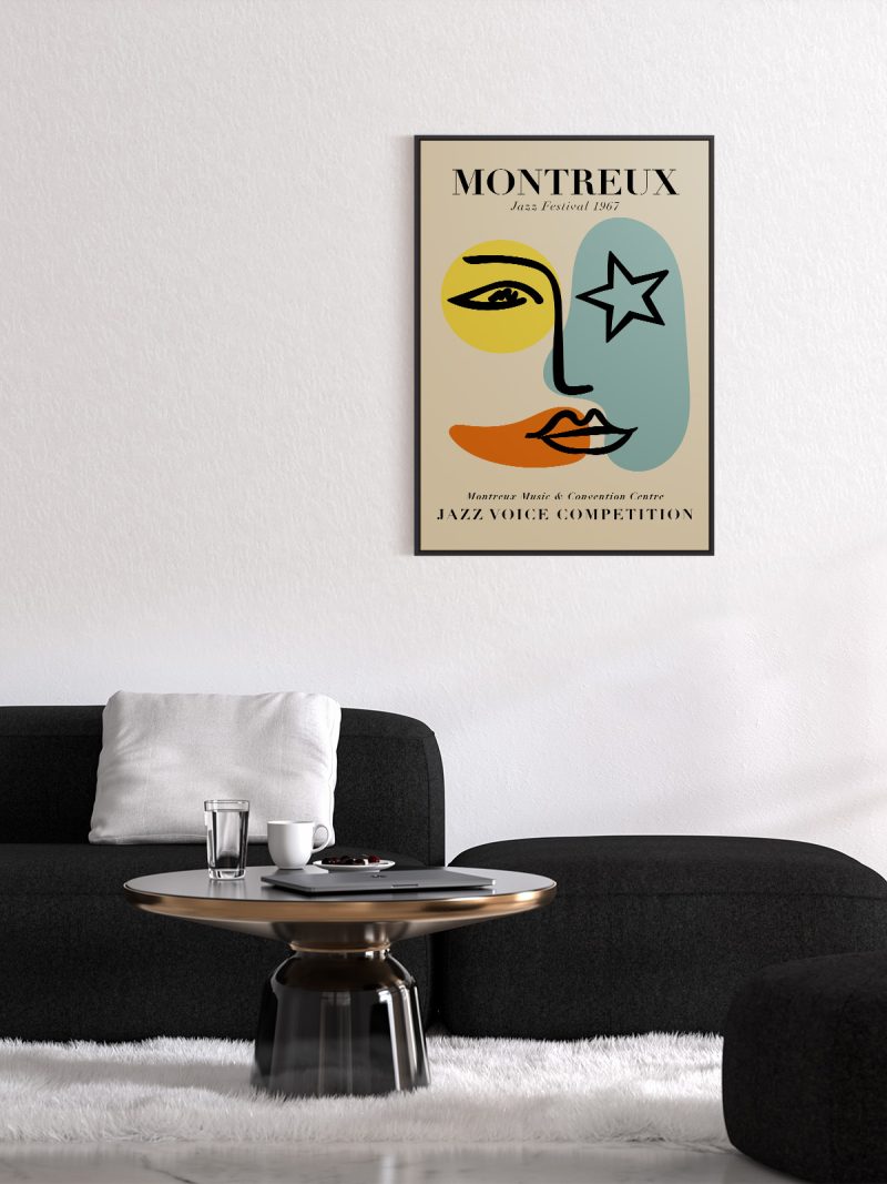
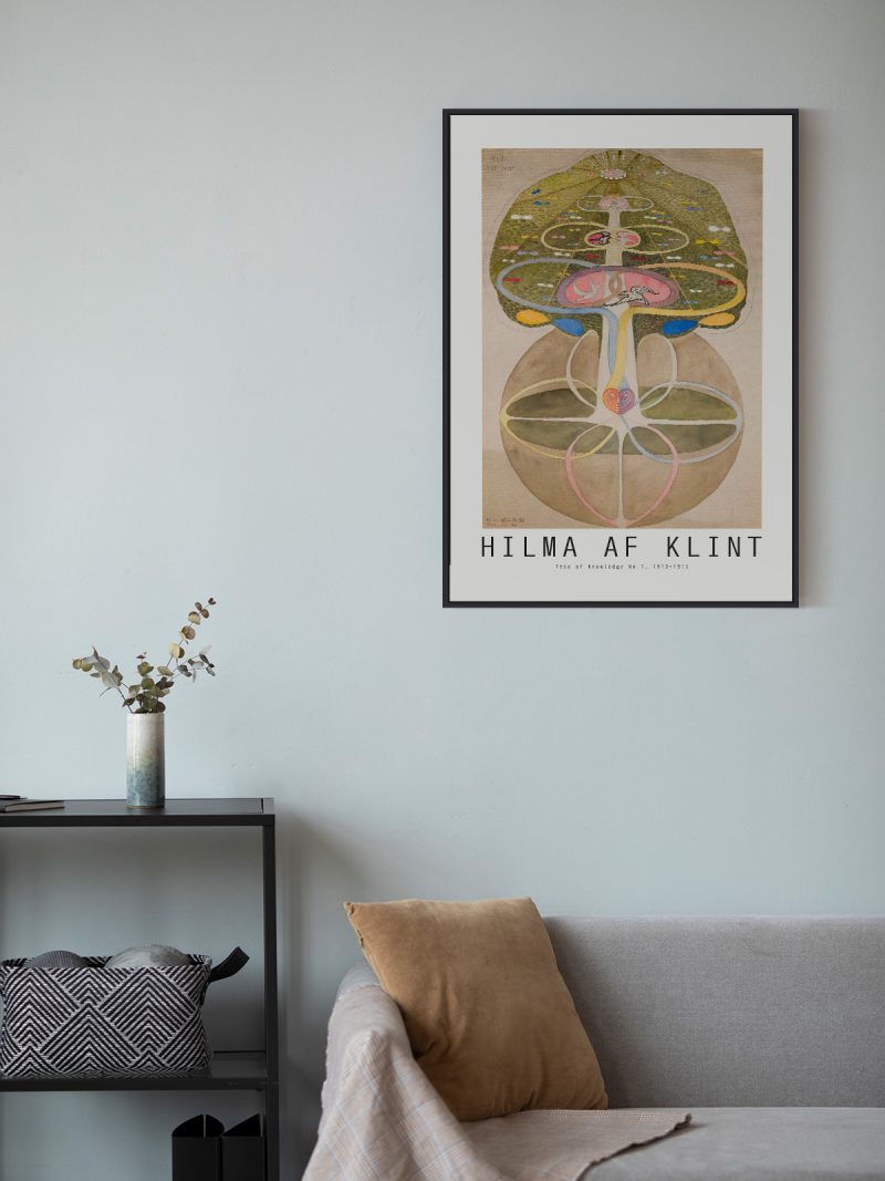
It suits a study, a hallway or a living room with modern furniture, where a sparse graphic gives a wall structure. Because the composition is open, it holds a large wall without filling it. In a group it should be the piece that sets the spacing.
In company
Pairs well with photography and with plain furniture and it sits naturally among the modern prints in the collection. Avoid hanging it beside other dense graphics, the emptiness is the point and needs protecting.