Details
The image
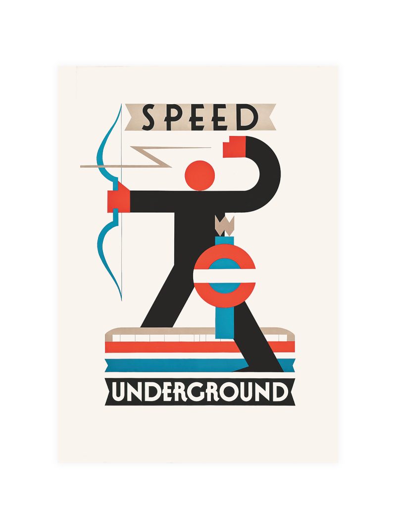
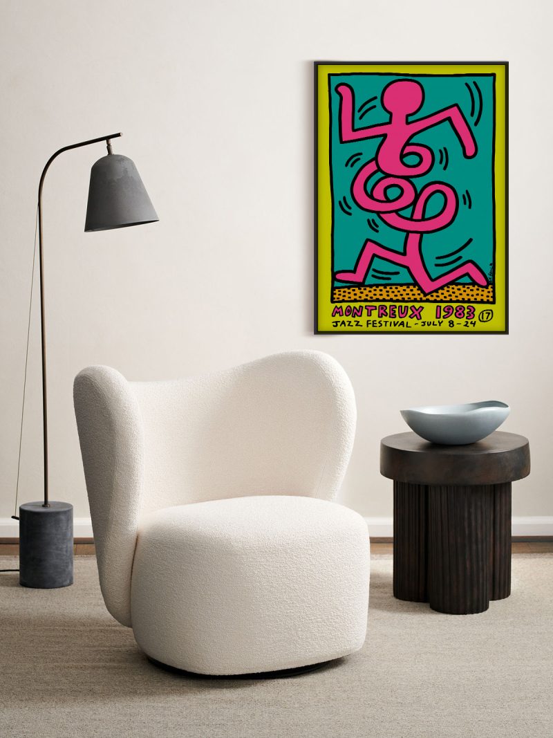
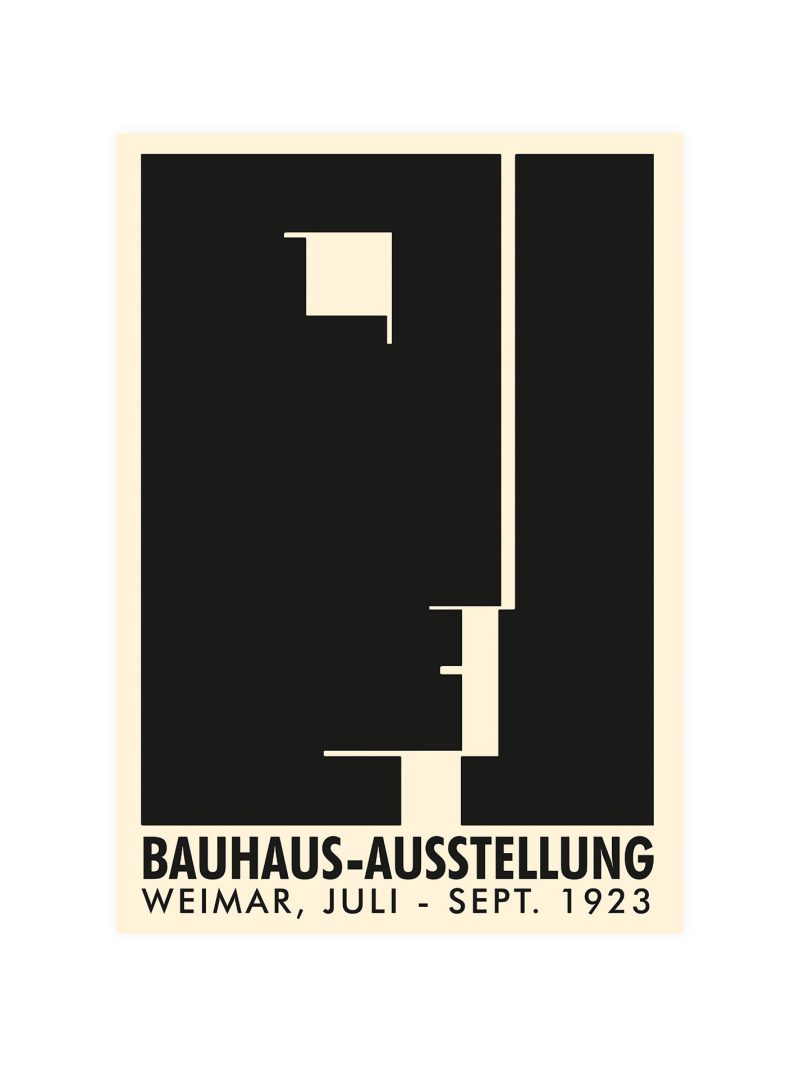
Flat planes of colour arranged so that a package, a letterform and a background all occupy the same space without perspective. The composition is frontal and rhythmic, and the edges are hard everywhere, as though the picture had been cut from paper rather than painted.
Where it comes from
American painting between the wars borrowed its structure from commercial design and its rhythm from jazz: a sign, a package, a word, all assembled into a composition that refuses depth. The approach argued that the ordinary objects of a street were legitimate material for art, and it became one of the clearest bridges between advertising and the museum in the twentieth century.
On the wall
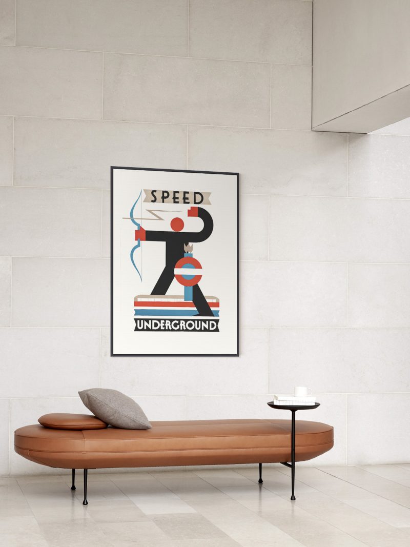
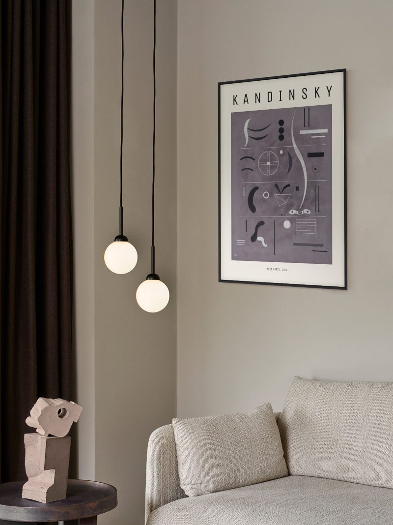
It brings colour and structure at once, so it suits a living room, a study or a hallway with strong furniture. Because the composition is dense and the outlines are firm, it needs a plain wall around it. In a group it should be the piece that sets the tempo.
In company
Pairs well with industrial furniture and with photography in black and white, and it sits naturally among the geometric prints in the collection. Avoid hanging it beside soft, tonal work, where the colour would look accidental.