Details
The image
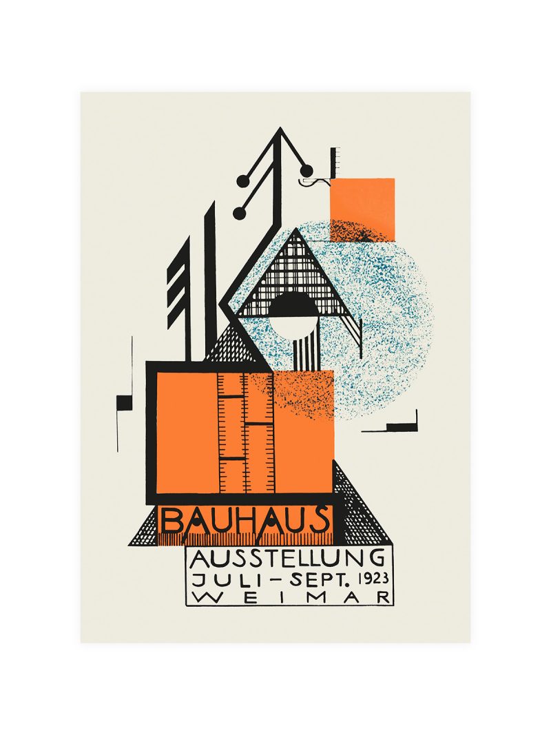
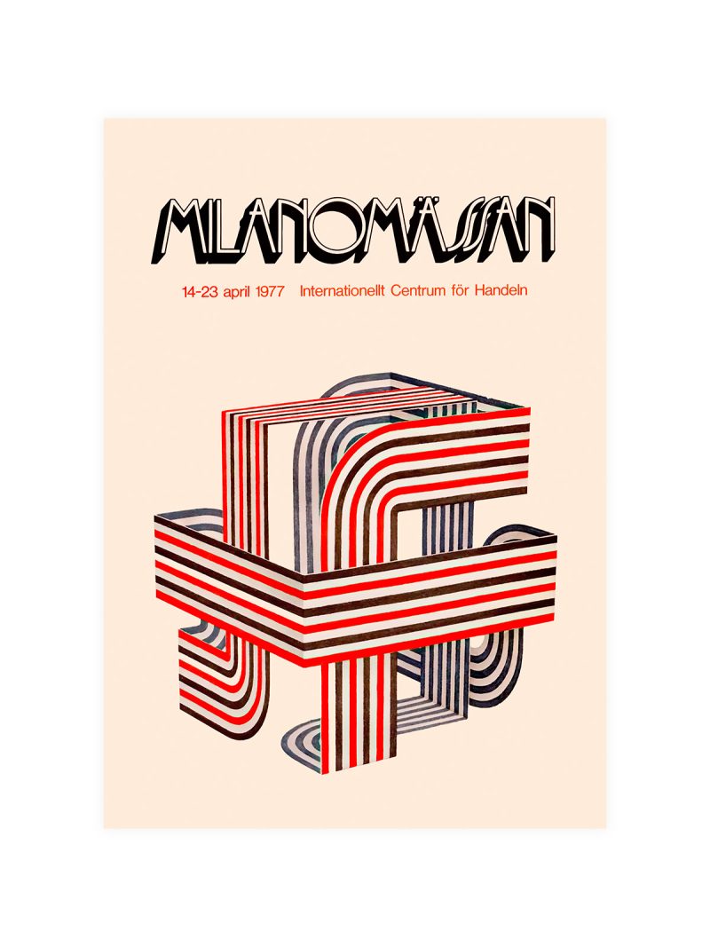
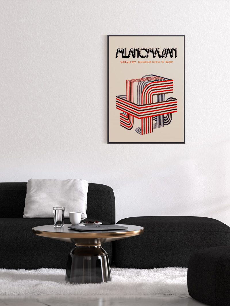
A transport graphic built on repetition: wheels, rails or lines converging, lettering set in a geometric face and pushed into the composition rather than placed above it. The image is about movement and says so with structure instead of with scenery.
Where it comes from
Public transport advertising in the first half of the twentieth century had to sell speed to people who had never travelled quickly. Designers answered with abstraction, converging lines, repeated forms, hard colour and the results became a school of graphic design that commercial work still borrows from.
On the wall
It suits a hallway, a study or a loft with industrial furniture, where a graphic about movement reads as structure. Because the composition is dense and angular, it needs a plain wall. In a narrow corridor it works particularly well, since the lines lead the eye along the space.
In company
Pairs well with photography of architecture and with metal and it can anchor a group. Avoid hanging it beside figurative work, the abstraction needs contrast. A thin black frame keeps the geometry sharp and at a narrow size the converging lines do more work than at a wide one. The lettering sits inside the composition because the message had to arrive before the picture did. Hung as a pair with something from the Travel collection, it gains rather than loses.