Details
The image
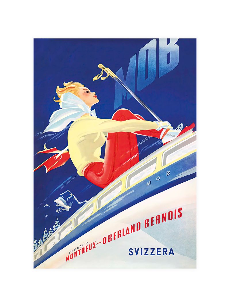
A landscape arranged along a diagonal: a lake in the middle distance, hills behind it, a shoreline in front, the lettering set small and disciplined at the base. The colour is flat and the perspective raised, so the scene reads as a diagram of a journey rather than as a view.
Where it comes from
Railway companies sold scenery as much as seats and Italy had more scenery per kilometre than most. Posters of the 1920s and 1930s answered with economy: three bands of colour, one horizon, a place name, enough to make a destination look like a decision already taken. The same restraint runs through the rest of the travel collection.
On the wall
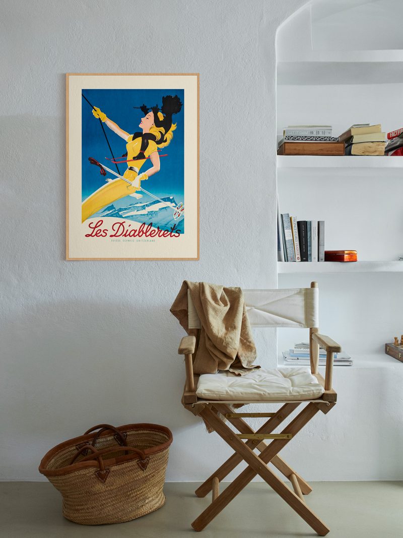
It behaves like a window, pulling the eye to the far side of a room. A hallway, a study or a bedroom suits it, especially where walls are pale. Because the composition is calm, it holds a large wall without making the room feel crowded.
In company
Pairs well with photography of landscape and with other railway posters and it looks right at the end of a corridor. In a group it should be the quietest element. A pale wood frame keeps the sky reading as sky.