Details
The image
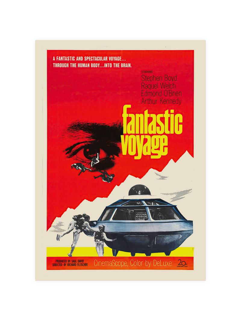
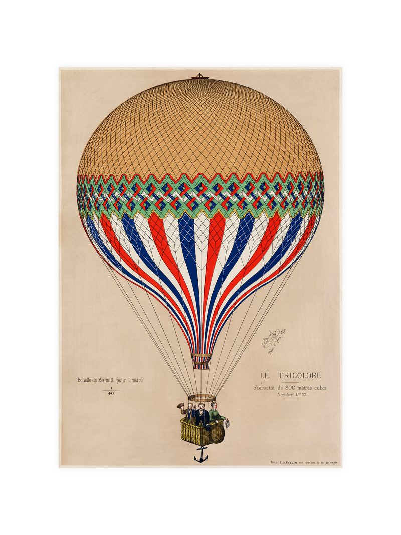
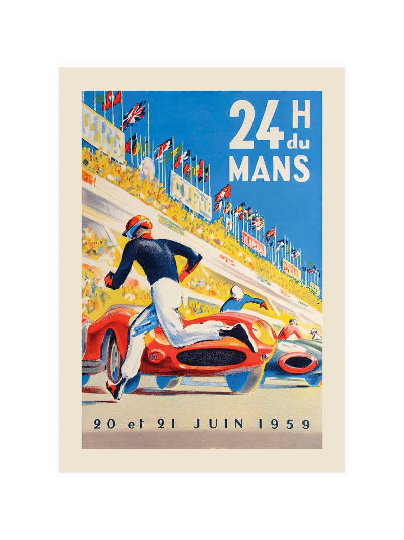
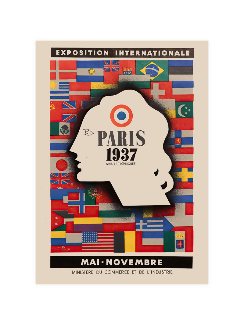
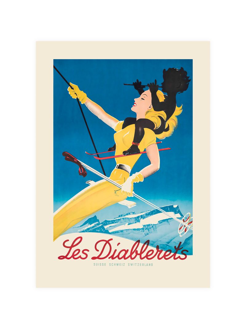
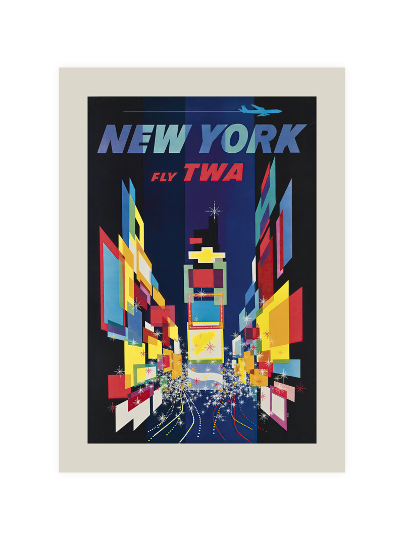
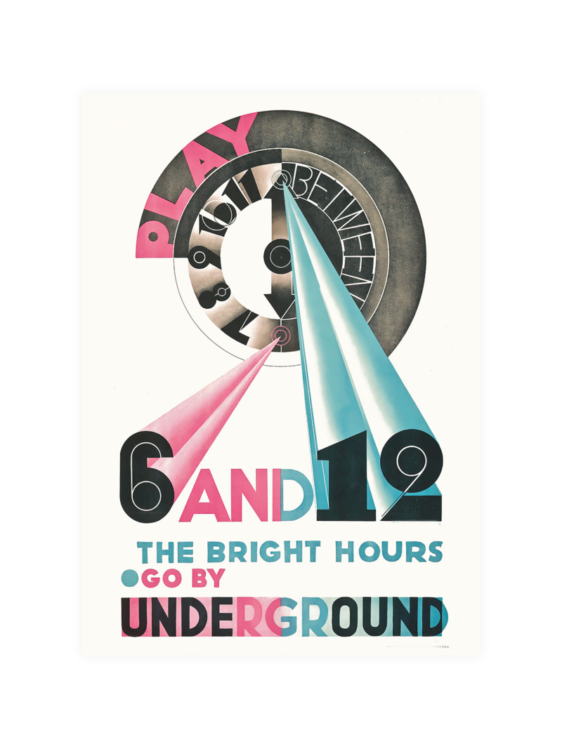
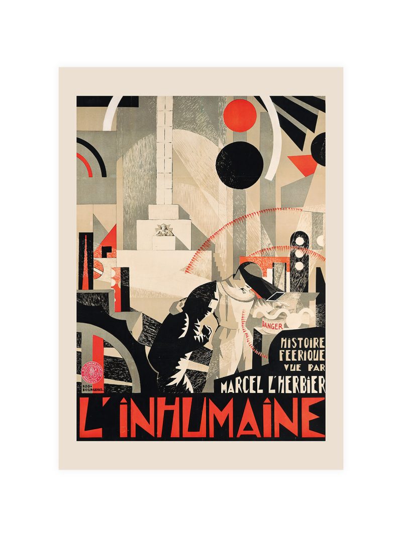
A figure rendered in flat, saturated colour against a plain ground, with the lettering built into the composition rather than placed on top of it. The drawing is stylised: simplified features, strong contour, a pose that reads instantly from a distance. Nothing is modelled in light and shade.
Where it comes from
The poster as a form reached its commercial peak when printing in large flat colours became cheap and reliable: a sheet had to work on a wall, in a window, at ten paces. Designers responded by treating the human figure as a shape, reducing the face to a sign and letting the typography carry the rest. The approach survived long after the printing limits that produced it.
On the wall
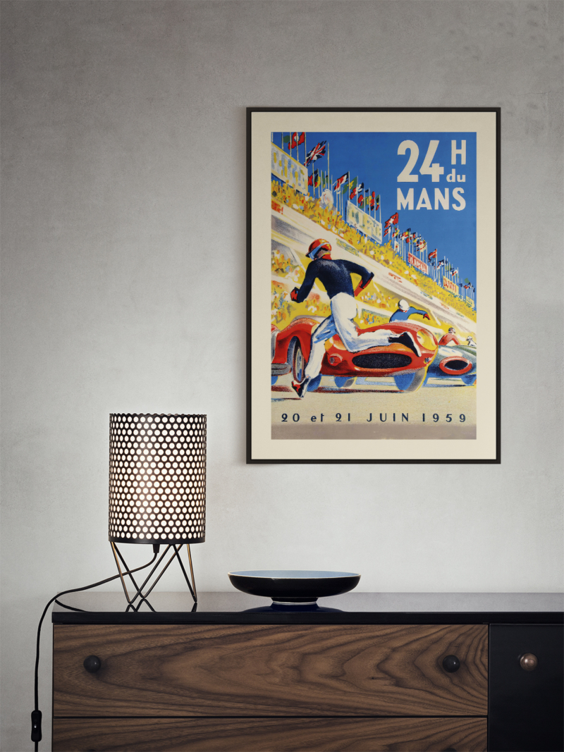
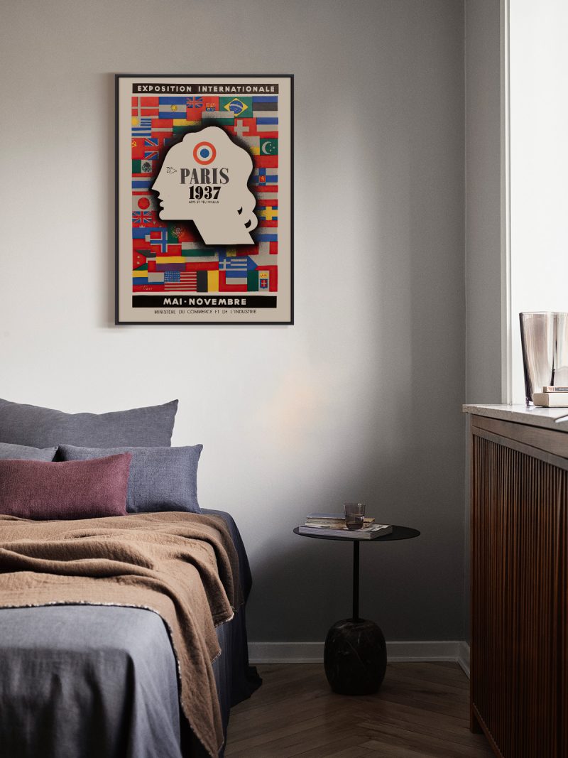
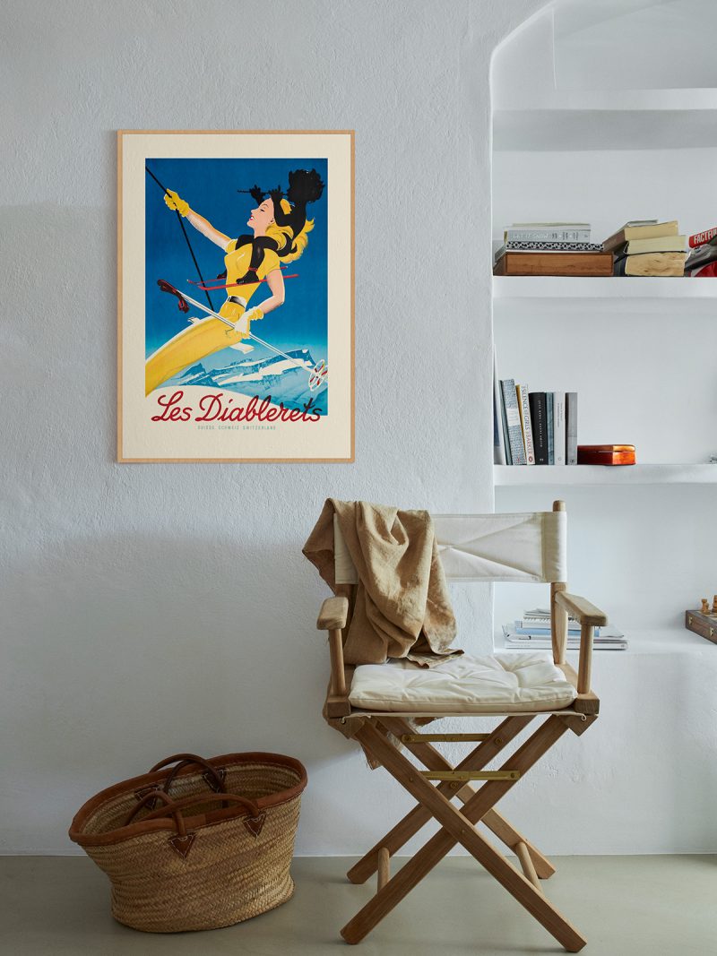
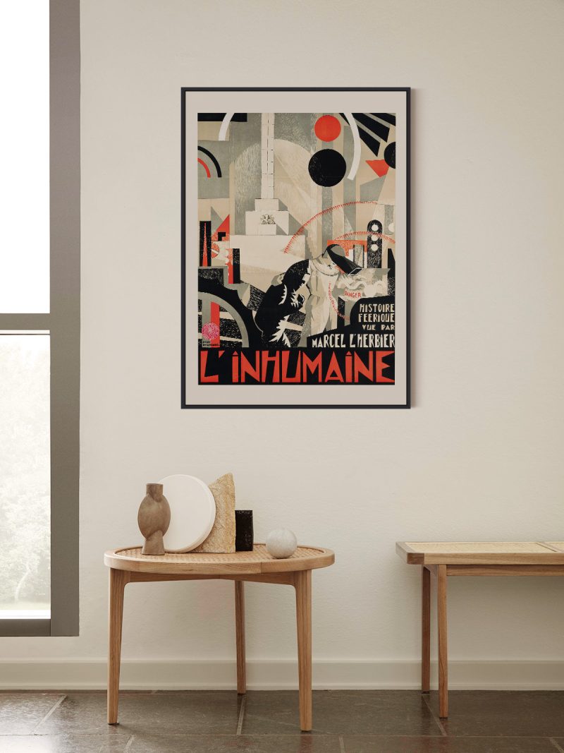
It wants a room with some colour of its own, because the poster does not blend, it asserts. In a hallway, a studio or a child’s room it earns its space; in a very quiet minimalist interior it may be the only loud thing. Hang it at eye level so the lettering stays readable.
In company
Pairs well with other commercial posters of the same period and with strong furniture. It should not be crowded: give it space and let the colour land. In a group of two, place it next to something photographic and quieter, so the flat colour has contrast rather than competition. The Vintage collection gathers prints made for the same kind of wall.