
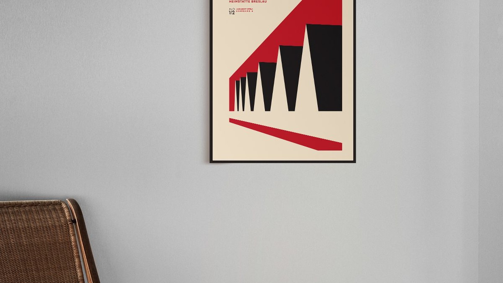
Bauhaus Interior Design and How Its Shapes Work in a Room
Bauhaus was a school, not a decorating style, which is why most attempts to copy it end up as a room full of black metal and coloured circles. What actually travelled from that school into living rooms is narrower and more useful: a way of deciding what belongs on a wall, in what size, and in which colour.
Below is how those decisions work in an ordinary flat, and where people usually get it wrong.

Shape first, decoration later
The school’s habit was to build an object from a few honest shapes and leave them visible. Applied to a room, that means the eye finds a circle, a rectangle and a straight line, and nothing is pretending to be something else.
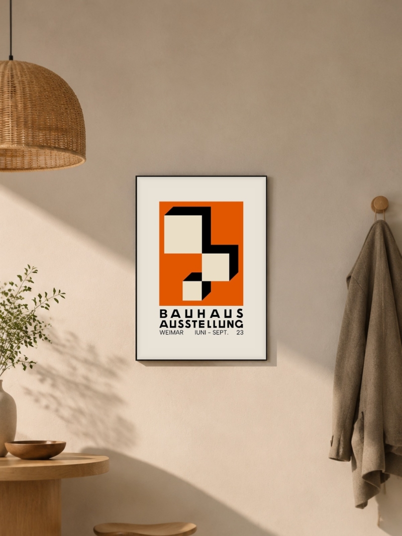
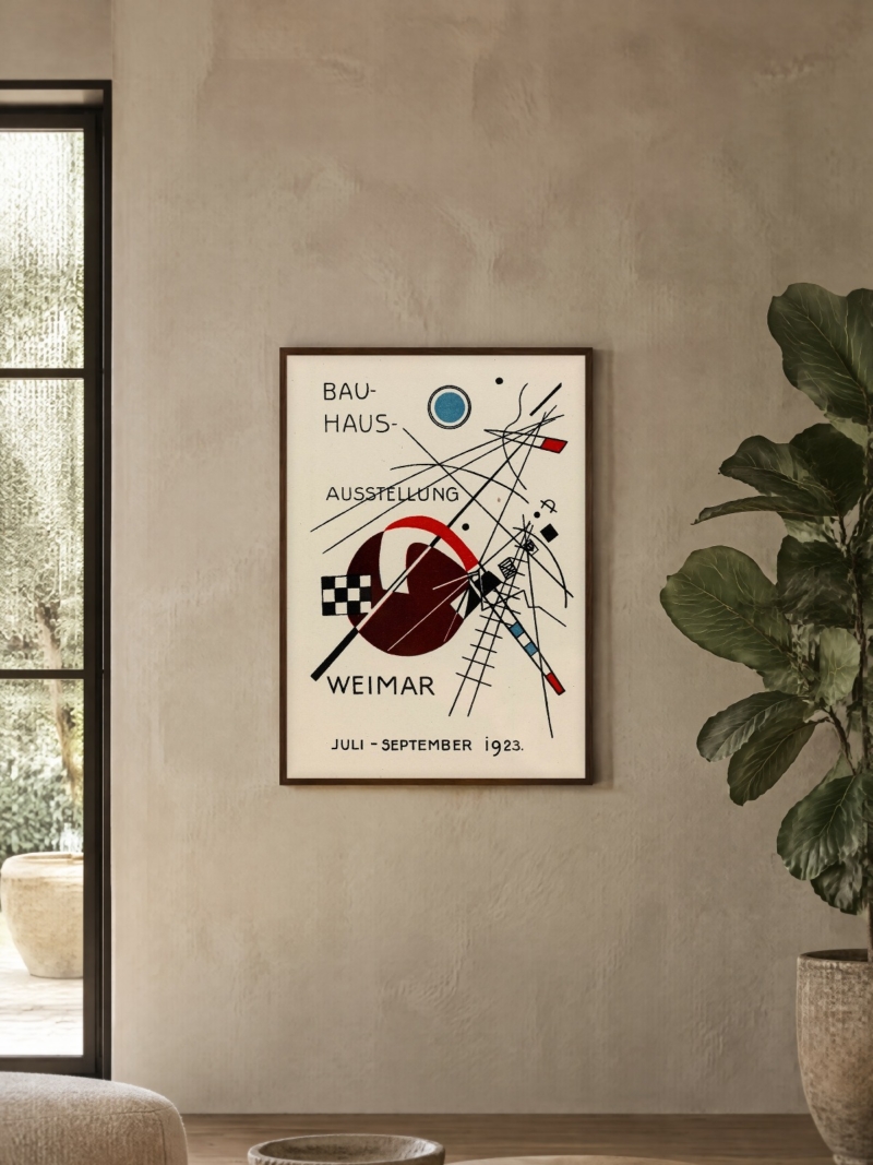
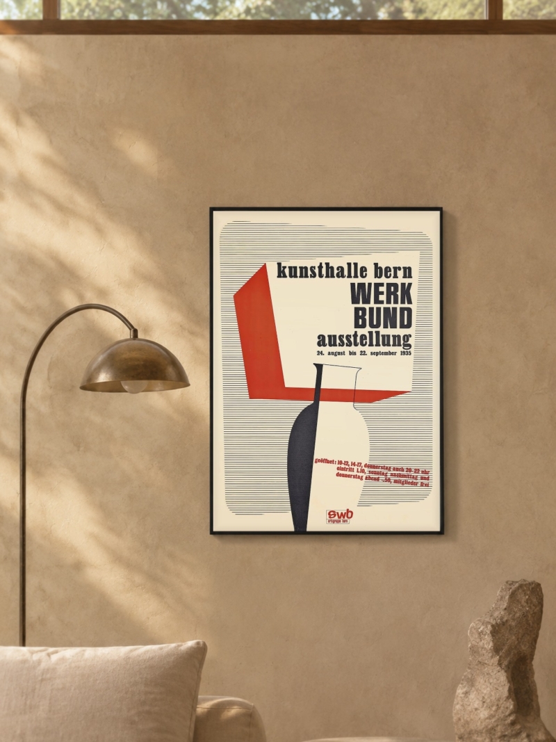
A Bauhaus print does this on its own. It gives the wall one clear shape to read, which is why it works in a room that is otherwise plain and looks stranded in a room that is already busy.
Primary colour as an accent, never a base
Red, yellow and blue appear in this work as small areas of strong colour against black and off-white. If you paint a whole wall in one of those colours, you invert the logic: the colour becomes the background and the print disappears into it.

How to use it in a normal room
One print, one wall, thin frame. Then let it carry the geometry: white or off-white wall, furniture with straight lines, no ornament around it.
If you want the colour to echo, pick it up away from the wall: a cushion, a book spine, a ceramic. One repeat is enough. Two or three reads as a theme, and a themed room ages faster than the print does.
Furniture, in plain terms
The interior pieces that came out of this period are simple on purpose: tubular steel, flat surfaces, no carving, no visible joinery pretending to be decoration. You do not need originals or copies of them. A plain table, a chair with clean legs and a lamp with a metal shade do the same job.

Where the style usually fails
Two mistakes, over and over. The first is symmetry everywhere: a row of identical objects, mirror-placed, which reads as a hotel rather than a home. The second is treating the palette as a rule: every accessory in red, yellow or blue until the room looks like a catalogue cover.
The work itself was never that tidy. Diagonals, uneven weights and visible construction were part of it. Give the wall one strong geometric element and leave the rest of the room a little loose.
Light, and the one thing people forget
These interiors were designed around daylight and simple lamps, not around a single bulb in the middle of the ceiling. A wall with a hard geometric print shows every shadow, so light it from the side, low, and keep the ceiling light off when you can.
A room in five decisions
Wall: white, off-white or pale grey. Nothing patterned behind the print. Print: one, at 50 x 70 cm or 70 x 100 cm, centre 145 to 150 cm from the floor. Frame: thin, black, white or light wood, twenty to twenty five millimetres. Colour: one strong accent, repeated once somewhere else in the room. Furniture: straight lines, low clutter, no ornament competing with the wall.
That is the whole method. It costs nothing to try, and if it feels too bare, the answer is usually a bigger print rather than more objects.
Prints From the Bauhaus Collection




FAQs
Is Bauhaus interior design only black and white with primary colours?
No. Those colours are accents in the graphic work. The interiors were mostly neutral, with colour used in small, deliberate areas.
Can I mix Bauhaus prints with other styles?
One at a time, or with work from the same period. Mixing it with painted landscapes usually flattens both.
What size print should a Bauhaus wall have?
One large print reads better than several small ones. Our guide to poster sizes lists every format we print and the wall each one needs.