
Le Corbusier Posters and the Colours He Chose for Walls
Le Corbusier is remembered as the architect who wanted houses to work like machines. Less known is the part that matters on a wall: he spent years assembling colour sets, tested them in buildings, and used them to decide how a room should feel before anything was placed in it.
That is why his prints look settled the moment you hang them, and why they clash so badly with the colours people usually pick. Below is what those sets were, how the prints are built, and how to choose a wall for one.

Colour first, then the picture
In the early 1930s he put together a collection of wall colours, forty or so tones chosen to work as a system rather than as individual favourites. Each one had a job: a background, a light, a wall that recedes, a wall that comes forward. He tested them in real rooms before publishing them.
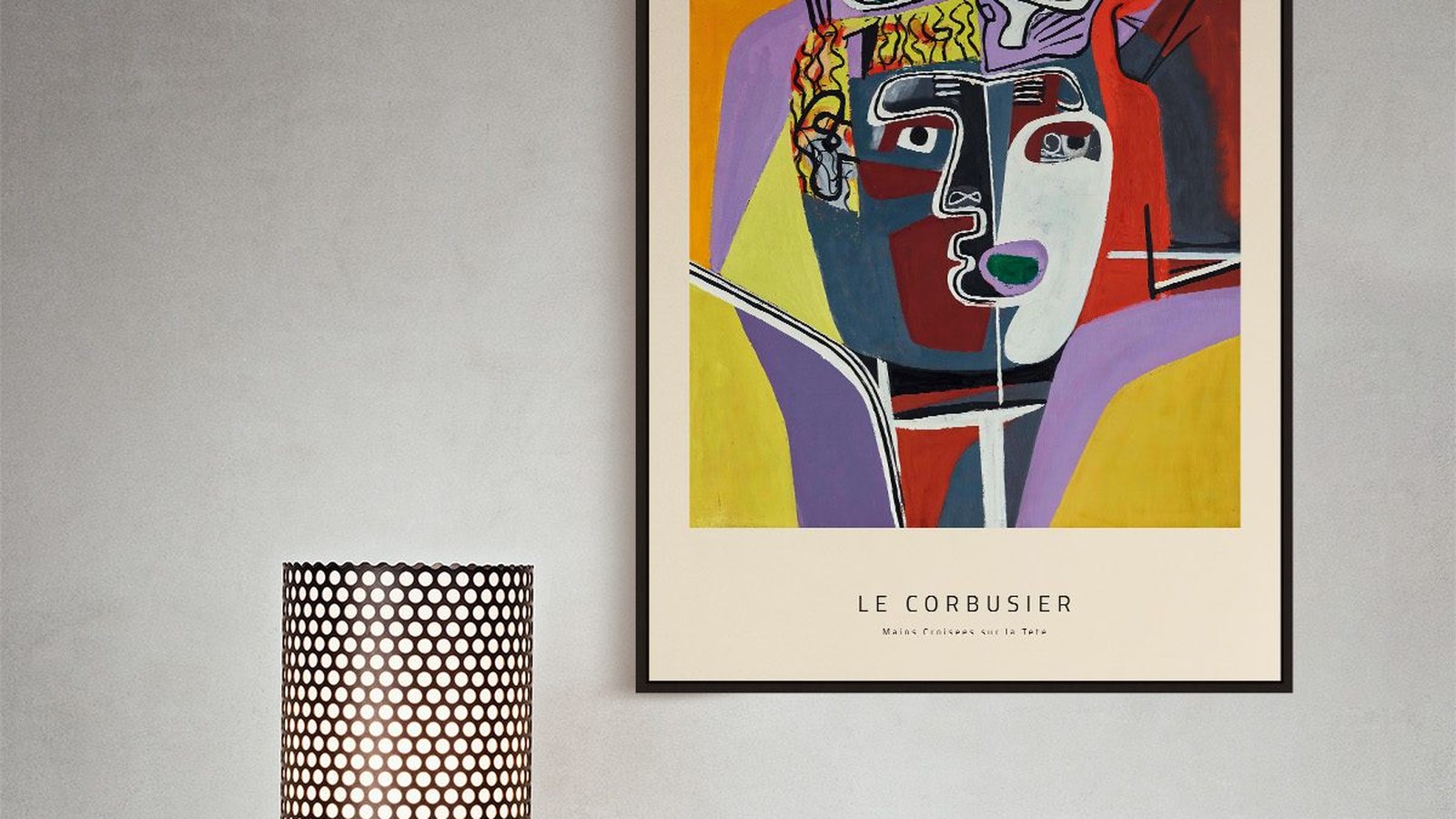
A print like Mains croisées sur la Tête carries that logic. The green, the red and the yellow are not decoration added afterwards. They are placed, and they hold their positions.
Why this matters when you hang it
A print built from placed colour needs a background that stays out of the way. Off-white, pale grey, chalk, or one of his paler wall tones. A saturated modern wall behind it competes with colours that were chosen to win.

What the prints actually are
The works we print come from his drawings and lithographs, not from his buildings. Hands, heads, totems, a bull and a figure from a corrida, drawn in a heavy line and filled with flat colour.
They were made late in his life, when drawing and printmaking took over from building. That is why they feel more personal than the architecture and why they survive enlargement so well: the line is confident enough to be read across a room.
Colour or line, and how to choose
The colour prints hold a wall on their own. The black and white ones, like Petite Confidences, are quieter and need less space around them but more light.
If the room already has strong colour, take the line work. If the room is neutral and a bit flat, take the colour.

Hanging a print that carries a whole palette
Let the print be the only strong element on that wall. Thin frame, twenty to twenty five millimetres, black or natural wood, and no wide mount. The drawing already has a margin of its own.
Centre it between 145 and 150 cm from the floor and leave 20 to 30 cm above the furniture. In a dining room, the print should clear the heads of people sitting down, which usually means the bottom edge no lower than 75 cm.
Size, in a room with normal ceilings
50 x 70 cm is the right choice for a wall above a sideboard or beside a door. 70 x 100 cm suits a wall that has nothing else on it. Below 40 x 50 cm these prints start to look like reproductions of drawings rather than posters, which is a different object.
What the Modulor has to do with hanging height
He spent the 1940s building a proportional scale based on a human figure with an arm raised, so that a building’s dimensions would relate to a body. The grid you see in his prints comes from the same habit.
It is also why the ordinary rule works so well with his work. Centring a print at 145 to 150 cm puts it at eye level for a standing adult, and his compositions were drawn to be read at roughly that distance and height. Nothing exotic is needed. Just do not hang it low to fill a gap above a sofa.
Prints From the Le Corbusier Collection


FAQs
Are these original Le Corbusier prints?
No. We print reproductions on matte 210 gsm Hahnemühle paper, in sizes from 30 x 40 cm to 70 x 100 cm. We do not sell originals or signed editions.
Which wall colour suits a Le Corbusier poster?
Off-white, pale grey or chalk. His palettes were built to sit on quiet walls, and a strong modern colour flattens them.
What size should I choose?
50 x 70 cm for a wall with furniture under it, 70 x 100 cm where the print has a wall to itself. Our guide to poster sizes lists every format with the space it needs, and the full range is in the Le Corbusier collection.