
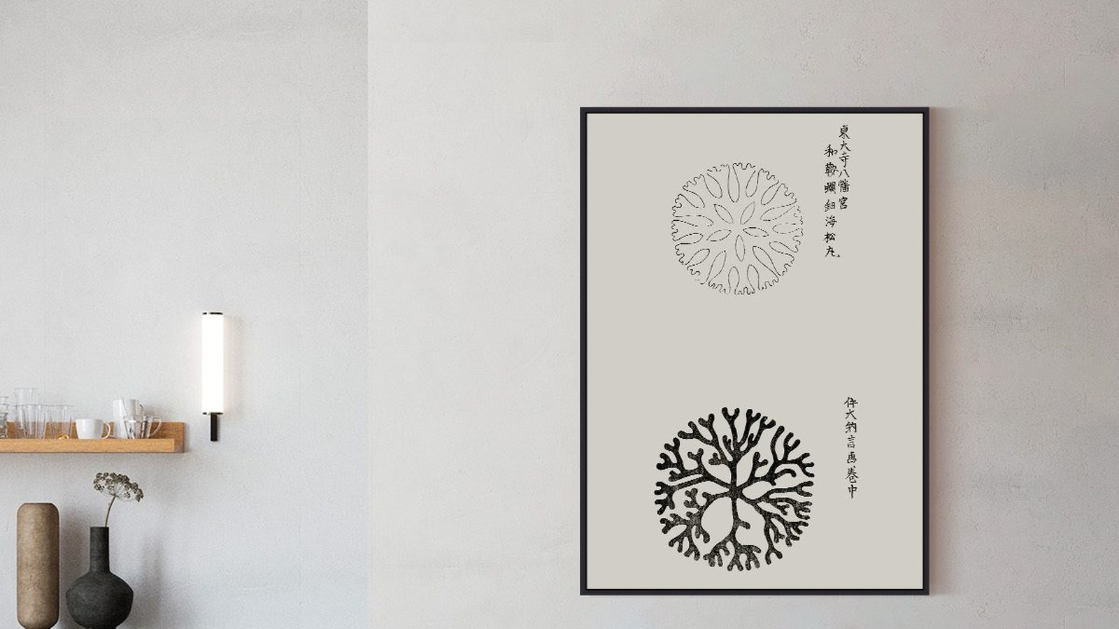
Japanese Motifs in Posters and the Rooms They Suit
Japanese prints arrived on European walls more than a century ago and never really left. What makes them work in a modern flat is not the subject. It is the empty space, the flat colour and the fact that nothing in the picture is trying to impress you.
We print several Japanese motifs, from woodblock landscapes to Kusama’s pumpkins. This is how they behave on a wall, and what to think about before you hang one.

Why these images feel calm
Japanese printmaking leaves a lot of paper unpainted. The sky, the water and the space between two figures are part of the composition, not leftover area behind it. When you hang a print like that, the empty paper reads as air in the room, and the wall feels larger rather than busier.
Woodblock lines and how they age
Woodblock prints are built from flat areas of colour separated by a line. There is no shading and no light source, which is why a hundred year old image still looks modern next to furniture from this year. Taguchi Tomoki’s birds and flowers sit easily above a wooden sideboard for exactly that reason.

Pumpkins, dots and one wall rule
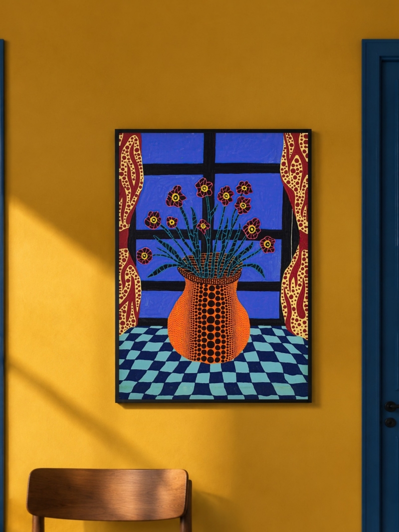
Kusama’s pumpkins are the loudest thing in this group. The pattern repeats until the edge of the paper, so it never quite finishes. On a plain wall that reads as rhythm. Next to three other framed prints it reads as noise. One per wall, always.
Colour that comes from the season
Traditional Japanese palettes are seasonal: indigo and grey for winter, soft pink for spring, deep green and ochre for late summer. If you want a print to feel like part of a room rather than an object in it, match the wall to the season the print belongs to. A pale grey wall makes an indigo landscape look colder and quieter. A warm off-white softens the same print considerably.
Small formats, and why they suit this work
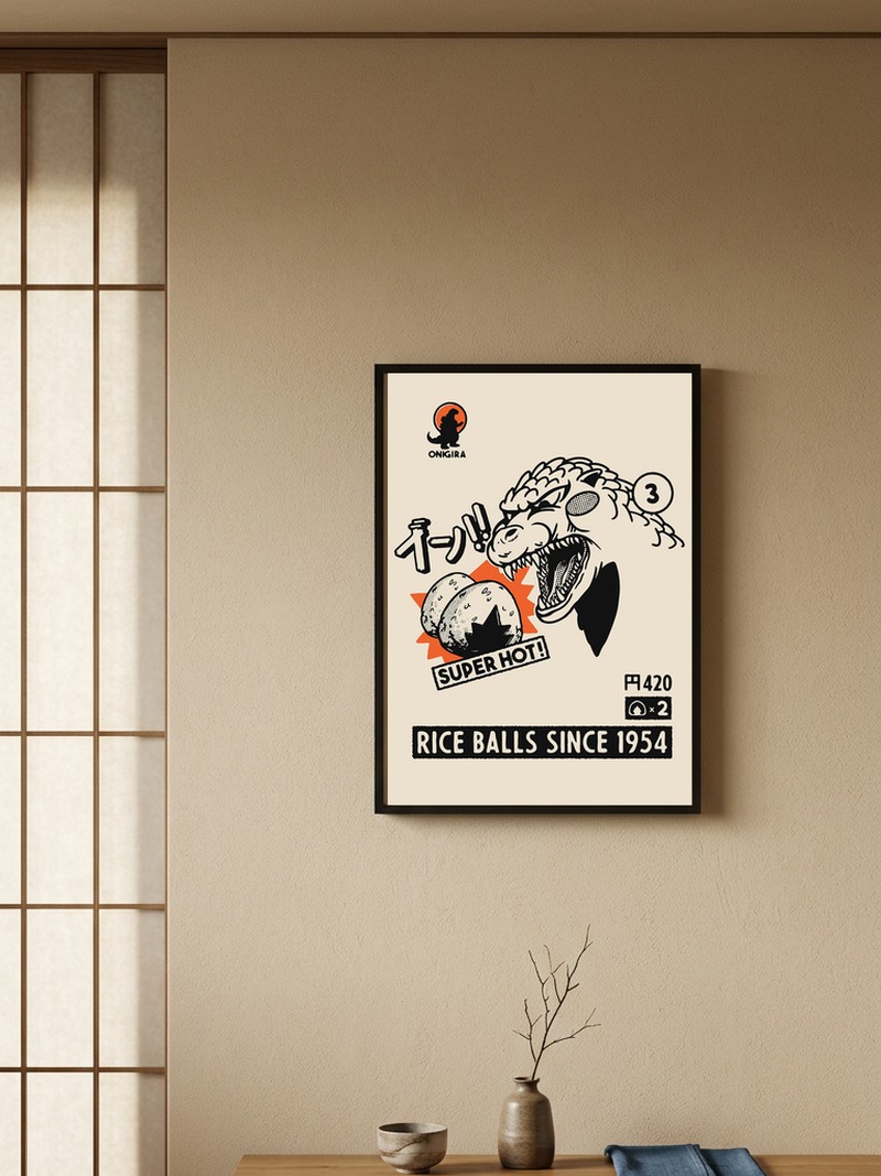
These prints were made for hands, not for large walls. At 30 x 40 cm a woodblock scene reads the way it was drawn: close, detailed, something you step towards. At 70 x 100 cm the line thins out and the image starts to look like a poster of a print rather than a print.
Our advice is simple. For a hallway, a kitchen wall or the space above a small desk, stay at 30 x 40 or 40 x 50 cm. Save the larger formats for the bold, graphic motifs such as the pumpkins, where scale adds to the effect instead of thinning it.
Food, everyday objects and kitchens
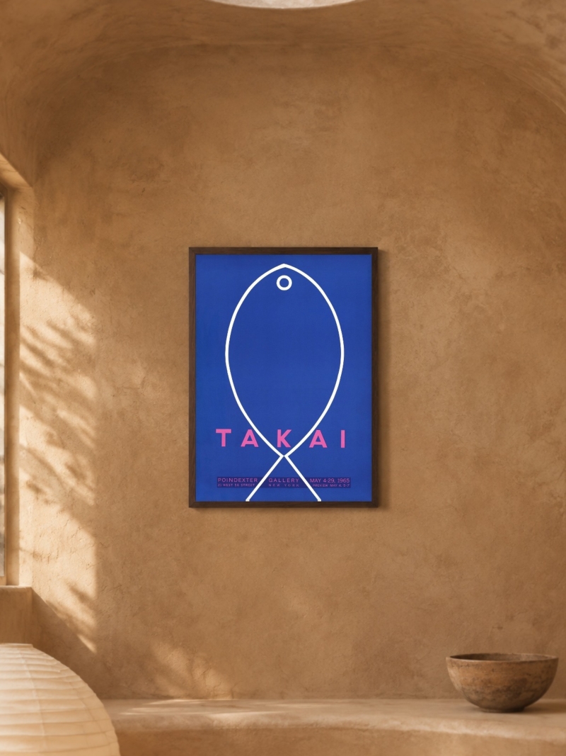
Japanese printmaking has a long habit of treating ordinary things as worthy subjects: rice balls, a bowl, a fish, a teapot. That is why these images work so well in a kitchen. They are not still lifes in the European sense, they are pictures of something about to be eaten, and they belong near where food is made.
Where they work in a flat
Hallways and kitchens first, because the prints are read at a short distance and the detail rewards it. Bedrooms second, particularly the quieter landscapes. Living rooms last, and only above a low piece of furniture, where the print does not have to compete with a television.
A single print is usually enough. If you want two, use the same format and the same frame, keep 5 to 8 cm between them, and hang them as one block centred at 145 to 150 cm from the floor.
Prints From the Japanese Collection



FAQs
Are these original woodblock prints?
No. We print reproductions on matte paper in the formats listed on each product page. We do not sell originals.
What size works best for a Japanese print?
30 x 40 or 40 x 50 cm for detailed woodblock scenes, 50 x 70 cm for the bolder graphic motifs. Our guide to poster sizes lists every format we print.
Which wall colour suits these prints?
White, off-white and pale grey. Indigo and grey prints look colder on grey walls and warmer on off-white ones, so pick the wall for the mood you want.