
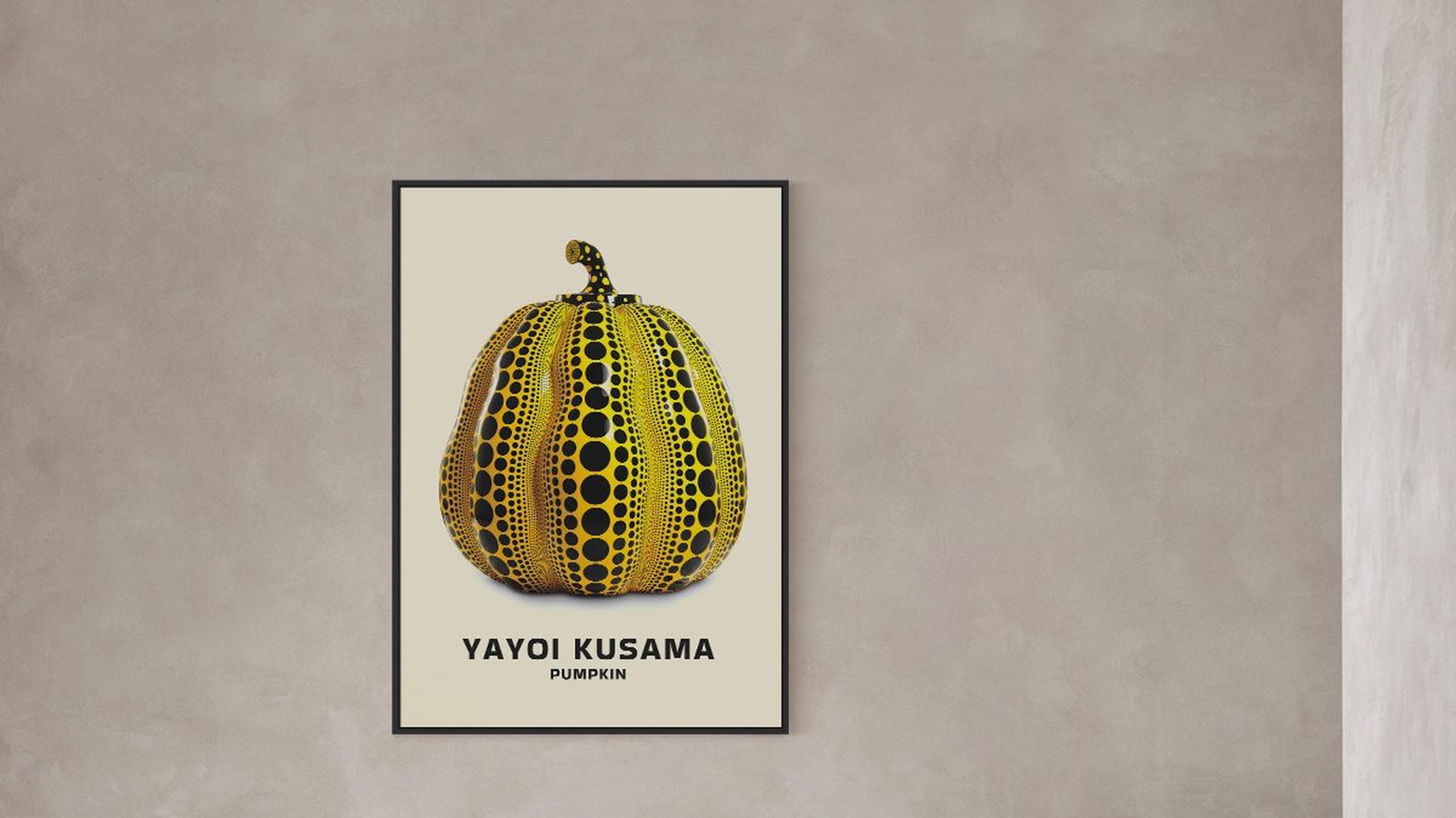
The Yayoi Kusama Pumpkin and Its Halloween Connection
A pumpkin is one of the few shapes everybody recognises before they know anything about art. Kusama covered that shape in dots, and something odd happens: the pumpkin stops being a pumpkin and becomes a pattern with a silhouette. Every October people rediscover it, and every November a lot of them take it down again.
This is why the two things belong together, and how to hang a print like this without turning a room into a seasonal display.

Why dots change an object
Kusama has described her dot work as a way of dissolving the thing she is painting into its surroundings. Whatever you make of the idea, the effect is easy to see: a surface covered edge to edge in dots loses its boundaries and starts to read as texture.
In our pumpkin print the dots sit on a yellow ground with black marks between them. The outline stays sharp, so you recognise the object first and read the pattern second. That order is what keeps a busy image calm.
The pumpkin is the anchor
The familiar shape is why the pattern does not become noise. Without it, dots on a page are just a field. With it, the eye has somewhere to start.

A pattern with no object at all
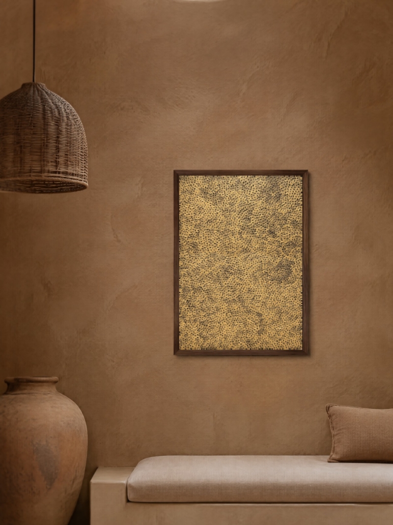
Put the two prints next to each other and the difference is clear. The dots print on this page has no subject: the pattern fills the sheet, with the name set in red underneath. Nothing to recognise, only texture and type.
That is why one carries a corridor and the other carries a large wall. The pumpkin print has a focal point. The dots print does not, so it works as surface rather than as a picture.
Why it reads as Halloween
Not because of orange. Our print is yellow with black dots, which is close enough to the season to feel familiar and far enough to survive November. The trigger is the shape, not the colour.
That is also the limit. In a room where everything else is warm beige and wood, a bright yellow pumpkin looks like it is waiting for a date to pass. On a white wall with black frames, it reads as a graphic decision.

The same shape in another colour
We also print the pumpkin in green on a pale ground, under the title Pumpkin Forever. Same form, same dot logic, completely different mood: quieter, closer to a botanical plate than to a seasonal decoration.
If the yellow version feels too loud for the room you have, this is the answer, and it is the one that stays on the wall all year without anyone asking about October.
Formats that suit this image
The dot field is repetitive by design, so it can go large without becoming heavy. 50 x 70 cm is the safe size for a room wall, 70 x 100 cm where the print has a wall of its own. Below 30 x 40 cm the dots start to read as grain rather than pattern.
Frame thin, twenty to twenty five millimetres, and skip a wide mount. A full-bleed pattern cut off from its own edges looks trimmed.
If you want a Halloween wall, do it properly
One print, one wall, no props. The image says what it needs to say on its own. Adding plastic pumpkins, candles and a garland around it turns the print into part of a display instead of the reason for one.
The usual rules apply. Centre the print between 145 and 150 cm from the floor, leave 20 to 30 cm above the furniture, and keep the surrounding wall empty. Take it down in November only if you would take down any other strong graphic print.
Prints From the Kusama Collection



FAQs
Is the pumpkin print only for Halloween?
No. It is a two-colour graphic print that happens to share its shape with the season. On a neutral wall it works all year, and the green version even more so.
What size should I choose?
50 x 70 cm for a room wall, 70 x 100 cm where the print has a wall to itself. Our guide to poster sizes lists every format we print.
Is this an original artwork?
No. We print reproductions on matte paper. We do not sell originals or signed editions.