Details
The image
A tennis player caught mid-swing, the racket a single dark stroke above the shoulder. The court behind is reduced to bands of flat colour, so the geometry arrives before the subject does: the eye reads rectangles and diagonals first and only then works out that a match is happening. The palette stays narrow, two or three tones, no shading.
Where it comes from
Sport entered poster design as a subject worth drawing rather than photographing and tennis was a favourite: it offered white clothing against strong ground, a clean silhouette and a gesture that reads from a distance. Posters of this kind were made for clubhouses, tournaments and sports shops and most carried no tournament name at all, because the picture was the advertisement.
On the wall
It behaves like a graphic print rather than a sports memento, which is why it sits comfortably beside abstract work. In a study or a hallway it gives a wall one strong, square gesture without asking for a large space. It also works in a child’s room, where the flat shapes still read when seen from a bed.
In company
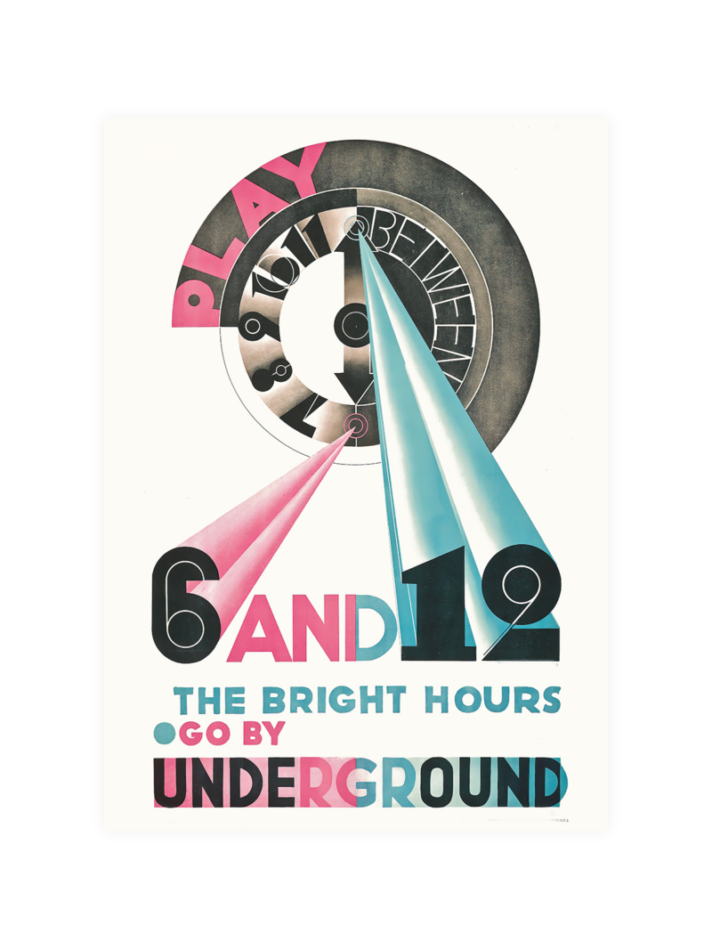
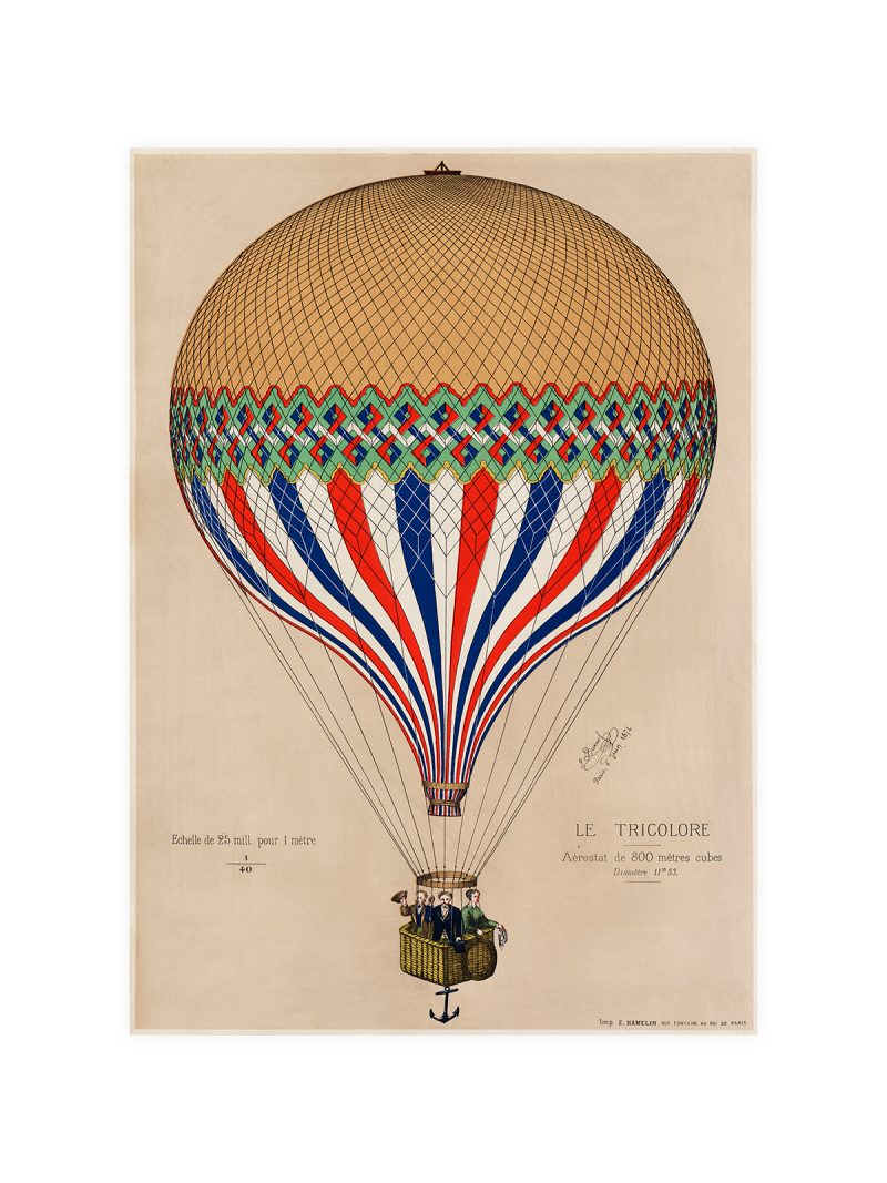
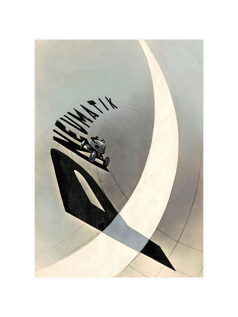
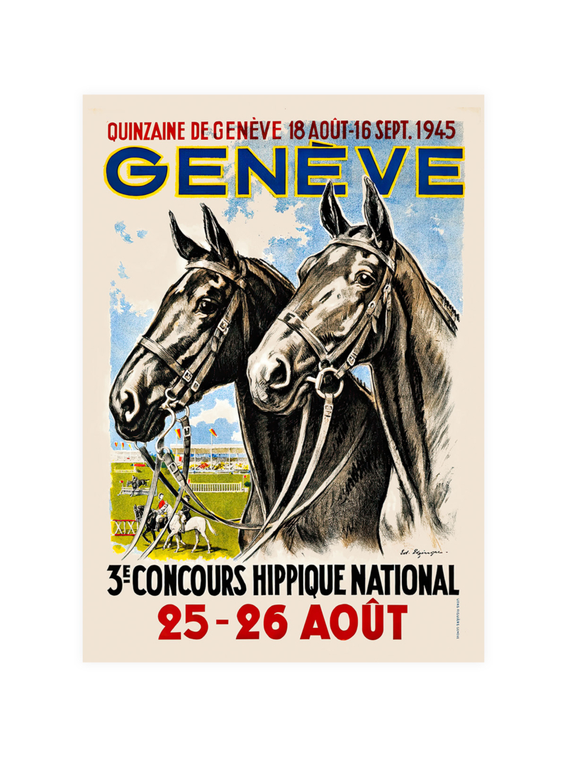
Pairs well with travel and racing posters of the same period, because they share the flat colour and the emphasis on gesture over detail. In a group of three it works best in the middle, where the square shape holds the composition together and the white of the player’s clothing gives the eye a place to rest. Other sheets in the Vintage collection work the same way on a wall.