Details
The image
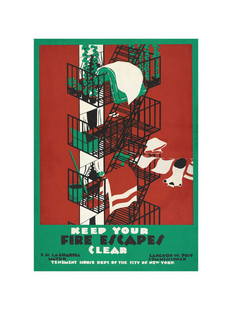
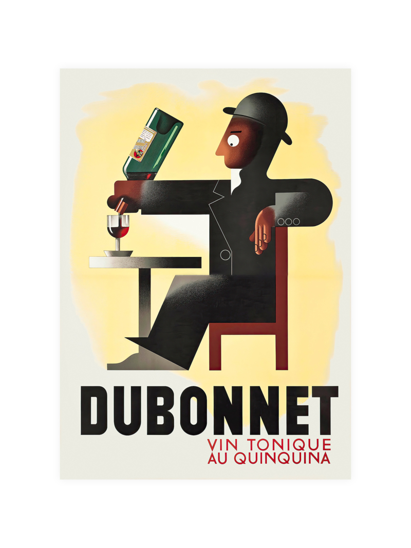
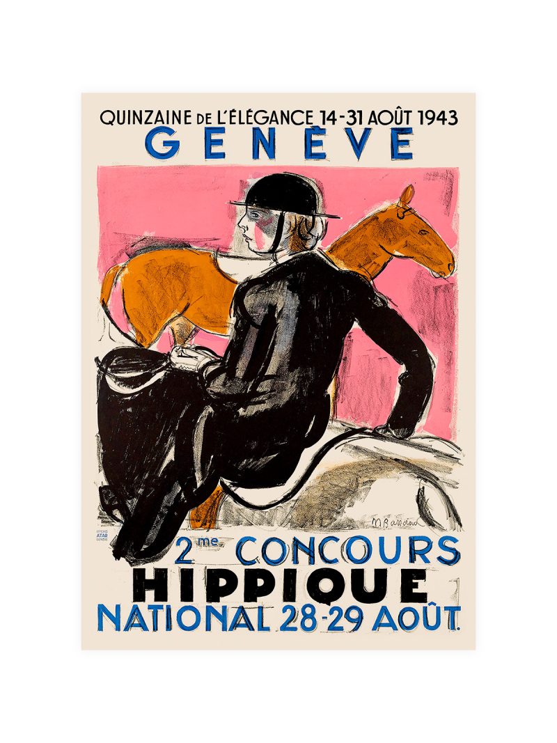
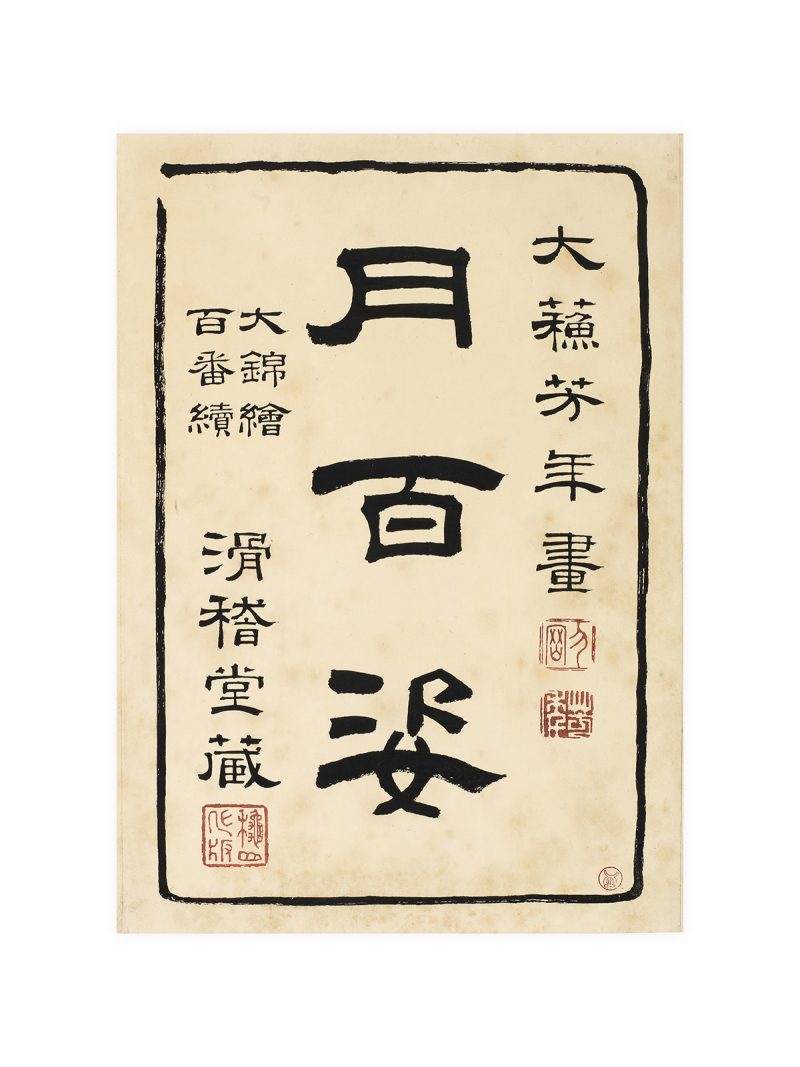
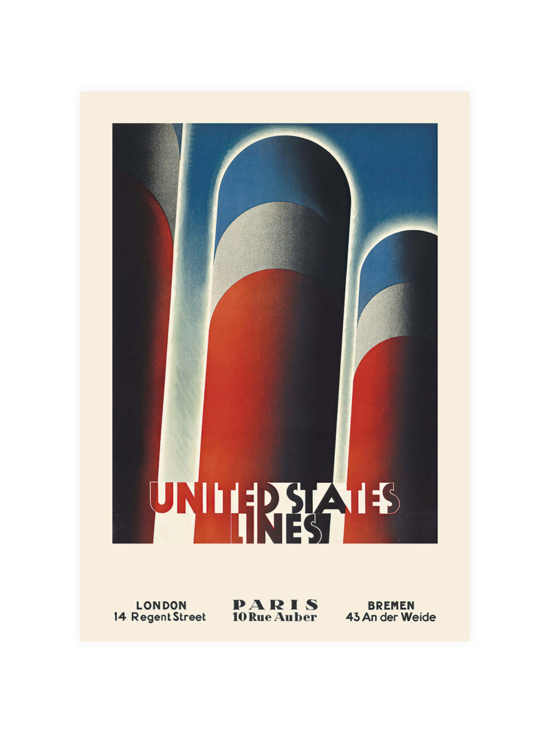
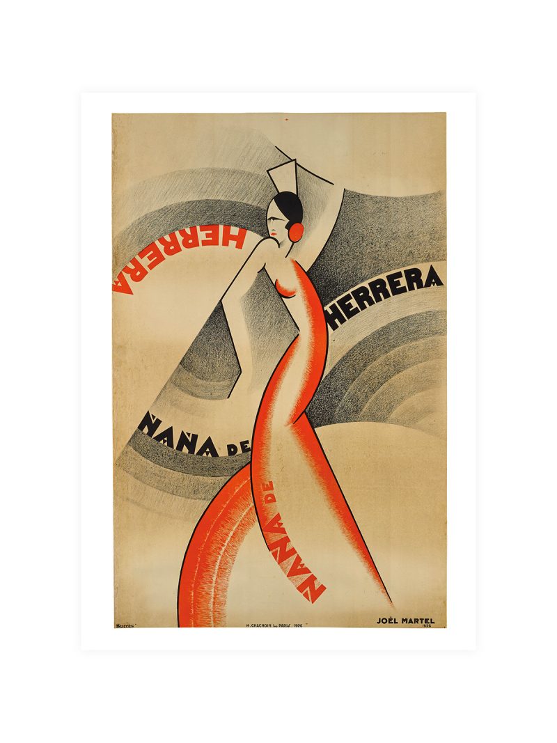
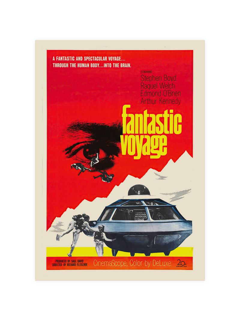
A stylised transport scene: a tunnel or a platform drawn in flat planes, lettering set in a geometric face, colour limited to a few strong notes. The composition is built for speed of reading rather than for detail, a poster designed to be understood by someone walking past.
Where it comes from
The London Underground commissioned posters from artists and designers from the early twentieth century onward and the result was an unusually consistent visual language: flat colour, simple shapes and an assumption that the viewer is in a hurry. Those commissions turned public transport advertising into a school of graphic design.
On the wall
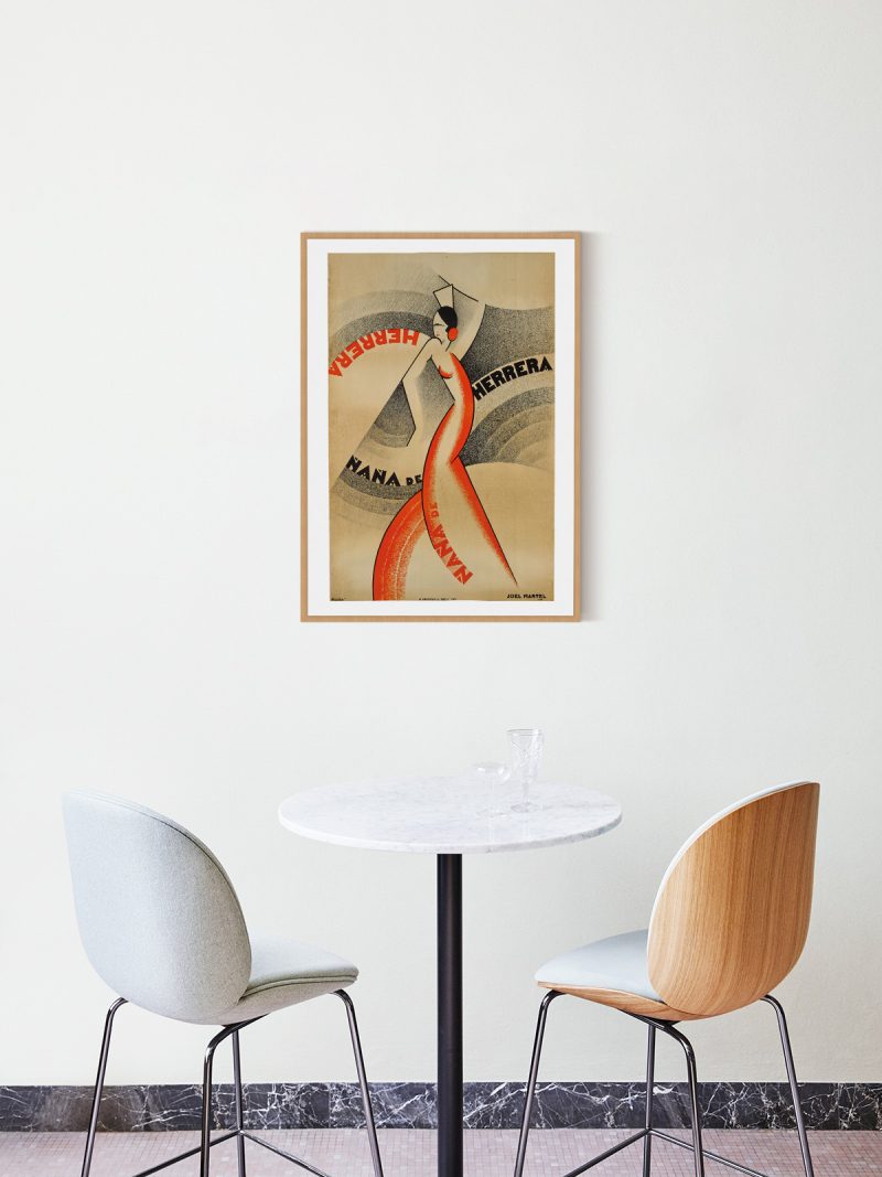
It suits a hallway, a study or a child’s room, where a strong graphic with clear shapes works at a glance. Because the palette is limited, it tolerates strong wall colours and dark furniture. In a narrow space it reads well at a distance, which is how it was meant to work.
In company
Pairs well with other transport and travel posters and with industrial furniture. In a group it should be the most graphic element. A thin frame keeps the flat colour clean; a heavy one would turn it into a period object rather than a picture. The rest of the Vintage collection holds pieces from the same years and the same printing habits.