Details
The image
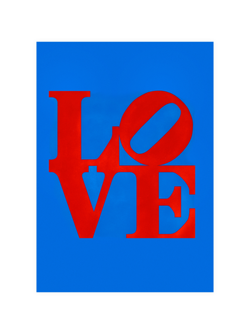
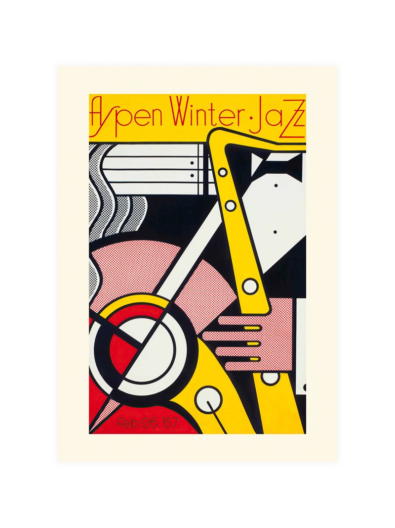
A word and a shape arguing for the same space: heavy lettering stacked in two lines, a symbol placed beside it and the paper carrying nothing else. The palette is limited to two colours and the composition is frontal, so the sheet behaves like a placard rather than like a picture.
Where it comes from
Protest graphics of the twentieth century developed a grammar of its own: no illustration that could be misread, no decoration that could date and a message that had to work at the size of a wall and on the size of a leaflet. Designers who made these sheets often worked anonymously and the best of them are studied now as examples of how little a poster needs to carry an argument.
On the wall
It suits a studio, a hallway or a study, where a blunt graphic can hold a wall without decoration. Because the composition is frontal and the text is large, it needs a plain surface around it. In a group it should be the piece that sets the tone.
In company
Printing of this period is what the Iconic collection is made of.Avoid hanging it beside decorative work, the message needs silence to stay a message.