

Minimalist Poster Design Masters Pablo Picasso and Taguchi Tomoki
Two artists, two continents, one habit: take almost everything out and let the rest do the work. Picasso’s dove poster for a peace congress and Taguchi Tomoki’s woodblock birds were made for completely different purposes, and they end up asking the same thing of a wall.
This is a comparison you can hang. Below is what each one reduces, why the empty space matters, and how to place two prints that both refuse to shout.

What Picasso removed
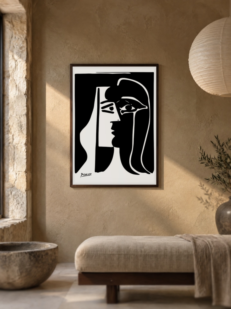
The peace poster is close to a single idea: a dove, a face, a handful of lines. There is no background, no setting, no shading. What is left is a silhouette that reads at twenty metres and still holds up at fifty centimetres, which is a much harder trick than it sounds.
What Taguchi removed
Taguchi works the other way round. In the green print on this page the birds are still there, each one reduced to a quick V of two strokes, scattered low across a field of worked green. What disappears is everything around them: sky, water and ground become one tone, and a column of calligraphy does the rest.

Why empty space is the hard part
Anyone can fill a sheet of paper. Leaving two thirds of it unused, and still making the image balance, is the skill. That is why minimalist prints look calm and why they are unforgiving: put one on a busy wall, or hang it crooked, and the whole thing reads as a mistake.
The practical consequence is simple. A minimalist print needs a plain wall, a thin frame and nothing beside it. Give it that, and it will make a room feel larger than the furniture suggests.

Hanging two prints that both stay quiet
Two minimalist prints side by side break each other, because the eye needs one empty field to rest on. Put them on separate walls, or in separate rooms.
If you only have one wall, choose one print and go up a format. A single 70 x 100 cm version of a stripped-back image reads better than two 50 x 70 cm ones competing for the same silence.
Sizes and colour
Both artists survive enlargement because there is so little to blur. Picasso’s line holds at 70 x 100 cm. Taguchi’s line motifs hold at 50 x 70 cm and start to thin above that, so keep them at 30 x 40 or 50 x 70 cm where the drawing is the point.
Walls: white, off-white, pale grey. Both palettes are narrow, so a strong wall colour takes over the image instead of supporting it.
Where each one belongs
The Picasso suits a hallway or a study, a wall you pass and glance at. The dove reads instantly, which is what a corridor asks for. Taguchi suits a kitchen, a bedroom or a reading corner, where you stand close and look at the detail rather than the silhouette.
Both hang at the same height as anything else: centre between 145 and 150 cm from the floor, bottom edge 20 to 30 cm above the furniture. The difference is how much wall you leave around them, and the answer for both is more than you think.
Prints From the Picasso Collection




FAQs
Are these original prints?
No. We print reproductions on matte paper in the formats listed on each product page. We do not sell originals or limited editions.
Can I hang a Picasso and a Taguchi in the same room?
Yes, if they are on different walls. On one wall they compete for the same empty space and both lose.
What size should a minimalist poster be?
One size up from what feels natural, and never small. Our guide to poster sizes lists every format we print. More woodblock works are in the Japanese collection.